Want to help fight Covid-19? Your phone can support research while you sleep

Looking for a way you can help contribute to fighting the Covid-19 pandemic? An app from UK network Vodafone is now helping contribute to research into the coronavirus, and your phone can help out.

The Vodafone Foundation is working with doctors and researchers at Imperial College London to speed up Covid-19 research with its existing DreamLab app.

The Vodafone Foundation first launched its DreamLab app in 2015 to help researchers treat various types of cancers. Given the fact it has had years to hone the app’s features and the infrastructure behind it, redirecting the app’s efforts temporarily to tackle the Covid-19 pandemic seems like a welcome temporary switch.  

In case you missed it the first time around, DreamLab uses the collective computing power of its user's smartphones to analyze complex data. This all happens while users are asleep, so they don’t feel the impact of the app on their phone's performance. 

The additional computing capability the app generates gives scientists access to much-needed processing clout, supporting them in identifying existing drugs and food-based molecules that may benefit Covid-19 patients and more.

The more people that download DreamLab, the higher the chances of it helping scientists taking advantage of its communal computing, specifically those in search of a coronavirus cure.

If you want to fire it up while you sleep, all you have to do is to remember to open the app on your Android or iOS smartphone every night when it’s plugged in to charge. You don't need to be on Vodafone to download it, and you can get it from anywhere in the world too.

DreamLab will automatically run in the background, and stop when you start using your phone again in the morning.

If you're connected to Wi-Fi then the background data processing will use that. Vodafone UK customers needn't worry about Wi-Fi though as the network will foot the bill for any data costs incurred while running the DreamLab app.

Imperial's research aims to identify existing drugs and food-based molecules with anti-viral properties that may benefit those with Covid-19 as part of phase one. 

Phase 2 of the DreamLabs Covid-19 research project seeks to optimize combinations of these drugs and food molecules to provide potential treatments and nutritional advice for those with Covid-19. 

Once complete, findings will be made available to the medical world to facilitate clinical trials. You can download the apps through the Apple App Store, and the Google Play Store

Posted in Uncategorised

10 days with the Huawei Mate XS: over a week with the latest foldable phone

It's hard to summarize the Huawei Mate XS in just a star rating. It's a new product category; both a tablet and a phone - entirely usable in either mode with minimal compromise.

While we've seen other foldables like Samsung’s Galaxy Fold and Galaxy Z Flip, as well as the Motorola Razr, the Huawei Mate XS perhaps best brings the two product categories into one foldable hybrid. Its hardware is unmatched.

That said, for the foreseeable, we won’t be able to write about Huawei’s Android phones and tablets (and indeed foldables), without mentioning their software differences when compared to other Android phones.

Since Google cut ties with Huawei at the behest of the US government, the Chinese manufacturer's devices have been handicapped. While Huawei is doing the right things - investing massively in plugging the Google-shaped holes in its software story, and being mindful of how it sells and markets its new phones, it would be reckless to underplay the real-world implications of no Google services to those outside China.

It's difficult for a review to capture all the nuances of how incredible the Mate XS is as a hybrid device, or how far-reaching the lack of Google Mobile Services is to a western user. That’s why we've written this diary which documents a week with one of the most complex smartphone stories of our generation.

Day zero: I came from a Mate 30 Pro

Huawei tested the Google-free waters ahead of announcing the Mate XS with its Mate 30 Pro. Despite launching in 2019, it only hit select shelves in the west in 2020.

The Huawei Mate 30 Pro launched in the UK with limited availability because Huawei knew its Google-free status would be a challenge. Unsurprisingly, the theater surrounding its sale is an ongoing, carefully orchestrated production.

Sales staff are being briefed on how to sell a phone with no Google services and who to sell it to.

Huawei is also, no doubt, assessing how much a fantastic bit of hardware (which the Mate 30 Pro certainly is), is being held back by the software situation. It wants to sell phones, but it doesn’t want high return rates and resentful customers - that would kill the brand equity that it has worked so hard to build.

I already had some experience with that phone, so had some idea of what to expect. But this story isn’t about the Mate 30 Pro.

Hour one: setup

I opened the box on the train, handling it as if a relic that might turn to ash if the wind changed direction. All the buzz surrounding the Mate XS made mention of the plastic screen being ever-exposed, so the last thing I wanted to do was scuff it up before I fired it up.

Huawei has fortified the plastic on the front with, well, more plastic. A double layer and adhered together, with the screen coating costing more, pound for pound, than gold. I wanted to try being a little haphazard about how I used the Mate XS in my time with it - just not straight out of the gate.

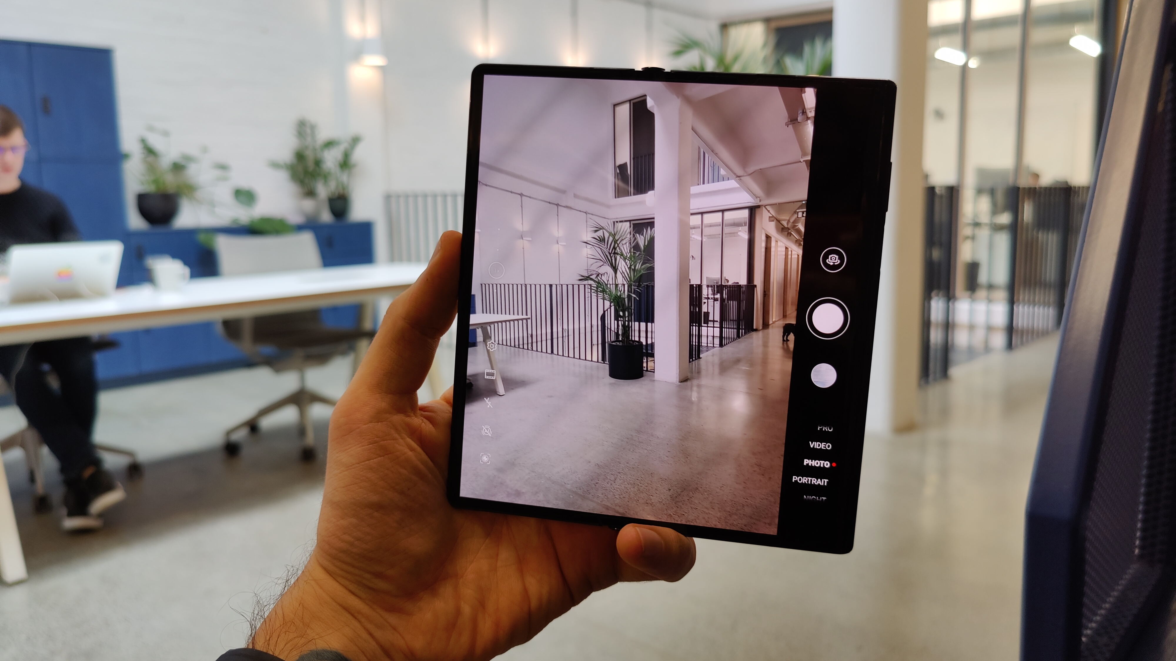
In the box, the phone is flattened out, in its tablet mode, so that’s how I left it when I switched it on. As the Huawei logo flashed up, first impressions were positive - an impossibly thin tablet, that turns into a phone, a folding screen that doesn't feel naff - this is special.

The setup process was very similar to that of the Mate 30 Pro. Connect to Wi-Fi, log into a Huawei account, link it up with Huawei Phone Clone on an old device (at around 60Mbps no less), and bam - all my apps bar Google-related services and my Barclays banking app shifted across.

There was one striking difference, though - a message warning me not to peel the screen protector off, get the phone wet or fold it in temperatures below -5 degrees Celsius / 23 degrees Fahrenheit.

If the political situation didn't rule out half of North America, that last point would, as -5 isn't event that cold! This was doing nothing for my fear of using the Huawei Mate XS in the real world.

Still, the fear didn’t deter me; my week with Huawei’s new super phone had begun.

Hour two: fold, unfold, repeat

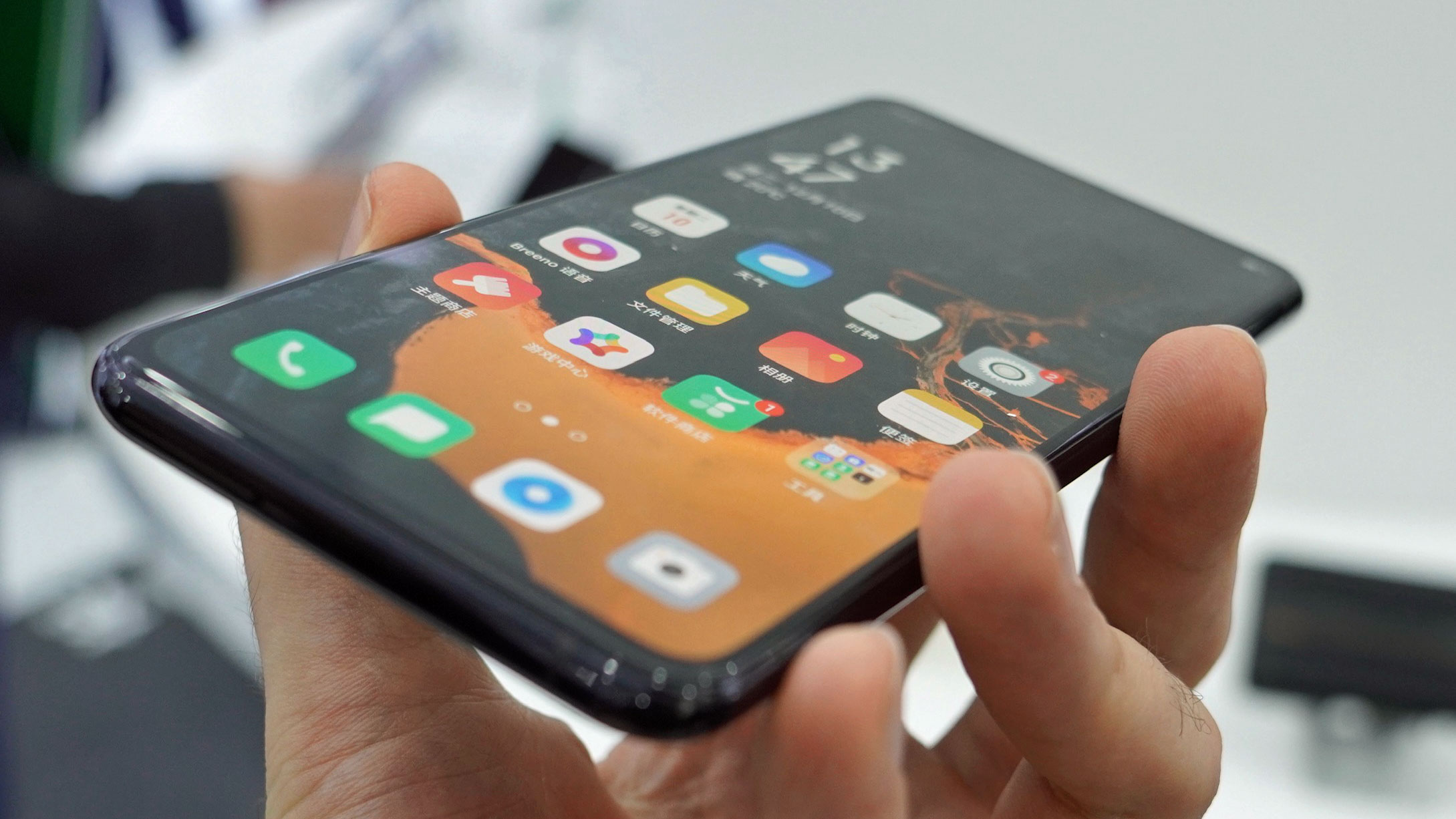
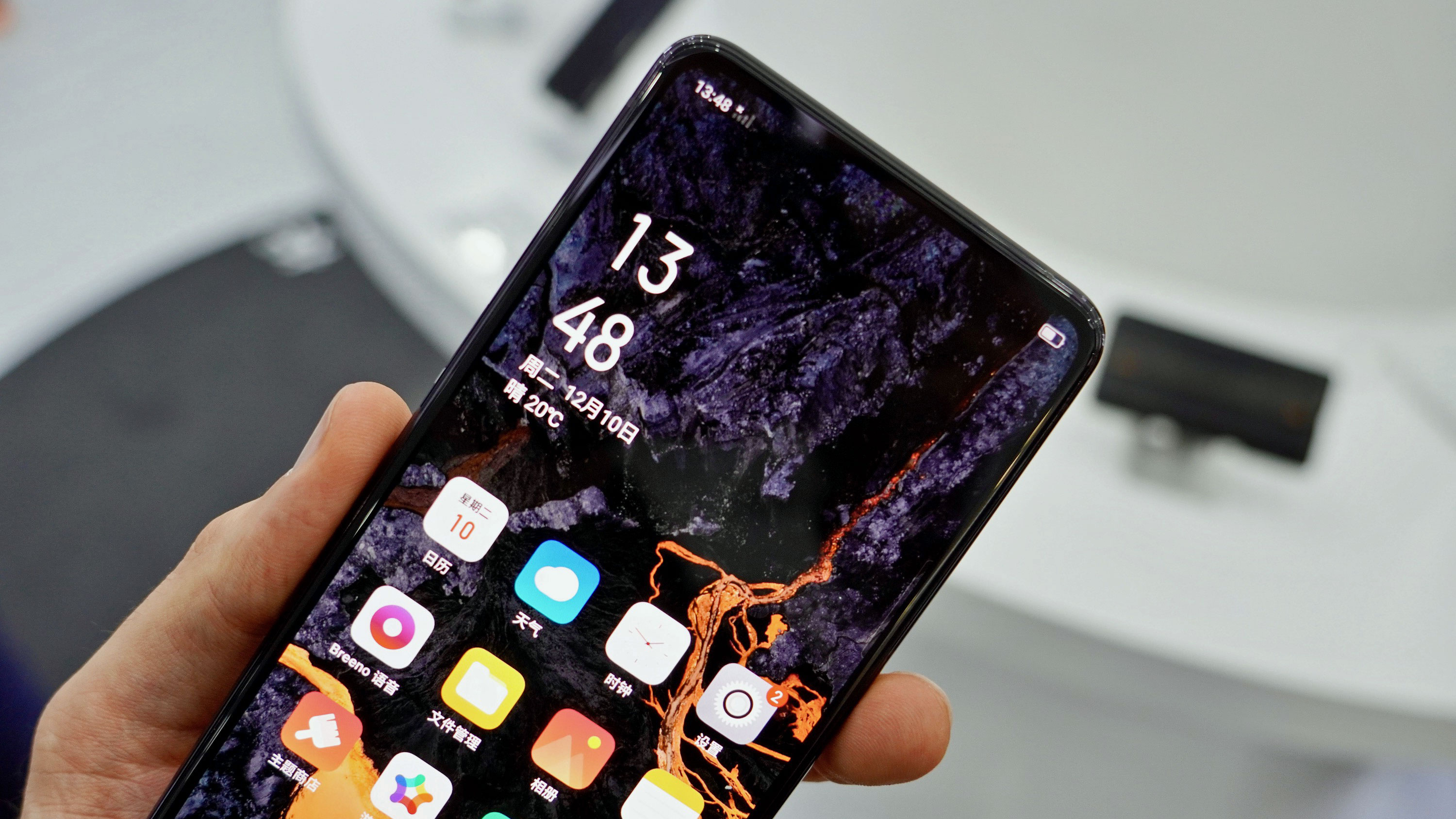
Before I dove into the software, first things first, I folded and unfolded it - a lot. The phone’s screen turns from a 6.6-inch tall smartphone to an 8-inch tablet. That might not sound like much of a difference, but it is.

It means you don't have to rotate your phone from portrait to landscape to beautifully showcase your pictures, you can open it and get a much better result, not to mention an "oooooh".

The unfolding mechanism is activated by hitting a latch on the back of the phone which unclasps the folded back side. It pops out a little, after which, you do the rest.

Initially, I didn’t love the clasp. If felt like yet another moving part in a device that already had more of those than most. The fact it enables the Huawei Mate XS to fold flat is a huge deal, though.

The Mate XS's 11mm thickness makes it thicker than most phones, but it’s still manageable, especially if you’re coming from an already large flagship like the OnePlus 7T Pro.

Day one: software

My first full day with the Huawei Mate XS after the novelty of its design subsided just a little, and I'd spent most of it setting it up. Huawei has invested $1 billion in its App Gallery, and in enticing developers to create for its non-Google devices.

That said, it’s clear that the associated improvements will be phased over the coming years, as the Huawei Mate XS’s app store experience is virtually identical to that of the Mate 30 Pro. That means you get a handful of the top ten apps available through it, but it isn’t comprehensive, yet.

Still, you can install apps manually, and there are other app stores; APK Pure and Aurora Store are the two I find most reliable and can recommend. 100% of the apps I needed were available in one or the other, except for games I’d bought through the Google Play Store, like Final Fantasy.

This was the first psychological hurdle I had to get to grips with - my Google Play investments were lost so long as I was living my best folding life.

Irrespective, I pressed on, setting up apps like Outlook to cover my Google Calendar, Drive, and Gmail needs. Some Google apps even worked without any headaches too - specifically Chrome and Maps, with the limitation being that I couldn't log into my Google account on them.

Most impressive, however, is the web browser experience. Whether through Chrome or Huawei’s default browser, viewing sites in desktop layout makes the Mate XS feel like something of an early days Chromebook.

I was able to upload files to Google Drive and even access my Gmail with a full web view. Hooked up to a mouse and keyboard, while it wasn’t a perfect experience, provided I had internet it was much better than it would have been if this was a traditional phone.

Day two: no sideloading Google

Having sideloaded Google Services onto the Mate 30 Pro, by day two with the XS, I was ready to give getting my old favorites onto the foldable a real stab. The method I used before was pretty straightforward; a few downloads, a couple of screen taps, mouse clicks, and a manual install of six APK files, and I was done. Not on the Mate XS though.

I tried twice to sideload Google Services, but no joy. Hmm. Time to get comfortable with finding workarounds to missing Google features.

The implications of no Google are far-reaching, extending beyond standard Google apps. Uber, for example, doesn't work on the Mate XS as it uses Google location-related APIs.

WhatsApp backups don’t work either as they are saved to Google Drive - the list of affected apps is extensive and random, so be prepared for a journey if you pick up a Mate 30 Pro or Huawei Mate XS.

Given the added novelty and utility a folding phone brings, however, in a masochistic way, this need to find app workarounds added to the sense of novelty that comes hand-in-hand with using the Mate XS. The ground-breaking hardware made it worth the extra effort, for me at least.

Day three: I dropped a £2,000 phone

For the first few days with the Huawei Mate XS, I’ve been coddling it. The foldable has lived in a microfiber sleeve. Nothing too firm or protective, but I haven’t been putting it on any surfaces without something soft cushioning it. Do this, and the phone will look great - my Mate XS on day three is totally scratch-free.

That said, by the afternoon, I wanted to test it out with no sleeve so I'd get an idea of how scratch-proof it really is. As much as it pained me, I started putting it directly on surfaces, and straight into jean and jacket pockets. By the evening, I was using the foldable like an actual phone, sliding it into my pocket, pulling it out, opening and closing at will - it was a dream, until…

Picture the scene - I’m in a kitchen (with tiled flooring). I pull the Mate XS from my pocket, open it up - and the doorbell rings. Lowering the phone to my waist, I walk over to answer it, but I don't realize there's a terrified cat about to fly between my legs - he hates strangers, and in turn, doorbells.

I stumbled, almost fell, steadied myself on a chair with the hand holding the foldable - it dropped from about half a meter. The flattened screen hit a wall, which seemed to have spread the impact as it bounced off and onto a tiled floor.

My heart fell through my chest. It was only day three, and I’d broken the most expensive, exclusive phone I’ve ever used! Wait; no, no, I haven't?

Turning the Mate XS over, the screen works fine. It folds, there aren’t any dents on the display, or on the metal frame. I’m not entirely sure how, but it looks as good as new…

Day four: party tricks

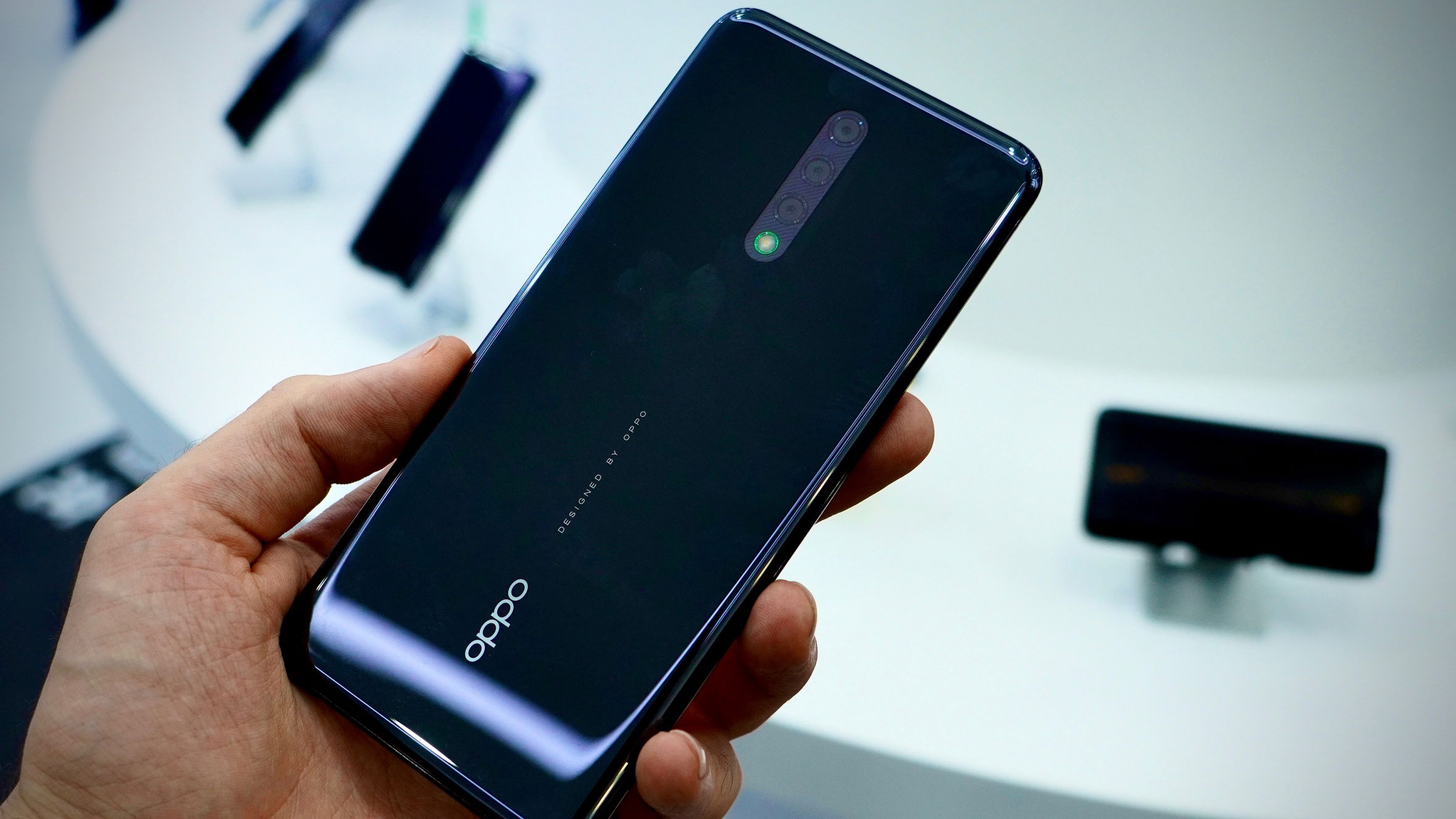
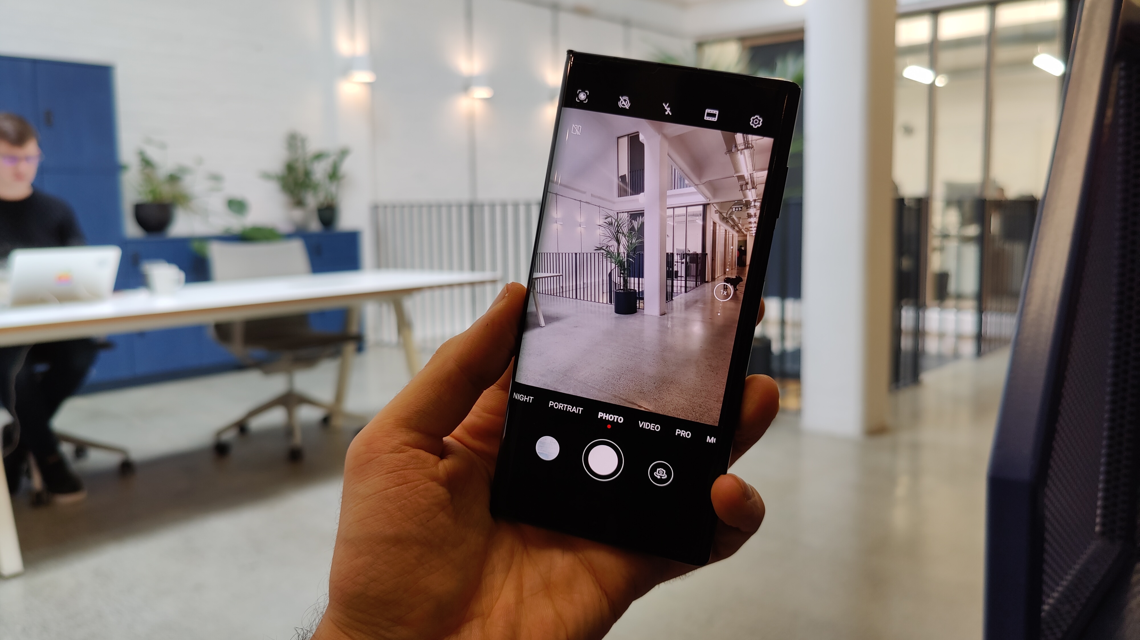
Dinner time, and four days in, I’m comfortable with what the Mate XS can and can’t do. It can take fantastic pictures; the 40MP main camera is lifted from the Huawei Mate 30 Pro and P30 Pro, so that’s little wonder.

Combined with its 16MP ultra-wide lens and 8MP telephoto one, it makes for a very good camera phone, as the example images below show.

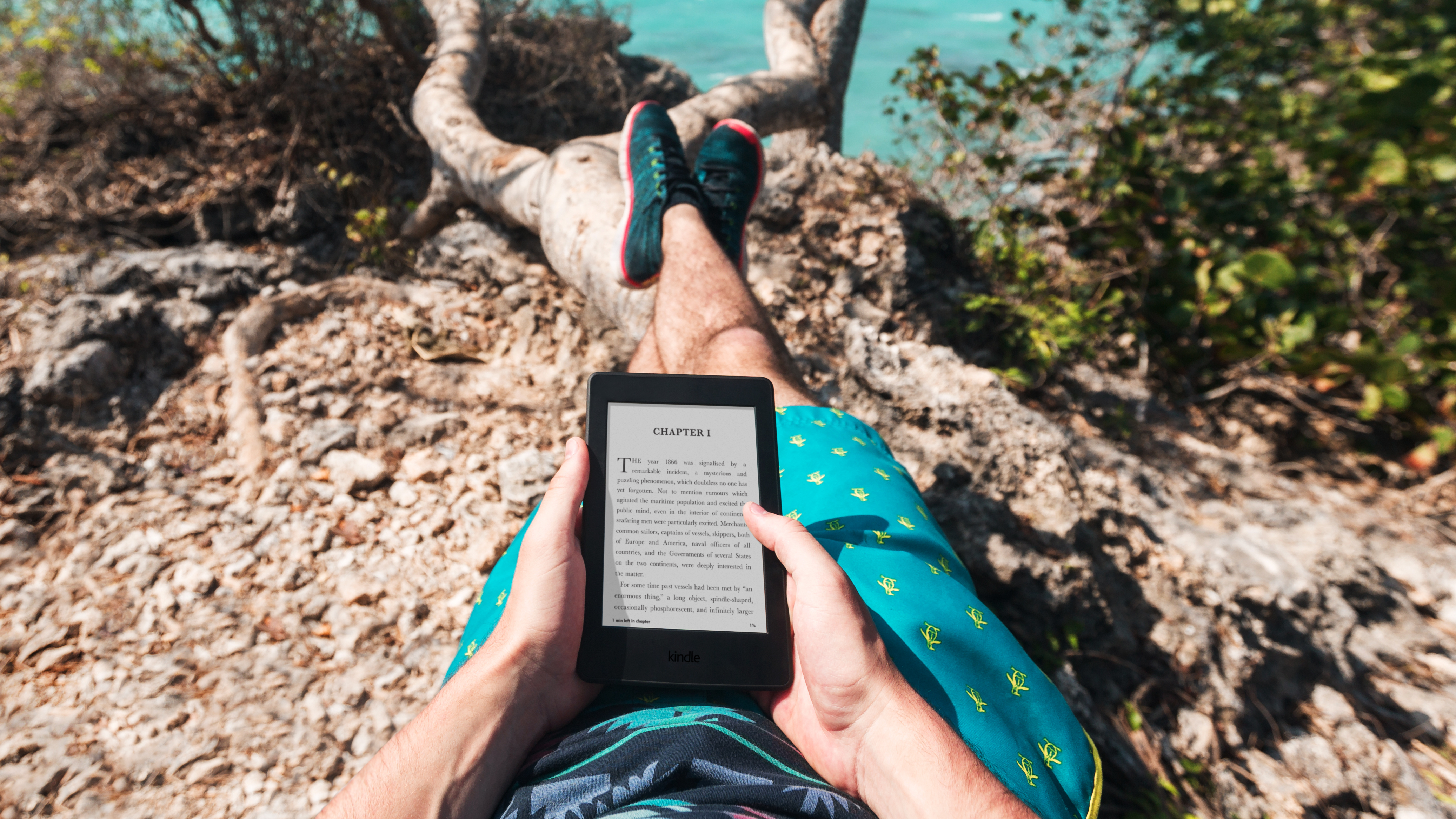
It’s also a beautiful thing reading magazines on the unfolded Huawei Mate XS. The Kindle app, for example, works great, and my Prime membership includes titles like Time magazine - which has never looked better on a phone.

Video is also a real treat on the foldable. While Netflix isn’t officially supported, I found an APK floating around, which works well - albeit with no support for downloads. Amazon Prime Video is fully functional, though, as is BBC iPlayer.

Then there’s what happens when you pull it out in public - no one flinches. As a phone, it’s so incredibly phone-like, people don't think anything of it. Only when I opened it up when showing a friend a picture across the dinner table did people gasp, and curse.

Then there’s the picture-taking experience beyond the camera itself being decent: Huawei’s camera app has been augmented to take advantage of the folding screen, so when you take a picture of friends, they can see themselves and pose.

Even without Google, the Mate XS is a serious people-pleaser.

Day five: battery-tastic 

There are two batteries keeping the Mate XS alive, one in either of its folding halves. They combine to make a total of 4,500mAh, which for a phone or a small tablet, is a decent capacity.

Better yet, the two batteries make 55W charging speeds possible. This means you can power it up by 80% in around half an hour.

A phone that lasts all day, turns into a tablet, and charges very quickly - where’s the catch? Well, from a battery point of view, there isn’t really a catch as such. Sure, there’s no wireless charging here, but I’d take 55W wired speeds over the 25W speeds of the Samsung Galaxy S20 Plus and lose the wireless charging, personally.

Day six: masterful multitasking

Something I’ve seldom done is use split-screen multitasking in the real world.

The only phone I’ve ever fired up the native Android split-screen feature on when out and about, was the extra-long Sony Xperia 1. The two halves end up being weirdly usable, given the phone's height. That was until I started using the Huawei Mate XS.

Unfold the Mate XS, drag in from the left or right side, and a shortcut bar appears. You can populate this with apps, after which you can drag the ones you need into the frame - one to the left side of the screen, one to the right.

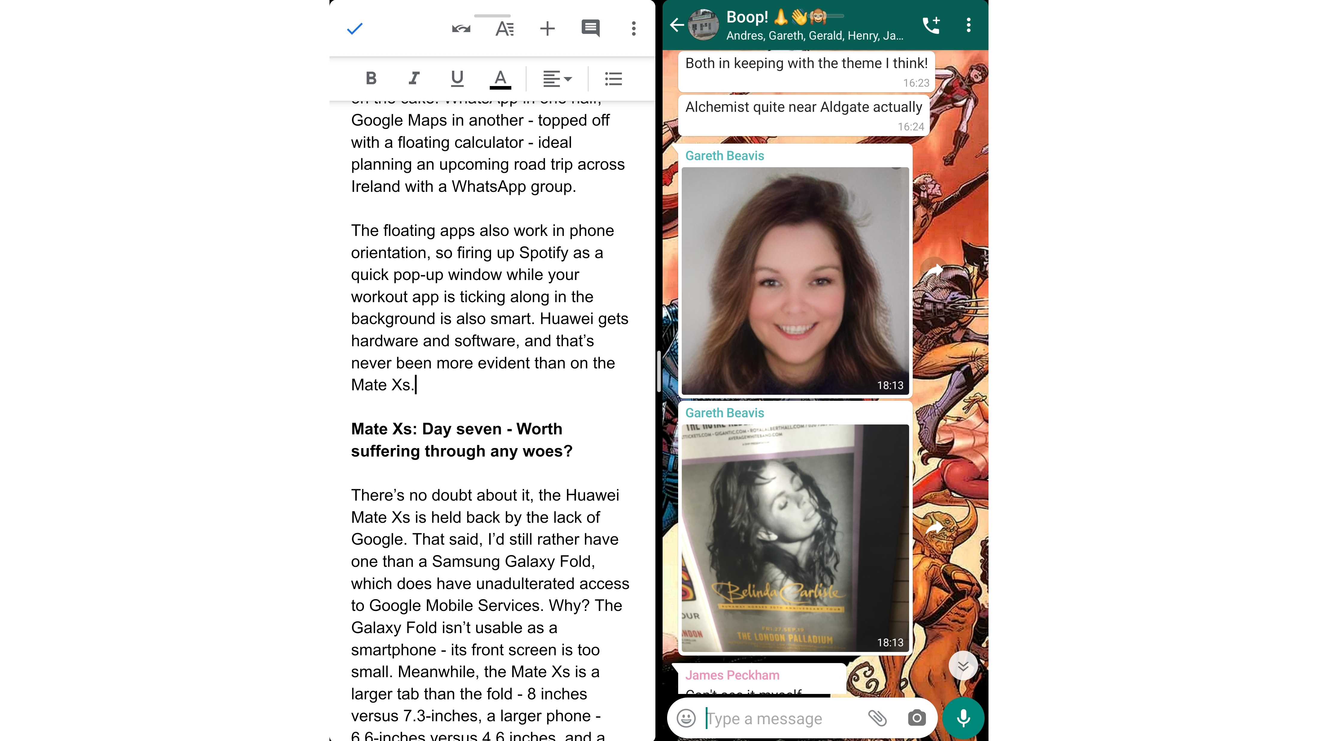
Each half of the phone is the size of a full smartphone in portrait orientation, and being able to drag a floating window across either is just the icing on the cake. WhatsApp in one half, Google Maps in another - topped off with a floating calculator - ideal for planning an upcoming road trip across Ireland with a WhatsApp group in my case.

The floating apps also work in phone mode, which can come in handy for example if you want to fire up Spotify as a quick pop-up window while your workout app is ticking along in the background.

Huawei gets hardware and software, and that’s never been more evident than on the Huawei Mate XS - not once did the phone bug out.

Day seven: worth suffering through any woes?

There’s no doubt about it, the Huawei Mate XS is held back by the lack of Google. That said, I’d still rather have one than a Samsung Galaxy Fold, which does have unadulterated access to Google Mobile Services.

Why? The Galaxy Fold isn’t a good smartphone - in my opinion, its front screen is too small. Meanwhile, the Mate XS is a larger tablet than the fold - 8 inches versus 7.3-inches, a larger phone - 6.6-inches versus 4.6 inches, and a thinner closed device - 11mm versus 15.5mm.

As for the clamshell foldables, the Galaxy Z Flip and Motorola RAZR, they’re compact, sure, but they don’t do much that traditional smartphones can't, so just don’t feel worth the hefty price premium.

That's why Huawei really does need to be applauded for the Mate XS’s hardware. That said, it isn’t without its faults. The hinge elements look like a stylus on either side - people will try to pull them out.

The ever-exposed screen of the XS does scratch more easily than glass too, it's worth noting. Five days of using it without a case, and there’s a slightly frayed horizontal strip from hinge to hinge. This is along the back part of the screen in contact with a surface when the Mate XS is face up.

When the screen’s on, you can’t make it out, but if the light catches it in just the right (or wrong) way when the screen’s off, it looks like a series of micro scratches. Alarming? That depends - personally, I'm impressed it isn't worse.

I expected the phone to fare poorly when faced with real pockets, tables, and that painful drop I put it through. The Huawei Mate XS is definitely more fragile than traditional smartphones, but it’s also much more impressive.

Day ten: finally, I have Google

Ten days in with the Huawei Mate XS, (an eye on XDA Developers forum the whole while), and finally, a new Google Mobile Services hack surfaces for the Mate 30 Pro that I can try.

Google has been blocking every hack that’s cropped up in recent months, so the fact other users had success with this new hack gave me hope.

I tried it, and you know what? It actually worked. Well, it worked with a caveat. Every time I reboot the phone, I lose Google access and need to wipe the phone and start from scratch.

On any other phone, this would have been a deal-breaker. For me, specifically faced with the prospect of using the Mate XS, this is just a powerful incentive to never switch it off.

And so I go, folding away with full Google Mobile Services, sideloaded onto what I believe to be the most advanced smartphone money can buy - with a power bank to hand, just in case.

Final word

Huawei’s mobile business has been rocked, hard. It had to contend with an unprecedented software challenge in 2019, shortly after establishing itself as the global number two smartphone seller in 2018, knocking Apple down a spot on the podium. That’s a fall from grace.

But the Huawei Mate XS lives in a bit of a bubble - the bubble of unfolding phones that turn into small folding tablets. The mere fact that it’s the best phone in that bubble is a testament to why you should still be paying attention to Huawei, even with all the drama.

Posted in Uncategorised

Huawei P40 Pro: we’ve held the phone early, but we weren’t allowed to see it

The Huawei P40 Pro leaks and rumors have been going wild of late, but what's better than hearsay? Information from the source, and better yet, getting our hands on a P40 Pro ourselves, with one caveat - no peeking. 

After an under wraps session with a Huawei product expert revealed design and camera highlights of the upcoming flagship, we can confirm that Huawei’s upcoming P40-series is set to take on the Samsung Galaxy S20 Ultra and its 100x Space Zoom with gusto. There's a new sensor, and an upgraded periscope camera. 

Design: curves every which way

Since the Huawei P8, the company has been pushing the envelope with its design, colors, materials and finishes. The P40 Pro looks set to be no exception, with the Huawei product expert all but confirming that the phone would play with materials that have not been used on smartphones before. Exactly what those materials are is currently unclear. 

Additionally, we were allowed to touch the unreleased phone. It was out of sight, in a mysterious box shrouded in cloth but we fondled it and it felt curvier than expected.

It was rounded on the sides, suggesting a curved display. Interestingly, it felt the same at the top and bottom of its screen meaning it was almost pebble-like. 

Additionally we can confirm, the Huawei P40 Pro will not feature a headphone jack. There is no tactile speaker grille, and it does have a rectangular camera surround around the back, similar to that of the Galaxy S20. It also feels like glass or ceramic, but we can't confirm that yet.

Upgrades to the camera

In the words of Huawei, the “P series is about photography”.

“Each time we have a new iteration of the P family, we’re taking a technology, and we’re advancing it. The Huawei P30… had a 1/1.7-inch sensor, so what about the P40 Pro? It looks set to have a “market leading sensor technology specifically designed to set new records”. 

As for the zoom, the term ‘Super-Visual’ image system flashed on screen as the product expert dodged questions about optical zoom specifics, though we do know it’s going to come with a new periscope zoom.

Huawei seems to be going in the direction Samsung and Oppo have in recent weeks, not disclosing focal lengths on their 2020 flagship periscope cameras. Instead, they are focusing on results achieved by hybrid zooms - combining optical and digital zoom. 

This may sound like marketing spiel, but the Huawei product expert's anecdote whet our appetites: "an eagle can spot a rabbit at around 3KM away - its eye is designed around resolution and clarity... we’re going to break through into a new generation of zoom capabilities". 

This wasn't confirmed in the briefing, but it seems like the P40 Pro would feature a next evolution Red Yellow Yellow Blue subpixel formation sensor. When quizzed on the subject, the specialist said “all that investment, we wouldn’t want it to go to waste”. 

You won't have to wait too long for the specifics, and information about the P40-series' battery, screen and specs. The phone is set to launch on March 26, but it will be an online-only event as the company has cancelled its scheduled Paris launch due to coronavirus.

Posted in Uncategorised

This phone of the future has no buttons, ports, bezels or visible selfie camera

Let’s get this out of the way - this hands-on is with a prototype smartphone; it won't go on sale, you won't be able to buy it and the new and innovative tech in it hasn't been confirmed for future devices. None of that matters though, because this phone is the future. 

The nameless device showcased at Oppo's innovation day 2019 alongside an AR headset and some lofty promises for 2020 - new wearables and millions of dollars R&D investment - has no buttons, no ports, no visible speakers and most impressively, an under-display selfie camera. 

If you’re not familiar with Oppo, you probably will be soon. The Chinese company has been wildly successful on home turf, and seen wins abroad, dropping one of the first 5G handsets in the UK - the Reno 5G. While it's yet to sell devices in the US, the Oppo brand has been all over TVs across the globe after it snagged the prime sponsorship spot for Wimbledon 2019.

Now, with Huawei in hot water and out of the Western smartphone game, for the time being, Oppo is primed to pounce and is seizing opportunities for headlines with devices like this buttonless, portless, notchless prototype. 

That’s why, despite the fact this future-phone looks kind of like a Reno 2, it’s so much more than anything we’ve seen before. It’s a glimpse into what we can expect from phones in 2020 and 2021, and Oppo is one of the few manufacturers bold enough to share its early wares with press.

Buttons be gone

No physical buttons may sound bonkers, but we've actually seen it before - remember the HTC U12 Plus? That was the first phone to forgo moving, clickable controls on the side of smartphones. Instead, the phone features a raised capacitive, touch-sensitive area that vibrates when pressed. 

Why kill buttons? Because moving parts are vulnerabilities - one more thing to go wrong in a smartphone's melange of components.

HTC didn't quite nail the no-buttons thing, but since then, Huawei got some of it right with Huawei Mate 30 Pro. Despite not launching in the UK or US due to political woes, Huawei's new flagship sports a section that can be double tapped and dragged to change the phone's volume. This works well most of the time, and while there’s still a power button on the right side of the phone, is a step towards a button-free smartphone future.

Oppo's buttonless solution is a mash-up of HTC and Huawei's mechanics. There's a raised power button on the right, but to change volumes, you drag across a touch-sensitive area. Perfect? Not quite, but nevertheless, impressively functional, for a prototype.

Port-free

Apple broke brains when it zapped the headphone jack from the iPhone 7 in 2016, and the missing port is still dividing audiophiles and smartphone users alike almost four years later. That said, it was definitely onto something - just like buttons, ports are weak spots. 

Water damage, an overload of pocket lint, worn-out pins; USB ports, like 3.5mm jacks can fail for many reasons, and a broken port means a phone that probably won’t charge. 

It's worth noting Oppo is also not the first to go portless. Meizu revealed the Meizu Zero portless smartphone at the start of 2019 - however that phone did have sizable bezels, something Oppo has eradicated with its concept.

Why hasn't it been removed from more phones already? In the past, charging wirelessly has been painfully slow, and transferring large files like videos from phone to phone or phone to a computer has required a cabled connection, so cutting the cord hasn’t been feasible. Luckily, Oppo is taking a two-pronged approach to de-porting with its prototype. 

The first prong is speeding up wireless charging, and this prototype powers up with wireless speeds of 30W. Putting it into context, the iPhone 11 ships with a 5W wired charger, while the iPhone 11 Pro’s is a fair bit faster at 18W. Either way, both are slower than this wireless prototype.

Other phones wired charging speeds aren’t far off the 30W wireless speeds of Oppo’s prototype; the OnePlus 7T Pro charges at 30W, the Huawei Mate 30 Pro at 40W and the Note 10 Plus at 45W. In fact, the fastest wired charging phone around is the Oppo Reno Ace which isn’t even launching in the west; this climbs up to 65W charging for a full tank in around 30 minutes.

The other prong is Oppo’s take on AirDrop. We’ve seen Android manufacturers do this with some success - Huawei Share is an excellent example and works across the MateBook laptop line as well as its smartphones. That said, Oppo’s WiFi file sharing is being created as part of a combined effort with Xiaomi, Vivo, and Realme to create a new standard across Android phones - File Transfer.

This won’t be as fast as USB-C, but will enable wireless transfers at around 20Mbps - fast enough for photos and small to medium-sized videos.

Now you see me; the almost invisible selfie camera

Selfie cameras have turned into design problems for smartphone makers. They were fine when 5mm bezels were the norm, squishing in above the display, but since the edge-to-edge craze took hold, phones like the Pixel 3 XL were pretty much ruined from a design point of view by really gross, giant notches. 

Workarounds have been hole punches and water droplet notches, sliding components and pop-up cameras, but nothing has solved the problem: how can we make the selfie camera invisible without the need for moving parts? 

First up, Oppo has put the camera behind an OLED display. OLEDs don’t light up when displaying blacks, so when the screen in front of the camera isn’t fired up, there’s no interfering light. 

Next, the screen pixels covering the camera are physically larger than those of the rest of the display. This extra size lets enough light in for the camera to turn into an image.

If the screen’s black, the selfie camera cutout is totally invisible, and it’s virtually impossible to make out when there’s a dark wallpaper. Fire up some white or light colors, however, and it looks like a slightly color-shifted portion of the display.

We took a selfie using the phone and can confirm, it works just fine, though we weren’t able to take the image off of the phone for closer inspection. 

Oppo wasn’t willing to divulge much more when it came to the specifics but did confirm that the screen portion above the camera doesn’t have to be square, it could be a circle to make it even more inconspicuous. 

Additionally, while this example is already impressive, the aim is to make it totally invisible and in turn, Oppo doesn’t consider the tech to be ready for market until it is. 

Speaking of totally invisible, it’s also worth noting that this nifty prototype also features a Huawei P30 Pro-esque behind-the-screen speaker that uses screen vibration to amplify sound, so you won’t see any visible speaker grilles or holes dotted around the device. 

However, we first saw this speaker technology back in February 2018 when we got our hands on the Vivo Apex Concept.

And as for the SIM card, it’s a simple eSIM, a la iPad Pro 2018 and Apple Watch Series 5

When can we expect it?

As mentioned, this prototype isn’t going to be launched, but its key features will likely be trickled across Oppo devices throughout the next couple of years. 

The first will likely be the 30W wireless charging - we’ve seen 27W charging on the Mate 30 Pro, so it’s not too much of a stretch to push that up to 30W in 2020, potentially in-line with Oppo’s MWC 2020 announcement, when it’s expected to be launching the Find X2.

The next most likely thing to feature would be button-free design. That said, ditching buttons seems like a bit of an unnecessary evolution at this stage, to us at least. 

The same can be said for removing the USB-C port to make for a totally port-free experience. Necessary or not though, both of these features are clearly oven-ready if this prototype is anything to go by, so are likely deliverable in 2020.

The biggest win for Oppo will be the under-display camera if it’s first to market with one. That said, this also looks set to be the biggest challenge, given the fact that Oppo is intent on making it totally invisible - and it definitely isn’t there yet. 

While we’re hoping to get this feature on devices shipping in 2020, therefore, there’s every chance it won’t drop until 2021. 

However, the way is already paved for the crystal goblet of smartphone design - a front-to-back, uninterrupted, truly all-screen device with no cameras in sight despite full picture-taking functionality - we live in hope.

Posted in Uncategorised

Your next Intel laptop could be 5G-ready thanks to MediaTek

If you’ve heard of MediaTek, it’s probably been in relation to a midrange smartphone like the Motorola One Maco or Oppo Reno Z; but this Taiwanese chip-maker is everywhere; or more specifically, everywhere there’s an Amazon Echo device… so, basically, everywhere. 

Not content with infiltrating homes around the world, MediaTek now has its sights set on 5G laptops and flagship 5G smartphones as 2019 draws to a close.

Kicking off with laptops and MediaTek is poised to hit the PC market, having announced a partnership with Intel. MediaTek will be offering up its 5G modems to Intel, and in turn, laptop makers, with the fruits of the partnership expected to hit the market around 2021. 

This isn’t the first time we’ve seen computers loaded up with cellular connectivity - Qualcomm’s chips connected devices like the HP Envy X2 back in 2018, for example. 

After reviewing that generation of Windows 10 on Snapdragon devices, however, it was clear that connectivity came at the cost of performance. 

Time to get excited?

Why MediaTek’s partnership is different - and in turn, exciting, is because, by just supplying the 5G modem and letting Intel get on with making its tried and tested processors, there could be less margin for error. 

This could mean full-fat Windows and blisteringly fast data-speeds wherever you have 5G signal - so long tethering and WiFi hunting, as well as latency-free on-the-go online gaming.

Dell and HP are expected to be amongst the first to make laptops packing Intel chips with MediaTek modems, so watch this space.

5G smartphones

Smartphones are getting the 5G treatment too, with MediaTek’s new 5G chipset, the Dimensity 1000 also announced. This could herald a wave of lower-cost 5G flagships, if the company’s value-centric history is anything to go by.

What’s cool about this 5G chipset is that it supports 5G dual-carrier aggregation; in English, that means it can grab two 5G networks and pool their speeds together, enabling downloads of up to 4.7Gbps. That means a 100GB 4K movie could download in just over 21 seconds! 

With its 7nm architecture, MediaTek is claiming that the Dimensity 1000 delivers greater power efficiency than other 5G SoC, as well as support for 80MP camera sensors and AI image processing too. It’s also the world’s first chip to pack an Arm Mali-G77 GPU, so is expected to deliver flagship-grade gaming on displays with refresh rates of up to 120Hz.

Luckily, we don’t have to wait until 2021 to get our Dimensity on, with 5G phones powered by MediaTek’s flagship processor expected to launch in Q1 2020. While we don’t know which smartphones will be getting the Dimensity 1000, current MediaTek partners include Motorola, Oppo and Sony, so our best guess lies with them. 

Posted in Uncategorised

Best Adidas backpacks: 5 great options to consider

Adidas has managed to straddle the worlds of sports and fashion masterfully, creating clothes and accessories that are on-trend and incredibly functional - precisely the qualities you want from the best college backpack.

Whether you’re after a bold Adidas logo on your next backpack, or a simpler, cleaner look with three stripes or a small crest, there are plenty of options available.

Compared to Nike alternatives, Adidas backpacks tend to include less padding on the inside, so might not be as good at keeping your tech safeguarded. That said, they are generally a bit more affordable, with the entry-level option costing less than £20/$25/AU$35, despite being as much a fashion statement as a means of transporting your stuff. 

Adidas also clearly places a focus on comfort, with padded shoulder straps, and the capacities inside are ample. The Creator backpack offers over 40 liters of space inside, with most Nike backpacks capping out at 25-35 liters.

As for the type of backpacks we’ve selected, for a back to school bag we’d recommend staying away from anything leather, and we’ve also kept the price below £70/$80 (around AU$120), as well as opting for plenty of compartments.

Additionally, if you suffer from sweaty-back-syndrome, as most people do, a bit of breathing space and padding on the back of the backpack should help and in its higher-end bags, that’s precisely what Adidas offers. 

We’ve ultimately picked five of the best Adidas backpacks for students across a range of prices, covering multiple styles, so there should be something suitable.

These are products that we haven't had in our test labs, but based on our experts' opinion and knowledge of the most reputable brands around, we think these are worth looking at.

Our selections, ranked from cheapest to most expensive, take into account online reviews, brand reputation, product capability, and unique features, to help you pick through the maze of choices available to you.

Divider

The Adidas Linear Classic Daily is the epitome of cheap and cheerful, despite the fact that it still delivers a stylish aesthetic with prominent Adidas branding.

Being the smallest backpack on our list, this definitely won’t work for power users who need maximum space for all their tech, kit, and books. Younger students in particular though will find the Linear Classic Daily to be an excellent choice. 

Available in six color options, including pink, red, blue and black, you can match it with your personal style, and the main zip also has a white accent, adding a distinct design element.

With a front pocket, you can keep stationery or other smaller items to hand, and while there’s no designated laptop compartment, it’s perfect for books and sports kit.

Padded, adjustable shoulder straps mean the Linear Classic Daily is comfortable to wear, and when you need to take it off your back, the handle at the top of the bag means you can hold it in one hand with ease.

Divider

If you want a backpack with racing stripes, a bit more space inside and a padded laptop component, the 3-Stripes Power Backpack is an excellent balance of affordability and versatility.

It looks excellent, playing vertical lines off against a two-tone backdrop. You can pick it up in some unique colors, including a reverse Kill Bill/Bruce Lee style yellow on the black scheme, along with four different tones of blue, black, or an off-white.

The TPE coated base is durable and water-resistant, so you needn’t worry about resting the bag on a wet locker room floor, and it features a padded laptop sleeve, one central zip section, and a front zip pocket as well.

The side mesh slip-in pockets provide space for bottle storage, while the top carry handle means it can be easily shifted off the shoulder on a full train carriage and carried in one hand.

Meanwhile, adjustable side compression straps mean you can shrink it down when it’s empty, so things don’t shake about inside too much, and adjustable ergonomic air mesh shoulder straps deliver breathable comfort.

Divider

Mature, sophisticated, clean - if this sums up your desired back to school vibe, then the Premium Essentials Modern Backpack from Adidas is for you. With a two-tone/textured look, it’s stylish without being too busy, and the small but prominent Adidas crest on its front pops nicely.

The Premium Essentials Modern backpack is only available in black, though the textured base is a dark grey, which plays well against the upper portion’s inkiness. 

It features two side pockets, an outer zip laptop compartment that can take up to a 15-inch laptop, and there’s a front zip pocket too for smaller bits like keys and pens.

Inside, there are also open compartments for pens, USB cables, and other small items, and there are adjustable compression straps either side too. The backpack also includes a chest strap to secure it in place for long bouts of walking.

Divider

With pockets and compartments for days, the Adidas Top Loader gives you space to stow your kit and stay organized 24/7, whether you’re exercising at sunrise or dancing in the moonlight (and inexplicably want to do that with a backpack on to make it that much trickier).

This tall, smart backpack’s look is tailored to compliment whatever you’re wearing, with its black body, vertical strap on the front, elongating it, and slip-in side pockets, as well as a convenient handle for one-handed carrying.

A contemporary take on the classic backpack, the drawcord at the top keeps everything inside in place when you want to clasp it closed, and when you want your kit locked tight, you can double that up with a zip too.

The laptop portion isn’t padded, but there’s a small tablet sleeve as well, so if you have both they can be neatly stowed away. By contrast, the shoulder straps are padded, and there’s a chest strap/buckle too to keep everything snug.

Divider

Whether you’re creating magic in the classroom, within a video editing suite or on the field, the Creator 365 is one of the most voluminous backpacks we’ve come across, able to take almost 45 liters of stuff, and sporting a separate slot for your laptop and your sports shoes.

The shoulder straps are engineered to take the heavy weight that comes with plenty of space, whether it’s school books, tech, sports kit, or all the aforementioned, and the chest strap will help with posture too.

The Creator 365 also includes a front zip pocket for quick access, an internal slip pocket for a tablet, and side compression straps, so when it isn’t full, it can be compacted for convenience. The bag also has laser-cut ventilation holes dotted around it as well as an air mesh back panel so that it can breathe from the front to the back.

Posted in Uncategorised

This is Huawei’s new operating system, ready to switch from Android if necessary

HarmonyOS, Huawei’s new cross-device operating system, has been announced by its CEO, Richard Yu at HDC 2019, the company's Developer Conference in Dongguan, China. 

Clearly a thinly veiled response to political events over the last year, the message is clear - if Huawei needs to ditch Android, down the line, it can.

For the time being though, this is a smart device operating system leading the charge alongside other unified operating systems such as Google's Fuscia. HarmonyOS is a platform designed for a variety of devices, and is currently aimed at IoT devices such as smart displays or smart home equipment.

Given the political situation between the US and China and the impact it’s had on Huawei’s access to Android over the last year, it’s little wonder that Richard Yu presented a defiant, confident stance. 

At the same time, Yu refrained from committing to any switches from Android just yet.

Huawei claims that with the rise of the IoT device, a more efficient operating system is needed. With these IoT devices packing less memory and storage than smartphones, they need significantly more streamlined code, and for 100 lines of Android code, you could just have one line of HarmonyOS code. Despite this, HarmonyOS is still able to deliver powerful functionality across devices.

By taking a 'single kernel across devices approach', Huawei also aims to create a shared ecosystem, break through silos and in turn save developers time. One app can be deployed across a car head unit, smartwatch, fitness tracker and speaker, working perfectly. 

Remember Windows Phone?

We’ve seen something similar before, most notably on Windows Phone, which had a shared Kernel with Windows 10. While that wasn’t a hit, Huawei’s could have a silver bullet in its gun - Android compatibility.

HarmonyOS will start life as a TV OS - Huawei Vision, with Richard Yu confirming that it would be featuring on an Honor announcement on day two of the developer conference - likely Honor TV. 

This will create opportunities for seamless casting and fluid across devices, so a user could be on a video call on their phone, cast it to a TV in the kitchen, then continue it in the living room. After that, they could take a phone call, moving from room to room, with the call following them around jumping from one smart speaker to another.

HarmonyOS will also feature on watches, speakers and car head units down the line, but isn't limited to these device categories. What’s more, it’s open-source, with Huawei releasing promises for plenty of developer support down the line.

HarmonyOS will also be an open-source platform, so developers will be able to provide apps for the platform and other manufacturers of smartphones may even choose to use the operating system.

As for smartphones getting Harmony OS, Yu was clear Huawei’s current stance: "When can we put it on our smartphones? We can do it any time, but for the Google partnership, and efficiency, the priority will be for Google Android OS ... If we cannot use it in the future, we can switch from Android’

He clarified that the switch would be “quick and easy”, putting forward fighting words while clearly safeguarding his company’s partnership with Google, for the time being at least.

Posted in Uncategorised

What is Amazon Kindle Unlimited?

Remember libraries - those big buildings filled with books? If you’re anything like us, you haven’t been in one since university. That said, digital libraries are very much alive, with services like Rakuten Overdrive, Borrowbox or RB Digital renting out eBooks to online library members across the US and UK. 

If you want more flexibility with your renting than a service tied to a national library, and want to read borrowed books on your Kindle, or the excellent Kindle App, Amazon’s answer is called Kindle Unlimited. 

With over a million ebooks to choose from, accessible across Kindles, smartphones, tablets and computers, it’s a great way for bookworms to get access to loads of literature. The service also offers up some audiobooks too, with the monthly subscription fee giving you scope to store 10 offline titles at any given time. 

Unlike libraries, there’s no ‘due by’ date, so no late fees, just leisurely reading until you’re ready to swap out your downloaded titles for more; think of it as the Netflix we’d want our kids to be hooked on. Also unlike libraries, however, there is a subscription fee to be paid. Read on to find out if it's worth your money.

What devices are supported?

Amazon’s Kindle Unlimited service works directly within the Kindle app, which can be downloaded to pretty much any device with an internet connection. The big players include iOS and Android phones and tablets, Fire tablets and Windows or Mac devices, all through their respective stores. 

Man reading on Kindle

Naturally, Kindle Unlimited books can also be read on Kindles - Amazon’s excellent eReaders, which range from affordable budget eInk displays to premium backlit slabs like the Kindle Oasis. That said, other manufacturer’s eReaders, such as Kobo Clara or Forma won’t support the service. 

Alternatively, if you want access to your books at work or at a friend’s computer, you can also log into your Kindle account and fire up your Unlimited library through a web browser like Chrome, Edge, FireFox or Safari. Our preferred usage? Discovering books using the web browser, and reading them on-the-go.

How much does Kindle Unlimited cost?

Kindle Unlimited costs $9.99/£7.99 per month, which equates to $119.88/£95.88 a year, so depending on how many books and magazines you buy, it could be a great way to streamline your costs, provided your chosen titles are available on the service.

You can sign up for a trial which should give you a flavor as to how much of the content you want is available.

How many Kindle Unlimited titles can I rent at once?

You can rent ten titles at any given time with your Kindle Unlimited subscription. This covers books and magazines, so you can mix and match until your library is full. If your library is at capacity, when you come to rent an 11th title, the service prompts you to either buy it or remove another Kindle Unlimited title from your account.

So it's just books?

Kindle Unlimited definitely isn’t just a book service, with glossy magazines and audiobooks available to download too. Certain magazines can be rented as standalone issues, while others can be subscribed to and delivered to your Kindle device or app as new issues are released.

Many titles like National Geographic are optimised for the display they’re being viewed on, reflowing the text to display perfectly, and resizing images. This means whether you’re reading on a long smartphone or a wide tablet, the experience should be easy on the eye. Others, however, don’t, so will leave you having to deal with a fair bit of pinching and zooming if on a smaller display. 

Audiobooks are a bit harder to pin down than magazines and work with Kindle Unlimited in two ways. The reliable way is through WhisperSync, with Audible downloads that you’ve purchased syncing with Kindle Unlimited books. This means that you can pick up where you left off when you’re juggling a single book across eBook and audiobook formats.

The service also includes over 2,000 free Audible audiobooks, which can be listened to through the Kindle app or the Audible app according to the website, apparently. That said, in our experience, the service constantly suggested we buy the audiobooks included with the Unlimited package, and we weren’t actually able to make a single ‘Audible narration included’ book playback for free.

What happens to my old Kindle books?

If you’re worried about messing up your library with loads of Kindle Unlimited books, don’t be. All your old books remain in-tact and are just supplemented by your rented books and magazines until either you ‘return them’, or cancel your Unlimited account, which can be done at any time.

What other alternative rental services are available?

If you like the idea of Amazon’s Kindle Unlimited, but want to shop around, then the main competition comes from Scribd. Offering a one-month free trial, Scribd costs $8.99 (about £7.25) per month, and even gives you a free access to Blinkist, Pocket and Mubi at no extra cost, so long as your Scribd subscription is active. The main drawback of Scribd is that it isn’t available on Kindles.

If however, you plan on reading content on your phone or tablet primarily, it’s a great alternative with easy to find audiobooks (that work). One point to note, unlike Kindle, which is a global service with great localisation, Scribd is a US-centric offering, so magazines, in particular, are the US versions.

The best thing about Kindle Unlimited?

While the audiobook offering isn’t perfect, one thing the Kindle Unlimited experience does better than the rest is display eBooks. It offers extensive customisations to the look and feel of your eBook, right through to a feature called Word Runner, which helps wannabe speed readers whizz through titles by displaying single words at a time at a set pace. 

With all the services mentioned offering free trials, and Kindle Unlimited giving you a 3-month grace period to figure out if the service is right for you, if you’re addicted to reading and have an Amazon account, it’s definitely worth checking out. 

Posted in Uncategorised

This is how 5G will take mobile gaming to the next level

If you’re not sure what 5G is, in a nutshell, it’s the next evolution of mobile internet. 

With download speeds that beat most home broadband transfer rates, and 4G speeds by around ten times, speed is definitely the name of the game when it comes to 5G connectivity.

Faster mobile internet is only one of the benefits of 5G, though. It will also result in less congested networks.

If everyone is downloading a web page over 5G, it’ll take less time than it would over 4G. That means that one web page download clogs up the network bandwidth for less time (because it downloads faster) – and that means less congestion. 

In addition, 5G was built with more ‘lanes’ than 4G, so can handle peak hour data usage that little bit better, so users should be able to enjoy a more consistent service. 

This will also lighten the load placed on 4G networks as fewer users will be downloading and uploading on 4G, given the fact some will be on 5G. This ultimately means even non-5G users will benefit from it – so that Candy Crush commute home will leave you waiting even less, whatever your network.

Image credit: Sony

The obvious benefits for mobile gaming

Given what we know about 5G so far, there are some very obvious ways it will benefit mobile gamers.

For starters, game downloads will be quicker. 

With games like Injustice 2 and Valkyrie Profile clocking in at over 1GB, most gamers today will likely wait until they’re connected to a Wi-Fi network before downloading them. This is primarily to save data, but another factor is that over 4G, the download takes longer, and would wreak havoc on your phone’s battery.

5G looks set to increase the size of data plans too. Take EE for example. It currently offers 5G with two data packages – 30GB per month, or 60GB per month. The 4G packages meanwhile, range from 250MB through to 50GB per month. 

With 5G resulting in more data and faster downloads, a 5G gamer dropping 1GB and a few seconds of time spent downloading, shouldn’t leave their data plan or battery breaking a sweat. 

Many mobile games today also require an in-game internet connection too. Tracking your score, fleecing you for gems and other in-app purchases, or logging you into a battle royale arena to compete against other mobile warriors Fortnite-style – all these require a connection, and have historically resulted in long wait times. 

In a nutshell, the main, obvious benefit of 5G and more speed can be summed up in three words: no more waiting.

Image credit: Shutterstock

Latency part one: multiplayer mayhem

Lower latency is a less obvious benefit of higher speed mobile internet, but its implications are game-changing.

Latency is the time between an action, and that action being registered. So, when you write with ink, the latency would be the time between the ink leaving the pen and marking the paper. When it comes to online gaming, latency is the speed with which a command is registered and actioned on your screen. The lower the latency, the better. 

5G will mean incredibly low latency gaming, which will be handy when multi-player blasting, especially as mobile gaming tournaments and eSports continue to scale new heights of popularity, and a focus on high-performance connectivity becomes a differentiator between champions and runners up.

Latency part two: the Netflix of gaming

If you think back to the rise of 4G, it coincided with Netflix hitting stratospheric levels of adoption – and that’s no coincidence. Wireless watching gained popularity when great quality content became ‘streamable’ over fast mobile internet speeds with 4G.

What’s that got to do with gaming and 5G? Streaming games take up more bandwidth, but 5G speeds are fast enough to support it.

There are two ways of streaming games. The first involves streaming from one device, whether it’s a console or a PC, to another. The brunt of the processing is undertaken by the primary device, which plays the game. The secondary device just receives a video feed and registers controller input commands.

Currently, PS4 Remote Play and Steam Link are available for mobile and let you stream from your console or PC to your Android or iOS device with ease, provided your connection can hack it.

The second way to stream games is more exciting when it comes to 5G. Games are run on remote servers, and streamed to your screen just like Netflix. Subscription services like this are available today – Nvidia’s Geforce Now, Sony’s PS Now or the upcoming Google Stadia for example, but all require fast, home broadband to play back smoothly. 

The Google Stadia controller (Image credit: TechRadar)

What 5G will do is take these services out of the home, and into… well, anywhere there’s a 5G signal. Just think – console-quality games, streamed directly to your phone’s 2K or 4K screen at full resolution. 

Hook up a Bluetooth controller, and a 5G connection will enable you’re commands to reach the server and relay back to your display in milliseconds. While this might not be good enough for some professional competitive eSport gamers, it should suffice for the vast majority.

There are other benefits to streaming games too – your smartphone doesn’t need particularly powerful internals as it won’t be processing a bunch of 3D objects. This also means it won’t get as hot, and might not run out of battery as quickly as were you playing a game it was powering.

In addition, streaming games would remove the need for powerful hardware altogether, democratizing console-grade gaming. Providing it has 5G, your budget phone in 2020 could play the same quality games a flagship could.

Image credit: Shutterstock

That's not all

Mobiles aren’t the only on-the-go gaming gadgets set to benefit from 5G. Laptop gamers should be reeling at the prospect of faster mobile internet. Online multiplayer games tethered to your phone’s 5G connection will deliver imperceptible levels of latency, so wherever you are, you can crack out your gaming laptop and blow up things with your friends.

A subscription model, made possible by streaming gaming services could also save gamers money when compared to buying a library of games – something the soon-to-be-launched Apple Arcade could do. 

Meanwhile, 5G would also enable streaming virtual reality movies and games, which have higher bandwidth requirements. This is because two images need to be streamed for VR, one to the left eye and one to the right eye, and both of these need to be high-resolution to deliver high-quality experiences.

Mobile gaming hardware is also set to reflect 5G’s advancements. We’ve already seen the likes of the Asus ROG Phone, Black Shark 2 and Razer Phone 2 refine hardware to suit gamers’ needs, with features like front-firing stereo speakers, left and right triggers and pressure sensitive displays. These all pack flagship internals though, and cost a fair whack. 

In the future, these awesome features can come to phones that don’t need powerful internals so cost a fraction of the price, don’t even need to run Android or iOS, or even be a smartphone. 

5G could create a new breed of handheld gaming consoles – 5G shells that receive console grade games on a monthly subscription basis.

Sound far-fetched? Watch this space; these are just a handful of predictions, but whatever happens, 5G will certainly play a part in the next revolution of mobile gaming. 

5G Uncovered, in association with Samsung, brings you everything you need to know about the next wave of connectivity - not just how fast it's going to be, but in just how many ways it's going to change your life. Our 5G Uncovered hub is carefully curated to show everything there is to know about the next generation of connection.   

Posted in Uncategorised

Android through the ages: the history of Google’s smartphone OS

In the beginning there was Cupcake

2008, when pinch-to-zoom was a right reserved for iPhones and BlackBerrys were still the business, a new kind of smartphone hit the scene: the Android smartphone. 

Starting at version 1.5 for public consumption, Android was launched on the HTC Dream (known as the T-Mobile G1 in the US), a QWERTY keyboard-packing slider phone. Based on a modified version of Linux, Android offered something very different to the iPhone: freedom.

Android 1.5 screen shots

An open source Cupcake

Unlike iOS’s heavily policed, locked-down operating system, Android arrived with the promise of open source everything. Google made access to the Android Market (now called the Google Play Store) freely available, and users could even customize their home screens with widgets, offering in-app functionality from said home screen, no app opening needed.

With Android 1.5, codenamed Cupcake, a new way was born. 

Android 1.6: Donut

Is it an albatross? Is it a jumbo jet? No! It’s the Dell Streak!

Version 1.6 of Android, Doughnut was announced in 2009, and it’s the update we have to blame for today’s giant phones that don’t quite fit in normal-sized pockets.

While Android tablets hadn’t quite taken off by this point, Donut was a step ahead, laying the foundations for the ‘phablet’, and introducing support for more screen sizes than Cupcake.

Big screens ahoy!

The aforementioned 5-inch Dell Streak, for example, despite being small by today’s standards, was a veritable beast when it was launched, and it owed its big screen to advances Donut introduced. 

Other innovative features introduced in Android 1.6 included a text-to-speech engine, universal search and a more complete battery usage screen, so you knew which apps were draining your smartphone dry.

Android 2.0: Eclair

Android 2.0 Eclair

Who knew there was ever a time when you couldn’t have multiple Google accounts on your Android smartphone? We did! 

Eclair, named for the choux pastry French patisserie staple, remedied account limitations and more.

Multi-touch me

But multiple accounts wasn’t the highlight feature of Android 2.0 – oh no. Eclair finally introduced multi-touch to smartphones that weren’t made by Apple (although that created  something of a hoo-ha in itself.)

Take a picture, open it up, pinch to zoom… Android and iOS were in a two-horse race now, and Android was catching up.

Eclair also introduced Google Maps navigation, as well as additional camera modes, live wallpapers and Bluetooth 2.1 support.

Android 2.2: Froyo

Froyo, aka frozen yoghurt, is confectionary number four, and Android version 2.2. Loaded up on classic phones like the Samsung Galaxy S2 and the HTC Incredible S, it marked the point at which Android hardware started to feel more premium, finally doing justice to the OS inside – from Super AMOLED screens bettering the LCDs of iPhones through to excellent industrial design from the likes of HTC.

Get some Froyo on that hotspot

Version 2.2 also introduced a feature that could make Android phones more attractive than iPhones for the everyday user – Froyo’s most practical highlight was most definitely mobile Wi-Fi hotspotting.

While Windows phones had Bluetooth and USB hotspot tools before, the idea of using high-speed Wi-Fi tethering to share your phone’s (then blazingly fast) 3G data with a laptop or even another smartphone was vindication for Android fans the world over.

Apple would take a full year to get the feature onto iPhones, with many carriers still blocking iPhone tethering for some time to come. 

Android 2.3: Gingerbread

Android 2.3 gingerbread

Android Gingerbread didn’t get a new look or feel compared to Froyo, but it did get a host of new features, including support for new sensors, including NFC. Other highlights included internet calling and a new download manager – but none of those were our highlights.

Copy, paste, catch up with Apple

Oh no – our highlight was the seemingly rudimentary and long-overdue copy and paste feature that was giving iPhones the text-editing edge over Androids for over a year: single word selection. 

Before Gingerbread, Android copying was clumsy, given the fact that only entire text boxes could be selected. 2010 saw Google closing the gap, with a long press over a word selecting just that word, and displaying a pop-up menu that included copy and paste options, just like we have on Android phones today. 

Android 3.0: Honeycomb

Remember the Motorola Xoom? No, not the Microsoft Zune – we’re talking about the Motorola tablet that introduced Google’s tablet version of Android, codenamed Honeycomb.

The most striking difference between it and any version of Android we'd seen before was the interface. Introducing ‘Holographic’ UI elements, Google went a bit Tron here – all illuminated lines, gradient halo highlights around objects – and while it didn’t look timeless, it did look cool.

On-screen navigation, the shape of things to come...

Android phones today seldom sport hardware navigation buttons; that’s to say, the back, home and recent apps buttons are in a navigation bar at the bottom of the screen on the biggest phones out now – the Google Pixel 3, Samsung Galaxy S9 and Huawei Mate 20 for example.

Funnily enough, we don’t have a mobile OS to thank for this – it was first introduced in Honeycomb, with the back, home and recent apps buttons displayed in the bottom-left of the home screen.

Android 4.0: Ice Cream Sandwich

Android 4.0 Ice Cream Sandwich

So long physical buttons, hello unified Android typeface!

Ice Cream Sandwich was probably one of the richest updates Android has seen. Available on the Galaxy Nexus and HTC One X, it brought an excellent in-gallery photo editor to the table, as well as a data limiter within the settings. 

The whole look and feel was refined, in line with Honeycomb’s design direction, and it delivered a much richer experience than Android 2.3..

Swipe to dismiss

In hindsight, probably the most pervasive feature introduced in this version was the swipe to dismiss gesture. 

While it had been used by other smartphone manufacturers before, getting Android users comfortable with this little swipe gesture ensured its rise to ubiquity.

Swipe to dismiss interaction has since, for example, shaped email and text message handling, influenced Windows 10’s touchscreen notification management, and is a fundamental component of everyone’s favorite dating app, Tinder.

Android 4.1: Jelly Bean

Android 4.1 jelly bean

Jelly Bean was a tale of three parts: 4.1, 4.2 and 4.3.

4.1 was all about refinements. It took Ice Cream Sandwich and made it smoother, introduced improved support for multiple languages, and automatically resized widgets to fit your home screen.

Android 4.2 was a further refinement, this time polishing the look and feel, making for an excellent-looking tablet UI, showcased well on the Nexus 10, complete with Miracast wireless display projection support.

The final episode – Return of the Jelly Bean, if you will – was a corker for developers, giving them tools to improve UI smoothness, use the latest version of Bluetooth and restrict profiles on devices with multiple user accounts – handy for parents and businesses alike. 

Expandable notifications

Our Jelly Bean highlight? Dragging down with two fingers for expanded notifications. This feature gave users a peak into the details of their most recent updates. So, if your notification read '3 new tweets', a two-finger drag down would expand the notification and showcase who those tweets were from, with a snippet of the message itself. 

Simple, and still in Android today. 

Android 4.4: KitKat

Android 4.4 Kitkat

Emojis on the Google Keyboard, lower RAM requirements paving the way for budget Android phones, and NFC security being bumped up to help make mobile payments a reality – all this and more was loaded inside the Android 4.4 KitKat update.

'Okay Google, will this ever catch on?'

But it was Google Now becoming a voice assistant that blazed the trail for today’s world of talkative phone assistants and smart speakers.

The always-on microphone and 'OK Google' command were introduced alongside KitKat in October 2013, harnessing the power of Google Search.

It paved the way for Apple's Siri, set to follow in June 2014, and the two-horse mobile OS race was about to splinter into separate smartphone and a voice assistant contests, with Google making the early running.

Android 5.0: Lollipop

Android 5.0 Lollipop

Material Design, Google’s flatter interface that features fewer gradients and a cleaner look than Jelly Bean, debuted on Android 5.0. 

Support for 64-bit architecture was also introduced, helping Android achieve near-parity with desktop operating systems when it came to power potential, as was improved notification handling on lock screens.

Setting the scene for wearables

But the hidden gem within Android Lollipop was support for Bluetooth LE, or low energy. 

This feature meant that wearable technology could finally exist without draining your phone’s battery dry. With lower battery demands, Bluetooth LE also enabled manufacturers to create smartwatches and fitness trackers with low-capacity batteries, small enough to fit inside a device that looked good and which could be worn comfortably. 

Android 6.0: Marshmallow

Android 6.0 Marshmallow

Launching on the Nexus 5X and Nexus 6P, these Marshmallow devices introduced USB-C ports and fingerprint scanners to the Nexus line.

As for the software, app security was tightened up with element-specific permissions prompting users to grant access to apps that needed to use things like their camera, phone etc.

Android 6.0 also supported MicroSD card integration into internal storage - handy for phones with under 16GB storage, though this feature has since been removed.

Doze mode

For a second time in a row, a battery saving feature is our Android highlight.

If you left your Marshmallow phone unplugged and stationary for a period of time with the screen off, apps go into standby and Doze mode is activated

This saved battery power and cemented Android as the operating system to go for if you wanted the battery edge, with Android hardware packing higher capacity batteries than iPhones, and its software optimised to take advantage of them.

Android 7.0: Nougat

Android 7.0 Nougat

Quick app switching by double-tapping the recent apps key, gender and race-specific emojis, separate home and lock screen wallpapers… Android Nougat made things both more functional and more attractive, but it also borrowed something from Samsung.

Split-screen multitasking

Having introduced split-screen multitasking on its Note line, Samsung was ahead of the curve. Google lifted the experience, and made it part of stock Android 7 over a year later, allowing one half of the screen to be used for one app, and the other half for another.

Google did do some cool stuff with the feature – Android 7 offered split-screen handling of two Chrome tabs for example, and even supported dragging and dropping of an image file across tabs. 

Android 8.0: Oreo

Android 8.0 Oreo

Shiny new battery menus and notification dots on app icons – Android Oreo brought with it a slew of refinements to the UI, not to mention better storage management, with a new file browser and more granular storage control within the settings.

Floating videos are cool, right?

But the highlight feature everybody wanted, and never ended up using when it launched, was picture-in-picture, another feature introduced by Samsung and later adopted by Google for stock Android. 

This little floating video window showcases a video in your UI, so you can get on with Twitter scrolling without having to stop watching your favorite show.

While initially it was awkward to activate and, frankly, a bit useless, now it’s reaching fruition, with apps like Netflix, WhatsApp and YouTube having adopted support for it.

Android 9.0: Pie

Android 9.0 Pie

We’re finally all caught up. Google’s 2018/19 build of Android, Android 9.0, aka Pie, is the freshest version shipping on the latest and greatest hardware, including the Pixel 3 and Pixel 3 XL.

Loaded up with notch support, improved battery smarts and a revamped UI, complete with iPhone X-esque navigations, Android Pie is gearing Google smartphones up for their impending all-screen, bezel-free futures.

A side serving of social responsibility 

Digital Wellbeing is a suite of services available in Beta right now as part of the Android P update. Including elements like a dashboard to help you better understand your app usage, it’s all about using your phone a bit less, or at least a bit more mindfully.

Additional tools range from app limiters through to a grayscale mode to give your eyes a break, as well as a wind-down feature, to help you disconnect at the end of a working day. 

With Google having iterated over 14 versions of Android, servicing more than two billion users, it’s a fitting conclusion to the current chapter that the big G has shifted focus to Digital Wellbeing, given the operating system’s vast reach.

Q is for… ?

But what about the shape of things to come? Android 10 will likely drop in the second half of 2019, and we already know it’s coming to the new Essential Phone.

As for its name, the distinct lack of confectionaries beginning with the letter ‘Q’ is keeping everyone guessing. Keep checking in with TechRadar throughout 2019 for the latest updates on Android Q, and to find out more about Pie, read our Android 9.0 overview

  • Brought to you in association with Nokia and Android One, helping you to make more of your smartphone. You can learn more about the new Nokia 7.1 here, and you'll find more great advice on getting the most from your phone here. 
Posted in Uncategorised

How to make mince pies…with a little help from Alexa

If it really is the most wonderful time of the year, we’re pretty sure mince pies have something to do with that. Short, crumbly pastry, a dusting of powdered sugar, the sweet festive spiced hit of fruity gloop breaking through the cracked shell. Ugh - mind passing a napkin? These mince pies are a messy business. 

But if you haven’t baked your own, you haven’t experienced them at their finest. Thankfully, Alexa is on-hand to help. Paired with the new BBC Good Food skill, Amazon devices like the Echo Show can serve up step-by-step recipes at your beck and call. As seasoned mince pie makers though - we’re here to ask and answer the question - is it any good?

“Alexa, show me mince pie recipes”

Alexa: “Okay, for mince pie, here are a few recipes.”

Good start! But what’s on screen? 

1. Unbelievably easy mince pies. 2. Cottage pie. 3. No-fuss shepherd’s pie. 4. Little mince pie cakes. 5. Mince pies (by Paul Hollywood). 6. Chunky mince pie slices. 7. Mince pie baklava. 8. Mince pie martini. 9. Multi mince. 10. Mince pie trees.

Not bad going! Only three out of the top ten recipes involved actual meat, and a good few gave us fun variations on a theme. Recipes are paired with a nice, big, high-res picture as well as the name of the chef behind the - in this case - pie. 

There’s also a star rating, and that dictates the order recipes are displayed in, so even if it did put a cottage pie recipe in at number two, at least it’s a very highly rated cottage pie. Finally, rough cooking time is displayed alongside the star rating.

We only listed the top ten, but our search for mince pies pulled no less than 23 results, with number 22 being a recipe for vegan mince pies. Firstly - that’s pretty niche, well done Alexa. Secondly - no butter or suet? Can’t be… we’re going to have to try these out.

But unable to tell Alexa to open the recipe, we’re forced to use our finger as opposed to our voice.

*Taps vegan mince pies*

Bam - the hi-res picture goes big-screen along with all the recipe information. In the bottom half of the screen are the ingredients which you can scroll through, below which is the method. It’s exactly like a cooking magazine or browsing a recipe in a website - mega intuitive and beautifully displayed.

If all you want is a smart display that showcases recipes in the kitchen therefore - Amazon and the Good Food skill have basically nailed it already. When the screen goes to sleep, it wakes up where it left off and all the ingredients and method are really well laid out and easy to scroll through.

The real challenge is whether the combination of smart screen and Alexa will make for a good voice assistant experience while we bake.

“Alexa, start recipe”

Alexa: “Okay, I’ll read the instructions one step at a time. At any time, you can ask me to move to the next step”

“Heat oven to 180C/160C fan/gas 4. Tip all the mincemeat ingredients into a casserole dish or roasting tray”

TechRadar: “ALEXA STOP”

She gets ahead of herself does our Alexa. 

Despite helpfully giving you some quick tips before she starts, the steps-within-steps are whizzed through pretty quickly, with no pause between.

For this recipe, the voice instructions for “step one” takes around a minute, but covers the entire cooking process of the dried fruit mincemeat mixture, which takes almost an hour.

While the pacing may be a little bit speedy though, voice interaction is excellent. “Stop”, “Go to step one”, “Go back a step”, “Show me the ingredients”, “Read the ingredients” - all these interactions did exactly what we hoped they would which was repeatedly delightful.

This is instantly a marked improvement over Recipedia, the service BBC Good Food is replacing as the default cooking skill on Echo smart displays. When reviewing the Echo Show (2018), despite pulling up some cracking recipes, Recipedia made us hate the world by glitching so very hard when we tried its voice interaction.

The Recipedia app looked good, but voice interaction left a lot to be desired

What’s more, Recipedia would reliably close down the recipe and go to the home screen after the Echo Show was idle for a few minutes, requiring we reopen it and laboriously trudge through its clunky voice interface to get to the step we left it at.

The BBC Good food app, in stark contrast, keeps the recipe exactly where you left it, even after half an hour of screen off time. 

Hmm… this could actually be usable.

So - Alexa mince pies, any good?

*Chomp, chomp*... Yup - TechRadar approved - 8/10.

The BBC Good Food website is one of the UK’s best recipe finders, so it really doesn’t come as a huge surprise. Recipes come from top chefs and magazine submissions, and they’re curated, so priority is given to quality over quantity. When accessing it through a browser, you can read user comments too. These supplement the recipes with top tips and recipe modifications, so there’s also a really rich community element to it too for anyone hopping between smart screen and their smartphone or computer.

All this only compounds what we figured out five minutes into our baking experience - the BBC Good Food service for the Echo Show is a much more polished option than Recipedia was, with recipe quality in line with UI and voice interaction. 

Add to that, localisation for British audiences delivers all the measurements in grams, not cups, and it definitely feels like non-American Echo Show owners are less of an afterthought than they once were.

Better still, talking to Alexa mid-bake was really fun and helpful, especially when handling pastry with floury hands.

As for our little mince pies? They came out tasting great - despite the fact we used the wrong sized baking tray, so ended up making ickle pies. Sure, a couple of times, we were forced to tap the smart screen rather than talk to it, but that quibble aside, it's a serious improvement that ended up in a tasty bake, excellent job BBC Good Food and Amazon, this definitely won’t be the last time we cook with Alexa. 

Posted in Uncategorised

Android Pie Digital Wellbeing Beta: a deep-dive into Google’s new phone feature

Android Pie, or Android 9, the freshest version of Google’s mobile OS has an optional Digital Wellness feature tucked away in the settings. Currently, it’s only in Beta for Pixel devices like the Pixel 2 and Pixel 2 XL, available to anyone running Android Pie who signs up for the early version

The feature looks set to be a talking point throughout 2019. After all, digital wellbeing in general is becoming a much more discussed topic, and that’s no surprise given the fact smartphone adoption is only on the up.

Why digital wellbeing?

We exercise, we watch what we eat, we think twice before walking in front of a moving vehicle. In fact, we don’t do that last one because instincts kick in. 

Over thousands of years, we’ve come to realize, consciously and subconsciously, that doing and not doing certain things improve our physical health and keeps us from damaging our most valuable asset - our self.

By contrast to the the physical, digital technology, revolving around smartphones and encompassing our always-connected relationship with tech, is a relatively recent phenomena.

Today, it’s estimated that roughly 70% of the populations of the US, UK and Australia are smartphone users, with users in the US spending an average of 3 hours 35 minutes per day on their phones.

The rate of smartphone adoption has been so high, it hasn’t given science and national guidelines time to keep up. This means that we’re one giant social experiment, identifying the impact of all this tech in real time, on us, and chances are, any guidelines to follow will be reactions rather than preventative measures.

It isn’t all doom and gloom, we’re better connected than ever before. Smartphones and the internet are helping us stay in touch with loved ones across the globe while ensuring we have incredible access to potentially life saving information.

In the same breath, smartphones are now shaping a generation of teenagers, many of whom are addicted to apps like Snapchat and Instagram. 

Recent research has found links between teen depression, body dysmorphia, suicide and social media use. As for adults, everything from increased anxiety to election rigging and national revolts have been tied to smartphone adoption. 

Two people texting on smartphones

Android Pie's Digital Wellbeing Dashboard explained

Android Pie’s Digital Wellbeing dashboard is currently available to early testers, with the less official option being to sideload the APK if users are running Android 9 on a compatible device. 

Once installed, the feature creates a menu within the settings titled 'Digital Wellbeing'. Open it and you’ll instantly see an Android pie chart illustrating your screen-on time.

This is broken down by application used as a percentage of total use, along with the number of times you have unlocked the screen and the number of notifications your phone has received in a day.

In isolation, this information is just a wake up call - "Basil, you spend 30% of your smartphone time on Tinder". The pie chart itself doesn’t give you any control over your usage, just stats.

As for the options below it - that is where the compulsion control lies.

Ways to disconnect

Below the pie chart, the first set of customization fall under the category Ways to disconnect.

The first of these is the Dashboard, a screen that documents usage of specific apps with a bar chart, giving users options to limit how long specific apps can be open. 

If, for example, you’re addicted to left and right swipes, like I apparently am, and want to minimize the amount of time you spend on Tinder, lock it to 15-minutes. When you have five minutes remaining, you will get a notification to alert you to wrap things up and send that final message of the day.

When your time is up, the app icon will go grey, you won’t be able to open the app and Tinder notifications won’t come through until the timer resets. Unless you go back into your settings and up your allotted time, that is.

Wind Down

Below the Dashboard sub-menu is Wind Down. Similar to Quiet Hours in the latest Windows 10 Creators Update, this set of options is all about helping you chill out from night to morning.

The first thing you can do here is activate Grayscale, making your screen monochromatic between these Wind Down times. 

The reason a black and white screen can help your digital wellbeing is down to how your brain processes color, emitted from the light from light in the display. Colors are like visual roars whereas monochromatic tones are more like whispers.

Wind Down times also activate Do Not Disturb, so notifications are totally silent. In addition, the mode also enables a blue light filter from sunrise to sunset as well, helping normalize melatonin production, which could result in a sounder sleep.

Reduce Interruptions

The final set of customization the Digital Wellbeing feature gives users is granular control over notification management and the Do Not Disturb setting. 

Notification management offers options we’ve had in Android in the past, but it’s now located in the context of Digital Wellbeing - an arguably easier to access location than its old home within the apps settings.

Open it up and your screen is filled with all your apps in a vertical list, complete with toggles to the left to blanket turn on/off notifications for the corresponding app.

Everything gets much more comprehensive when you click through on one of your applications though, revealing an expanded notification control.

The level of notification management over Twitter, for example, one of the most overbearing applications when it comes notifications is as follows:

  • Notifications can be turned on/off for individual accounts
  • Within these accounts, notifications can be toggled for direct messages, emergency alerts, news, followers and contacts, security alerts and more

Not all application notifications are this extensively customizable yet, but serial offenders like Instagram, Facebook and Twitter are..

Better yet, this kind of granular constraint on which notifications vie for your attention doesn’t require a deep dive into the Digital Wellbeing menu. 

If Android Pie notices you swipe a type of notification out of the way repeatedly - for example “Chuck Norris is Live on Instagram” - it will ask you if you want to ignore that specific type of notification going forward. That isn’t to say Instagram notifications will be blocked, only Instagram live alerts.

Do not disturb

The final aspect of the Digital Wellness suite, Do not disturb, will likely the most familiar to most people. Click through and the sub-menu gives users control over what Do Not Disturb does - sound, vibration and notification alerts. 

Here you can also set exceptions to the rule - calls and alarms for example, and you can schedule it on or off.

This scheduling can be fine tuned to set times, during a specific event, or it can even be automated to kick in when you’re driving, engaging with the phone’s location services to detect when you hit the road.

With all these features in tow, Android Pie looks set to be the best OS around for anyone concerned about smartphone addiction or general digital health, at least until iOS 12 drops. 

As promising as all this is though, there’s no word from Google as to whether Digital Wellbeing will be made available for other manufacturers.

Verdict: it’s a start, but is it enough?

Without a doubt, Digital Wellbeing is a step in the right direction, and considering it’s only in Beta right now, it adds some meaningful support for Android users who want to be more conscious of their smartphone habits. 

That said, the feature requires a degree of pro-activity to get any benefits from it. It’s also buried within the settings menu, with no option to add a shortcut to your home screen or access it a more convenient way. 

If Digital Wellbeing comes pre-installed as part of Android in the future, tighter integration with the OS, easier access to it and some proactive hints, tips and tricks for maintaining a healthier relationship with technology could take it to the next level.

That said, there is one striking omission from the Digital Wellbeing dashboard: parental controls. 

Studies on the negative effects smartphone use has specifically highlighted teens are most at risk of social media screen time negatively affecting their mental health.

Having a simple pin lock linked to the Dashboard so kids couldn’t override the time constraints so easily would have instantly made the feature a must have for parents.

What are other manufacturers doing?

Android’s only real competitor, iOS, is hot on Google’s heels with its upcoming iOS 12. Currently also in beta, its wellbeing center is called Screen Time and is also hidden within the settings. 

Similar, but different to Digital Wellbeing on Android, it doesn’t cover notification control or offer monochrome/screen color options - found elsewhere in the settings. 

Neither does it allow you to customize the Downtime, aka, do not disturb period, to the extent Android’s Wellbeing Dashboard does. Despite these differences though, it still manages to be win an important battle that could in turn, win the war - parental controls.

Screen Time’s parental control benefits boil down to one thing - passcode security. iOS, unlike Android supports a locked down system in which the amount of time within an app can only be restricted or unrestricted with a four digit pin. 

This changes the game completely, turning a soft rule that can easily be moved into one that needs to be respected. With increased durations spent on social media linked to greater risk of depressive behavior in teens, limiting screen time with unbreakable rules could be the clincher. My advice to Google - get passcode security in there before Digital Wellbeing is out of Beta.

After all, apps are designed to be addictive - time spent using them is a major metric when app developers sell advertising - so app developers are unlikely to help users curb addictive behavior. 

If any party is in the best position to support healthy smartphone use, it’s the OS maker. OS wellbeing features in Android will likely trickle down to the smartphone manufacturers, Samsung, OnePlus, Huawei for example, and then be built upon. 

In short, the smartphone world is on a precipice - get behind Digital Wellbeing or play catch up. In 2019, the term will go from being a Beta user setting within Android to an important buzz phrase, but unlike buzz phrases of old, Digital Wellbeing is something we should all care about, if we don’t already.

Posted in Uncategorised

Samsung Galaxy S9 Plus vs iPhone X vs Google Pixel 2 XL: portrait mode comparison

It's flagship smartphone camera comparison time at TechRadar. Our test subjects are the Google Pixel 2 XL, Apple’s iPhone X and the Samsung Galaxy S9 Plus, and we're focusing on the portrait modes across all three phones.

What's portrait mode?

Blurring the background of a photo while keeping the foreground tack-sharp used to be a mark of quality reserved for DSLRs and high-end bridge cameras. 

Thanks to today's smart camera phone software, however, shooting in portrait mode means it's easy to achieve relatively convincing background blur, or bokeh, on flagships like the Google Pixel 2 XL, iPhone X and Samsung Galaxy S9 Plus

What's special about these phones is that the portrait mode works on both the front and rear cameras, so we put all three smartphones to the test, in both indoor and outdoor lighting conditions, to find out which is the best at capturing that coveted bokeh effect.

Test conditions and judging

All three phones were set to the default settings within their respective portrait modes. If a beauty filter is applied, so be it. 

The reason we opted not to turn on or off any additional features was to make the test represent how we think most people will use these modes – at their default settings.

As for the judging panel, six TechRadar experts were asked to rank their favorite photos. We judged them not just on the accuracy of the background blur, but on the overall quality of everything from exposure to contrast to saturation. 

We've included the original photos at the bottom of this article, so you can judge all three phones' samples for yourselves.

Now that's all taken care of – let's get on with the tests!

Portrait mode: Outdoor comparison

With all three phone sensors featuring the same 12-megapixel resolution, detail should be comparable across all.

That said, Samsung's Galaxy S9 Plus loses out on the detail front, suggesting from the start that an aggressive beauty filter is applied to shots taken with its rear camera.


The Galaxy S9 Plus picture is also brighter than the other two shots, further flattening the subject and flattering him in the process. While the results aren't accurate, some may prefer Samsung’s stylistic way of tweaking its portraits.

In its favor, the S9 Plus also produces the most accurate background defocus effect of the three phones, with minimal artificial error around the hair and a consistent blur across the whole background.

The iPhone X's picture is higher in contrast than those from the other two phones, picks out a respectable amount of detail in the face, and offers decent background defocus accuracy. Results are nicely saturated, and overall it takes a good shot that proved popular with our panel.

As for the photo from the Google Pixel 2 XL, saturation is somewhere in between that of the Galaxy S9 Plus and iPhone X images, as is contrast, making it the most pleasing of the three. Detail in the face is also strong, with the whole shot coming together very well from a photography point of view. 

While it’s off to a strong start, however, the Pixel 2 XL produced the worst background defocus of the bunch – note the inaccuracies around the hair and upper portions of the background. It’s also worth noting that the Pixel 2 XL takes portrait mode photos with a wider angle of view than the competition.

Despite not producing perfect blur, the Pixel 2 XL still won our judges' hearts, with its portrait mode photo looking more balanced overall. So it takes first place in round one, followed by the iPhone, with the Galaxy S9 Plus trailing behind.

Portrait mode: Outdoor selfie comparison


When taking a selfie, the Samsung Galaxy S9 has the widest angle of view. Consistent with the rear camera in other ways, it produces the brightest shot, and applies the most smoothing to the subject's face.

Meanwhile, the iPhone X selfie showcases higher contrast, perhaps too high in parts of the face, prioritizing accuracy over flattery. What's most impressive about the iPhone shot is the way it appears to grade the background blur intensity on the wall.

While the Pixel 2 XL and Galaxy S9 Plus look like they simply cut out two layers – face and background – the iPhone X's Face ID seems to understand that the portion of the wall directly behind Gareth, our subject, is closer than the far end of the wall.

It's also worth noting that when we were shooting the outdoor selfie the iPhone prompted us to move to less bright conditions, impeding our ability to take a shot at exactly the same time as with the other two smartphones. With neither of the other phones throwing up on-screen warnings at any point during our tests, this could be something for anybody who likes to shoot in bright conditions to bear in mind before picking up an iPhone X.

As for the Google Pixel 2 XL, once again its picture fell in between the extremes of the other two phones' shots in terms of contrast, saturation, exposure and beautification. It captured a good amount of detail while still flattering – Gareth's face looks realistic, and the separation of background and foreground is nice and clean.

This means the Google Pixel 2 XL comes first in round two, making it our outdoor portrait mode king, with the other two phones tieing in second place. But what happens when we move to artificial lighting?

Portrait mode: Indoor lighting comparison

Time to strike a pose for some indoor portraits in artificial lighting. Kicking off with the Galaxy S9 Plus at a distance, the beautification applied here actually looks good. 

It's clearly smoothed things out more than the competition, but detail across the whole picture is strong. The photo also appears less washed-out than the camera's outdoor shots, suggesting that indoors may be where the S9 rear camera's portrait mode thrives.

As for the iPhone, we're not sure what went wrong here – the white balance is totally off, and Gareth's face is also far too highly-contrasted, blowing out the shine on his forehead in a very unflattering way.

Meanwhile, it looks like the Pixel 2 XL can do no wrong. It has produced a shot that clearly separates the foreground and background, and manages to retain detail in the face despite shooting at the widest angle of the three.

And so, in this round, the Pixel 2 XL once again takes top spot, with the Galaxy S9 Plus ranking second and the iPhone third.

Portrait mode: Indoor selfie comparison

For our final round we took a selfie, indoors, under artificial lighting and with some natural light leaking in to make things even harder for our three smartphone cameras.

Despite the Samsung doing better in the last round, its signature beautification has scuppered its chances of claiming overall victory as our test draws to a close. Between face flattening (and whitening), eye brightening and general overexposure, the Galaxy S9 Plus' selfie portrait mode falls short, placing it in third.

The iPhone X has managed to make up for a poor performance in the last round though. Here its shot has managed to capture a decent amount of detail in the face, with the extra contrast making Gareth look more 'human' than the other two smartphones' selfies.

While the Pixel 2 XL has managed to create the most accurate background/foreground separation in this round, some of our judges felt that Gareth's face looked a bit too flat compared to the iPhone image. 

As a result, despite this being a very close final round, with only one point in it, the iPhone X clinches victory.

Portrait Mode comparison verdict

There are a handful of conclusions we can draw from our portrait mode comparison tests. 

The first is that Gareth's modeling skills are matched only by his reviewing skills – you can check out his Google Pixel 2, iPhone X and Samsung Galaxy S9 Plus reviews, complete with a range of photo samples from each phone. 

The second is that you don't need two cameras to take a good portrait mode picture, with the Google Pixel 2 XL and its single rear camera coming out on top in three of our four tests. It also reigns supreme with its selfie camera, making it our unequivocal winner.

Third, there's more to a good portrait mode than accurate background blur. The way to win the hearts of photographers – and subjects  – is to prioritize the basics: exposure, contrast, saturation, clarity and color accuracy.

And finally, if your phone's camera makes you look super-smooth, bright-eyed and eerily childlike, check to see if beauty filters are applied by default. If they are, as is clearly the case with the Samsung Galaxy S9 Plus, you may want to switch them off, if you can.

Posted in Uncategorised

First look: Huawei Mate 10 Porsche Design

Huawei has just announced a Porsche Design variant of its latest flagship, the Mate 10 Pro

Loaded up with an 18:9 screen and a 4,000mAh battery, the Mate 10 Pro is already an impressive smartphone, so what can the luxury Porsche Design branding add to the mix? 

As with the Mate 9 Porsche Design, Porsche’s Mate 10 Pro swaps out the default colour-scheme for a deep black version. 

In-hand, it feels identical to the standard Mate 10 Pro, looks sleeker and has a tendency to attract a few more fingerprints. 

A 6-inch 18:9 screen, curved glass back and fingerprint scanner all combine to produce a very handsome, rich-feeling smartphone. 

Loaded up with a vertical strip and the Porsche Design logo at the back, there’s no mistaking this thing for the vanilla version.

Update: We've added US-specific pricing and release details below.

Same size, but more space

Unlike the vanilla version, this premium offering ships with 256GB storage, though sports identical remaining internals - a dual-camera, Kirin 970 processor and Android 8 under the hood.

What’s more, the Porsche Design branding also means that Huawei can command a very hefty €1,395 ($1,225, around £1,240, AU$2,090) asking price.

Anyone thinking - Huawei has lost the plot asking that kind of money, hold that thought. With this phone’s announcement came news that its predecessor - the Mate 9 Porsche Design - has officially sold out. 

Sporting the same price, there’s clearly a market for limited run, very expensive Porsche Design smartphones - and since Porsche Design jumped ship from BlackBerry to Huawei two years ago, both company’s public perceptions have been going from strength to strength.

It will be available in 20 countries from November, including the UK, UAE, Qatar, Singapore and a host of other European, Middle East and Asia locations. In February, it will be launching in the US.

For more on the phone at the heart of the Mate 10 Porsche Design - the Mate 10 Pro - check out our hands-on review.

Huawei Mate 10 Porsche Design hands on gallery

Posted in Uncategorised

Samsung’s S Pen makes the Galaxy Note 8 a truly portable artists’ tablet

The Samsung Galaxy Note 8 is the only current-gen smartphone that packs an S Pen. This tool, when combined with the Wacom digitizer under the curved Gorilla Glass 5 screen, supports 4,096 levels of pressure sensitivity. That’s the same kind of tech found in most graphic designer tablets. 

But while specs, numbers and tech is all good, what’s it like in real life?

The design of the S Pen is small, slotting into the bottom-right of the phone. Despite the S Pen’s size, it’s comfortable to hold for bouts of about one to two hours thanks to the fact it’s a bit flat. Holding it for much longer may result in hand cramp, especially for larger hands.

Perfect precision

The 0.7mm tip is also precise, with a guide dot appearing on the screen as you hover it lower than 1cm above the display. This is incredibly useful, and shows off the incredible precision of the screen’s pen calibration as the pen tip homes in on the dot guide.

As for sketching, the out-of-the box app, S Note, is multi-purpose, but limited for artists. 

Downloading a third-party app like Autodesk Sketchbook or Infinite Painter through the Google Play Store is the way to go. 

These apps add priceless features like layers and a range of brushes and tools, not to mention multiple export settings to the mix. You can even export your drawing as a PSD file and edit it in Photoshop at your computer.

The caveat

It isn’t perfect, though. 

The Galaxy Note 8 has curved edges, so when the S Pen reaches the sides of the screen, pressure sensitivity shifts and the experience suffers. That quibble aside, there really is nothing out now that fits in your pocket and can do what this can. 

Check out the speed sketch above for a real-world example of exactly what Samsung’s latest smartphone can do.

Posted in Uncategorised