Things are looking up for smartphone shoppers on a budget. While many expensive flagships continue to progress on an iterative basis, the affordable end of the market is starting to fill up with more and more values. Perhaps the most recognizable of those values is Motorola’s Moto G, which gives a virtually unhindered version of Android for $180 unlocked. The newest of them is Alcatel OneTouch’s Idol 3, which gives a brilliant 1080p display and a long-lasting battery for $250 unlocked.

Motorola Moto G vs Alcatel OneTouch Idol 3
These are two great devices in their own right, but being as inexpensive as they are makes them killer. They give a side of the market that’s often starved of quality a means of not being frustrated with something they use all the time. They both avoid the inflexibility of a carrier contract, too. They’re both models for future budget devices to follow.
So, naturally, it’s time to pit them against each other. Per usual, we’re not here to tell you which one is better, because that $70 difference may mean more to some buyers than others. Instead, we’ll do a quick rundown of what you’re getting with each device, hopefully clarifying which option is right for you along the way. Here’s the tale of the tape between the Motorola Moto G and the Alcatel OneTouch Idol 3.
Design
Value phones like these have greatly improved display and internal performance at the budget side of the market, but one area that invariably gets sacrificed to keep costs low is build quality. Neither the Moto G nor the Idol 3 buck that trend, but neither feels outright cheap. You’re getting straight plastic either way, but both Motorola and Alcatel have done a good job of making their designs comfortable to use.

Motorola Moto G vs Alcatel OneTouch Idol 3 side
If you’ve at all familiar with the original Moto G, you’ll know what the latest model looks and feels like. Motorola rolls out virtually the same design language across its family of smartphones, so the Moto G is either a chunkier Moto X or a taller Moto E, depending on how you want to spin it. It’s clean and minimalist, with a rounded back, metallic buttons, a slim pair of speaker grilles on its front, and a little dimple placed underneath its modest camera lens. Its matte plastic coat isn’t slimy in the slightest, and features a marginal amount of splash resistance, which is always better than none at all.
The Idol 3 has few frills as well. It comes in a flatter, more rectangular shape, but its brand of plastic is similarly pleasant to the touch. A couple of inoffensive logos adorn its back, while a pair of tiny speakers sit on its front, sunken below the top and bottom of the display. Otherwise, there’s little here to shout about. The only potential misstep is the metallic plastic on its edges, which comes off a bit greasy, but even then it keeps the phone from slipping through your fingers.

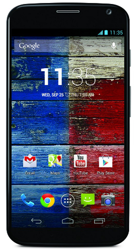
Motorola Moto G
Where the Idol 3’s design most impresses is in its dimensions. It’s taller than the Moto G (152.7 mm vs. 141.5 mm) due to its more sizable screen, but it wastes less space around that display, and it’s significantly thinner (7.4mm vs. 11mm), too. It’s also a smidge lighter (141 g vs. 149 g), despite being a larger device. Neither of these phones are likely to wow you, but the Moto G has a bigger issue with ergonomics. It feels taller than it should be, whereas the Idol 3 is less of a hassle relative to most phablets.
Display
The main reason the second-gen Moto G is harder to handle than its predecessor is because it sacrifices the convenience of the original’s 4.5-inch IPS LCD display in favor of a spacious 5-inch panel. Size issues aside, it replicates many of the things Motorola got right with the first G’s display. Its colors skew a tad warm, and can’t match the fullness of a better OLED screen, but remain generally accurate. Its viewing angles are fine, as is its visibility in direct sunlight. It can get sufficiently bright, and the whole thing is as responsive as it needs to be. This is a far cry from the brilliance of a Galaxy S6, but it’s hard to expect that quality at this price anyways. It’s great for a sub-$200 phone.

Alcatel OneTouch Idol 3
The only noteworthy problem with it is its resolution, which remains at 720p despite going up half an inch in screen size. That puts its pixel density at 294 pixels per inch, which isn’t low enough to bother you for most tasks, but does make for at least some jaggedness during certain animations or when you have the panel close enough to your face.
The Idol 3’s 5.5-inch 1080p screen, meanwhile, is about as good as we’ve seen on a budget phone. Again, you can’t expect the world here, but it wouldn’t look out of place on a phone twice as expensive. Virtually everything about it is at least good — it’s bright, it’s vivid, it’s roomy, and it’s visible in irregular settings. With 401 pixels crammed into each inch of its space, it has no worthwhile issues with sharpness either. It’s another LCD panel, so the deep black tones just aren’t there, but it’s a pleasure to behold all the same.
Internals
Powerful chipsets, especially those taken from a major manufacturer like Qualcomm, are expensive. Much like the design sacrifices mentioned above, just about all of these value phones (OnePlus One notwithstanding) hit their price points by using an older processor. Again, the Moto G and Idol 3 are no exception. The good news, though, is that these older SoCs are still beyond serviceable for just about everything you’re likely to do with your phone.

Motorola Moto G vs Alcatel OneTouch Idol 3 top
Specifically, the Moto G deploys a Snapdragon 400, which consists of a quad-core 1.2 GHz Cortex-A7 CPU and an Adreno 305 GPU. A sole GB of RAM accompanies that. These are actually the same specs Motorola used in the first-gen G, which is somewhat underwhelming as a business decision, but keeps the phone strong enough to get through everyday tasks without too much trouble. You’ll see some framerate drops when playing graphically demanding games, and you’re more likely to see a small delay in opening apps and menus, but nothing is ever sluggish enough to be unusable. At its worst, it’s a minor distraction. Most of the time, it’s a marked improvement over most sub-$200 devices. Having a near-stock version of Android allows older SoCs like this to run cleaner than they would with a skinned OS.
The Idol 3 uses a Snapdragon 615 SoC, which is made up of two quad-core Cortex-A53 processors (one clocked at 1.5 GHz, the other at 1.0 GHz) and an Adreno 405 GPU. It’s technically a 64-bit chip, and includes 2 GB of RAM as well. All of that sounds much more formidable than what the Moto G’s packing, but in practice the performance leap isn’t that large. It’s a little more adept at running multiple apps and more demanding games, but push it beyond ordinary use and you’re still liable to see some slowdown and feel the rear of the phone get hot. It isn’t head and shoulders above other devices in this price range the way the display is, but it’s a step up regardless. Alcatel’s Android skin is relatively light, but it’s still a skin, and that slightly levels the playing field between these two phones. There are very few, if any things you can’t do here that you could do on a $650 flagship. It just shows its effort a bit more.

Motorola Moto G vs Alcatel OneTouch Idol 3 back
Both devices are formidable in the battery life department, too, though the Idol 3 generally goes longer. Despite having a higher-res display, its 2910 mAh battery can easily last more than a day with average use. Don’t go overboard with it and you can push that to two full days. The Moto G’s 2070 mAh pack can get beyond a day as well, but getting more than that requires a little more conservation. That’s not a glaring negative, though — if a phone can reliably get from sunrise to sundown without needing a charge, it’s fine, and both of these two fit the bill. The only issue is that both packs at virtually non-removable: The Moto G simply can’t be opened up, while the Idol 3 requires more handiwork than the trouble’s worth.
We’d be remiss if we didn’t take a moment to praise the Idol 3’s audio, too. It lifts the dual front-facing speaker setup from HTC’s One series, and while it doesn’t quite reach the fullness of those devices, it’s capable of getting very loud while remaining crisp and clear. It’s another aspect of the device that punches well beyond what the phone’s price normally suggests. The Moto G puts its driver on the front of the device as well, but it’s more prone to muddier sounds by comparison. It’s just okay on the whole.
Storage wise, the Idol 3 again has a small advantage. It comes with either 16 or 32 GB of space by default, but that’s expandable up to 128 GB through a microSD card. The Moto G, meanwhile, features 8 or 16 GB of room, with up to 32 GB of additional space through microSD support. The fact that both of these phones support storage expansion at a time where many flagships are stripping it away is a major plus.
Software
The same sentiment applies for the Moto G and Idol 3’s software — whereas most Android flagships bog down the OS with thick, marginally helpful skins, these two stick closer to the spirit of Google’s default interface, providing cleaner and smoother experiences as a result.

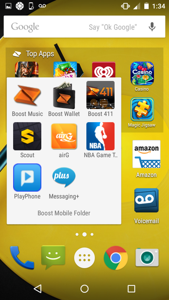
Alcatel OneTouch Idol 3 home screen
The Moto G is especially commendable in this regard. Like the rest of Moto lineup, it runs what’s effectively a stock version of Lollipop, with all the same menus, animations, and icons you’d find in one of Google’s own Nexus devices (camera app aside). Since the phone comes unlocked, it also doesn’t come with any unwanted bloat either. Google has made its mobile OS much more welcoming to new users over the past few years, and Lollipop only adds to that by making the whole thing friendlier to look at. The only potential negative is that the G doesn’t have the processing power to pull off some of the nifty features that come on the Moto X, like its always-on voice controls. Still, you’re getting a better UI here than most flagships for a fraction of the cost, and that’s hard to complain about.
The Alcatel take on Android is farther-reaching, but not nearly as intrusive as the worst skins. It changes up the icons of the Idol 3’s core apps and uses its own camera interface, but those alterations are mostly just different, not necessarily worse. (They will look out of place next to stock Google icons if you’re coming from a purer version of the OS, however.) There’s also a small amount of pre-loaded bloatware, though all of it can be deleted from the phone without too much trouble.
Alcatel bakes in a few of its own features, too, including an eye scanner for locking the phone and a series of app shortcuts that can be plastered onto the lock screen, but those are mostly gimmicks that can easily be ignored or shut off entirely in the settings menu. Otherwise, actually navigating the Idol 3 is much like navigating regular ol’ Android. The nav buttons and menus all look the same, the card-based multitasking menu is still there, and there aren’t any redundant first-party apps or marketplaces looking to compete with Google’s own options. It looks a little different, though, and will likely require you to ignore a few extra features.
Camera

Motorola Moto G vs Alcatel OneTouch Idol 3 cameras
Remember what we said about budget phones skimping on processing power to save cash? The same idea applies for their cameras, too, and it’s the same story with the Moto G and Idol 3. Suffice it to say that you won’t be buying either of these devices for their shooters. That said, neither one is as embarrassing as most of the cameras that litter this side of the market.
The Moto G’s 8-megapixel sensor is a major improvement over its predecessor’s 5-megapixel unit, but since the latter was pure garbage, that only results in something that’s merely respectable. It can take some decently exposed and detailed shots in well-lit settings, and it shoots much faster than the original G, but it’s never totally consistent. Low-light performance is predictably rough, but at least passable. There’s a halfway decent HDR mode in here, too. Motorola’s camera UI is eminently usable, with the only quirk being that you have to drag your focus point rather than tapping it to a specific point. It all makes for photos that are, if nothing else, good enough to be shared on social media. On the back, at least — the 2-megapixel front-facing cam is still shoddy.

Motorola Moto G
The Idol 3 is mostly the same story, though its 13-megapixel sensor allows for slightly sharper shots. It’s another mid-range cam that’s going to live and die by the lighting of your surroundings — go out during the day and it’s going to be fine, head into the dark and you might be reaching for the delete button before long. Much of the time, it offers good color and detail, and it’s never particularly laggy in shooting. Alcatel’s camera app gives some relatively granular controls for adjusting white balance, ISO, and the like if you feel like tinkering, but none of that ever gets in your way if you just want to open and shoot. The quality of the 8-megapixel camera on the Idol’s front stands out a bit more, especially in this price range.
Ultimately, camera quality is one of the last remaining things that today’s smartphone market really holds at a premium. There’s a tangible, obvious difference between the top-tier cameras and the mid-range ones, and to get the best you still need to shell out the cash for something like an iPhone 6 or Galaxy S6. These two value phones don’t change that.
Pricing and Availability

Alcatel OneTouch Idol 3 back
Neither the Moto G nor the Idol 3 are available through any carriers in the US, so you’ll have to buy them unlocked, either from the manufacturers themselves or a third-party retailer like Amazon. You’ll then have to supply them with their own SIM cards and set them up on either T-Mobile or AT&T, since both phones only support GSM networks at the moment. The Moto G is available for $180 unlocked, while the Idol 3 is out for $250. It should be clear by now that both are tremendous values, especially without the hidden costs of any carrier device plans.
The last thing to note here is a big one: As of this writing, the latest iteration of the Moto G sold in the US doesn’t support LTE. You’ll have to make do with HSPA+ speeds on T-Mobile and AT&T, which are reliable enough if you’re in the right coverage area, but not as zippy as their successor. (It’s also worth mentioning that the device doesn’t support T-Mobile’s faster HSPA+ 42 network.) An LTE-capable Moto G is available overseas — and includes a slightly larger battery — but for now that model hasn’t arrived Stateside. The Idol 3, meanwhile, has supported the quicker networks since its release earlier this month.
The post Motorola Moto G vs. Alcatel OneTouch Idol 3: The Tale of the Tape appeared first on Brighthand.com.