There’s an abundance of email apps designed to help you reach the fabled “Inbox Zero,” but it’s not always easy when you have to lose hundreds of unread messages. Between Mailbox, EvoMail, Mail Ninja, and their ilk, you have plenty of options, but few of them work as well as they should.
Even Google’s struggled with this. One of the common complaints about Google’s own Gmail app is simply how plain it is. It’s traditional at best, a bit boring at worst. However, the web giant has taken major strides to address that with Inbox, its newest email app. Regardless of how much you use Gmail, it’s worth testing the new app’s latest beta version.
Google Inbox
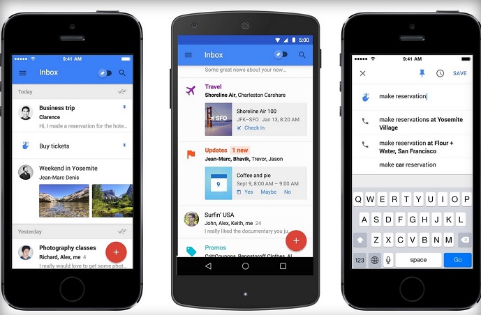
We’ve been using the iOS version of Inbox over the past week, and our initial impressions are positive. It‘s simple to set up three Google accounts at a touch of a button. The main menu lets you easily log in and out of multiple accounts simply by touching the log-in picture.
Inbox’s user interface is clean, colorful, and playfully reminiscent of the Google+ app. It includes numerous tidy features that help users keep their emails organized and grouped without making it seem like a chore.
The app automatically bundles similar emails. Google previously did this in Gmail by grouping these into separate tabs like “Social” for social media alerts or “Forums” for updates from message boards and mailing lists. With Inbox, those groupings are still there, but they’re each presented as if they were a single email by default, not as separate tabs. Only by tapping on them will you be subject to the whole list.
For instance, if you subscribe to a number of shopping and deal sites like Groupon, LivingSocial, and TravelZoo, any emails you get from those are sorted into Promos, and the app tells you how many new messages you have waiting. You also can create your own personal groups based on your most relevant senders.
While your ultimate goal may be to attain Inbox Zero, Inbox gives users the choice on where and when they want to deal with an email. A left swipe brings up a “Snooze until” window with choices to deal with an email later in the day, the next day, the next week, or even just “Someday.” The email also can be dealt with at a location such as home, in the office, or elsewhere, based on the device’s location.
A right swipe places the message into the Done category, taking it away from the screen. What’s missing, however, is an equally simple way to delete a message. Right now, it’s a relatively cumbersome three-step process. First the user needs to read the email, then select the menu option, and then hit the trash button. Google needs to have an icon or a simple swipe capability — a la Mailbox, which also deploys these kind of shortcuts — to delete messages that just don’t need to be read.
You can also flag a particular email by pinning it. An on/off pin button at the top of the app allows you to do just that and see a list of messages you’ve flagged.
Creating an email is easy. At the bottom right hand corner of the screen is a big hamburger icon with a plus sign on it. Tap on it and a list of recent and popular recipients appears.
Furthermore, Inbox also integrates aspects of your to-do list in as reminders. You can select the reminders feature from the main menu to see their list for the day or create a new one.
After using the app for a few days, we can see how anyone might actually think that going through their emails to achieve Inbox Zero could actually be fun. And one other side benefit: Google could tell we used the app for several days. It asked whether we wanted to convert its standard web-based Gmail client into the new Inbox once. Our answer was a resounding yes.
The post Google Inbox Hands-on: Swiping Your Way to Inbox Zero appeared first on Brighthand.com.