Put Password Boss in Charge of Your Login Credentials

Passwords are a hassle and changing them frequently is a total headache, especially when working in all those quirky alphanumeric combos and symbols. This is why password manager apps exist. One of them, the recently released Password Boss, offers comprehensive support for password vault and digital wallet functionality. We tested it out and here’s what we found.

Password Boss dashboard

Password Boss dashboard

Unlike the vast majority of password manager apps, Password Boss is easy to use. In this way, its makers have aimed their sights on the 92 percent of people who don’t use password managers because they’re hard to figure out. When you download the app you’ll be prompted to create a master password. This acts as a “single sign-on” through which you get access to your password vault and digital wallet, where all of your sensitive information lives.

Once you log in to the app, you’re given access to the main interface which gives you access to a number of functions. The Password Vault is where you manually key in and store your login credentials for websites. Tapping the plus icon lets you enter the desired website URL, username and password. You can also choose to enable auto login for specific sites, or set a requirement to key in your master password every time you access the site.

A separate Digital Wallet section lets you store banking and credit card information, including routing and account numbers or CVV and PIN data. Also included is a secure browser and a password generator that helps you create strong passwords that won’t be easily guessed. A separate Personal Info section that can be used to store other bits of random information, like your wall safe combination number or the hidden location of your spare house key.

All data is protected by bank-grade, 256-bit AES encryption, and you can pick between U.S. East, U.S. West, Ireland, Singapore, Sydney, Tokyo and Sao Paulo as your storage location of choice.

Password Boss is available as a free download for Android, iOS and Windows desktops – but the freemium version is only good for 30 days, after which you’ll be prompted to upgrade to the premium version for an annual subscription of $29.

That said, Password Boss gets away (for at least 30 days) with claiming it’s the only “free” password manager that lets you store an infinite number of usernames and passwords, share your info with anyone you want, and choose where your encrypted information is stored.

If and when you upgrade to the premium version for $29 per year, you get access to automatic backups, unlimited sharing with others, and cross-device syncing. Other perks of Password Boss Premium include two-step authentication and remote data deletion if your mobile device gets stolen.

Password Boss is available for Android and iOS mobile devices. There’s also a Windows version you can download to your desktop. The Android version requires 4.0 and up, and iOS requires 8.0 or later.

The post Put Password Boss in Charge of Your Login Credentials appeared first on Brighthand.com.

Amazon Cloud Drive for iOS is Flawed, But a Step in the Right Direction

Amazon’s cloud drive service has been around a long time, and apps to give users the ability to access at least some of their stored data aren’t new. But just this month, the iOS market got its own version of Amazon Cloud Drive, a comprehensive app that lets users remotely access all of their Cloud Drive data – including documents, spreadsheets, presentations, photos, videos and music files.

Amazon Cloud Drive

Amazon Cloud Drive

The Amazon Cloud Drive app ramps up the productivity stakes in a Dropbox-like fashion not possible with previously released standalone apps like Amazon Photos and Prime Music – which, as indicated by their very names, are limited to only certain types of media. Amazon Cloud Drive gives you mobile access to the whole enchilada.

Where design is concerned, the Amazon Cloud Drive app is no-frills and that’s probably just the way you need it to be for productivity purposes. Upon launch and initial sign-in to your Amazon account, the app displays a series of folders sectioned out by file type. From here you can view, share and manage all of your stored content. The interface is an obvious attempt to compete with Google Drive, Microsoft One Drive and the aforementioned Dropbox, Amazon Cloud Drive is a decent effort to mobilize the functionality of its existing desktop app already available for Mac and PC. But a handful of limitations that reared their heads in testing show it’s got a ways to go yet before it begins to worry the competition.

For one, you can access all of your cloud-stored files but there’s no way to edit them. Documents are displayed in the app’s simple built-in reader, but if spot some glaring error you’d rather edit you’ll have to wait until you’re within reach of a desktop to correct it. There’s also no search function, leaving you to hunt down the desired file in caveman-style fashion.

File management is also extremely limited. There’s a “Manage Storage” option found in Settings that displays a pie chart showing how much cloud space you’ve got left and breaking everything down by file type. The only problem is, if you see something you no longer want using up your valuable cloud space, you can’t delete it.

You can access video and music files, but if you’re planning on using this app in lieu of a mobile streaming app you’ll be better off switching over to Prime Music. You can play your media files from Cloud Drive, however there’s no way to create a playlist for continuous music playback and media files have to be launched individually.

The ability to share files remotely is the app’s one big redeeming quality. You can do this by creating a public link that can be sent via message or social media, or you can send files as attachments in email. This may not be a functionality that will set your world on fire, but it is a step in the right direction that shows Amazon is taking proactive steps to enable users of its cloud service higher levels of mobile productivity. Given time and plenty of user feedback, we fully expect to see this app go through some serious evolution.

Amazon Cloud Drive requires iOS 8.1 or later and is available as a free download from iTunes. It’s compatible with iPhone, iPad and iPod touch.

The post Amazon Cloud Drive for iOS is Flawed, But a Step in the Right Direction appeared first on Brighthand.com.

Huawei TalkBand B2 Review

If all they did was quantify exercise, fitness trackers would be a commodity just like the pedometers that preceded the popular wearables. But the Fitbits and Jawbones of the world can’t have that, so they have to figure out ways to differentiate their products from one another with added features.

Huawei TalkBand B2

Huawei TalkBand B2

For Huawei, a Chinese mobile maker better known for Android handsets, that means doubling up its latest wearable, the TalkBand B2 as both a fitness tracker and a Bluetooth headset, and by being the first third-party device to sync up with Jawbone’s excellent UP fitness app.

Is that enough for the Huawei TalkBand B2 to distinguish itself from the pack? Let’s find out.

Build & Design

The Huawei TalkBand B2 looks a lot like the previous generation of fitness trackers. It’s a bit bulkier than the current crop owing to the fact that is consists of two pieces: a removable tracker/Bluetooth earpiece, and the strap/receptacle. Wearing it, we found it protrudes a bit too much from the wrist, and snagged a backpack strap a few times too many during testing. But it’s not heavy, weighing around .04 pounds depending on the build.

Huawei TalkBand B2 consists of two pieces

Huawei TalkBand B2 consists of two pieces

The B2 is available in either black or silver with a plastic band, or gold with a leather band, and secures via a single peg-and-hole setup. It’s not uncomfortable to wear, and despite the single peg, remained securely on during our testing period, which included some vigorous runs and biking sessions.

The TalkBand earpiece houses a single multi-function button on one side, along with microphones. An earpiece and microUSB charging input hide on the bottom. The other half consists of two removable straps, and the earpiece housing, with a two-button release trigger.

The two-piece setup actually works very well, considering how gross fitness bands can get with gunk and dirt build up. It’s much easier rinse it off without fear of damaging the tracker. The TalkBand B2 has IP57 water and dust resistance, defined as partial resistance to dust and immersion in one meter of water for up to 30 minutes. This thing will likely weather a rain storm well, but take it off when you go swimming or bathe.

Display

HuaweiT alkBand B2 display can be tough to see

HuaweiT alkBand B2 display can be tough to see

The Huawei TalkBand B2 has a .73-inch black-and-white display with a 128 x 88 resolution. It’s OLED, but don’t get excited, because it’s Passive Matrix OLED, which is the budget version of the AMOLED found on flagship smartphones. To that end, it’s near impossible to see in direct sunlight because it’s not bright enough (and there are no brightness settings), the display glass is extremely reflective, and it’s a fingerprint and smudge magnet. It also shuts off way too fast, giving users only a couple seconds to glance before going to black.

As a touch display, it’s also not responsive enough. Granted, finger tips sweaty from running present issues for just about all touchscreens, but the Huawei TouchBand B2 exhibits delays with swipes and taps even under the best of circumstances.

The display stays off by default, powering up via a button press or a user wrist rotation upward, like the Apple Watch. This method is wholly unreliable (as it was with the Apple Watch). Too many times during testing the display did not light up during the first try, and when it did, there was a constant few-second delay.

Performance

The Huawei TalkBand B2 performs basic step and sleep tracking. The device displays steps, calories burned, and time spent sleeping. It pairs to any device running Android 4.0 or iOS 7, or later, via Bluetooth 3.0. Data is stored in the Huawei Wear fitness app, which can share data with the far superior UP app by Jawbone (more on that in a bit).

The TalkBand lacks a GPS, and cannot do exercise-specific tracking, like yoga or weightlifting. It will detect stair climbing and bike rides, but the latter proved wonky during our tests. It too often picked up a few minutes of driving as a bike ride, and cut actual rides consistently short by about 10 minutes.

Sleeping seemed off as well. Again, it consistently undercut the hours we spent snoozing, which strains its credibility for tracking deep and light sleep.

Fortunately, it tracks steps very well. Its numbers jive with the other popular wearables we tested it against, give or take a few steps, and the distance logged in the Huawei app corresponds to Google Maps data within a couple hundred feet.

Navigation is simple and easy to master, with fun animations for sleeping, walking, and the like. We especially like the fireworks display that celebrates reaching the daily step goal.

The main screen displays the date, time, Bluetooth connection status, and battery level. Swipes show steps, calories burned, time slept, and a stopwatch. The stopwatch will track steps and calories specifically for the time measured. A press of the power button reveals more options for Bluetooth, find-my-phone alert, and a remote camera shutter that oddly launched “OK Google” on Android devices when outside the camera. Not sure if that’s a deliberate feature or a bug…

The B2 has a few other tricks, including standard vibrating alarms, smart alarms designed to vibrating when light sleep is detected, and a “get-up” reminder after it detects between a user-defined 30 and 120 minutes of inactivity.

Battery

Huawei Wear app

Huawei Wear app

Huawei claims the TalkBand B2 will last up to six days with its 95mAh battery. That’s a stretch. We had to charge it every two to three days depending on usage. Being that it tracks sleep, we didn’t want to do it at night, so it thankfully charges quickly, taking about 90 minutes max. Those working at a desk will find plenty of time to plug it in without missing too many steps.

App

The Huawei Wear app aggregates all the sleeping, calorie, and steps data, and it’s here that users set up a profile and manage the TalkBand B2. The fitness band settings are limited to setting alarms, step goals, and standup reminders, with nothing to manage the display brightness or time before it dims.

It’s a good-looking app, but very barebones compared to others. It does have options for syncing to the popular MyFitnessPal calorie counter, as well as the excellent UP app by Jawbone.

Unfortunately, UP integration is hardly seamless. Information must first be logged by Huawei Wear, and it then automatically ports over. We found there to be inconsistent delays with this, though everything did sync up during our time testing. That complaint aside, the TalkBand app situation would be greatly improved if it could just sync to the UP app automatically, without the need for the middleware.

Bluetooth

Huawei TalkBand B2 doubles as a Bluetooth headset

Huawei TalkBand B2 doubles as a Bluetooth headset

Call it odd or innovative, but the TalkBand B2 doubles as a Bluetooth receiver. While connected, the number from any calls will show up on the TalkBand, and users can answer by popping the band out of the base. It really works, and works quite well. Voices sound clear to the wearer and a bit muddled on the other end, but no worse than some cheaper Bluetooth earpieces.

We actually found the unique functionality to be useful, freeing us from fumbling around our pockets looking for our phones (though most were happy to simply ignore the calls altogether). The caller ID is also a nice touch, and we can’t help but think how much better it would be if the TalkBand also displayed texts and other smartphone alerts.

The Bluetooth earpiece secures only via a rubber earbud, which stays put so long as the user doesn’t bob around too much. Kudos to Huawei for including multiple buds of various sizes with the TalkBand.

Price and Availability

The rubber TalkBand B2, which we reviewed, is available in black or silver for $180, and a gold and leather combo that runs $200. Of the three, the black option has the most viewable display thanks to the contrast, and that’s our pick overall.

Conclusion

The Huawei TalkBand B2 manages to distinguish itself from other fitness trackers with a few neat tricks, and it works mostly as advertised. It’s surprisingly comfortable, and the animations give it more personality than other devices. If it were less expensive, it’d be easy to recommend,

Unfortunately, it has just enough annoyances to make us question the price tag. While the headset feature proves useful, it isn’t enough to get us past the mediocre battery life, barebones app, and dim and occasionally unresponsive display, at least not for $180. For that money, you could snag a Jawbone Up2 ($100) and a superior Bluetooth headset from Jabra or Plantronics.

The post Huawei TalkBand B2 Review appeared first on Brighthand.com.

Don’t Break the Chain with Streaks – Daily Habit Tracker Android App

Imagine if you had Jerry Seinfeld hanging over your shoulder all day long – not cracking jokes (which would be as awesome as it would be distracting) but pushing you to get stuff done. Believe it or not, there’s an app for that. Sort of. Streaks – Daily Habit Tracker is a new Android app that employs Seinfeld’s simple “don’t break the chain” trick as its core function to achieve improved productivity.

Screenshot_2015-07-08-14-39-55Although Seinfeld’s methodology involves making big red checkmarks on a highly visible wall calendar to remind you to keep your chain of daily accomplishments going – and presumably to fill you with self-loathing and shame for any gap in days when you were too lazy to go jogging, or walk the dogs, or write a new joke, or clear your workplace email inbox – Streaks lives on your smartphone and follows you wherever you go.

It’s a simplistic app with a straightforward interface that doesn’t waste time on superfluities. You add a task by tapping a plus icon and keying in a brief description. You can schedule timed reminders that send push notifications to your smartphone, or if you’re of a more disciplined bent you can manually refer to the app to see where you stand.

Once tasks are added, they show up on the app’s main screen in descending order of when they were added. Tapping “Complete” on any item keeps a running tally of how many days in a row you’ve gone without shirking your responsibilities, giving you a visual representation of well you’re doing.

The goal, naturally, is to keep your streak alive without letting a calendar day get past you. If you fail to complete a task, the counter resets to zero. A social sharing feature is also present, giving you the option of bragging about your accomplishments via Facebook, Twitter, email, text message, or any other platform installed to your Android. You can also use the sharing feature to publicly shame yourself when you failed to live up to your own expectations, but we don’t recommend it.

Unfortunately, Streaks in its present form is only able to track daily tasks. This means you don’t have the ability to program every-other-day or bi-weekly duties. It also doesn’t let you edit task names once they’ve been created, and there’s no widget support – but with the developer’s demonstrated attentiveness to feedback, it’s likely much of this will change as the app evolves into maturity.

Streaks – Daily Habit Tracker is available as a free download from Google Play and requires Android 4.0 and up. The free version limits you to five tasks at a time, where the $1.99 pay version lets you set an unlimited number. Maybe not quite worth the full cost of admission, but certainly useful if you’re looking for an easy to use reminder.

The post Don’t Break the Chain with Streaks – Daily Habit Tracker Android App appeared first on Brighthand.com.

Bounce Is the Latest Whiteboard App, One of the Best

If you’ve ever taken part in a collaborative brainstorming session, you know one thing: follow-through is everything. Without it, even the greatest ideas in the world can suffer death by premature fadeout. As we’ve come to learn, there’s an app for that. There are actually lots of apps for that, but one in particular claims to assure the survival of creative momentum better than others. It’s called Bounce by IdeaPaint.

screen322x572Newly available for iOS (and promising an Android release soon), Bounce aims to be every iOS user’s go-to app for fostering continued collaboration long after the initial creative spark has dwindled and the caffeine high has worn off. It works by using your iPhone camera to capture images of things like whiteboards, flipcharts and notebooks so you can refer to them later and share them around as needed to keep projects going.

Launching the app gives you the option to snap a photo, import one from your gallery, or create a new project. If you’ve already created projects, these are populated on the app’s main screen and organized in descending order from the most recent.

Creating from scratch is done by snapping a photo, or by tapping the plus icon and following the prompts to add a title, a description, and the email addresses of your co-collaborators. Photos can be added at the start of the process or taken later on. The app includes a no-frills crop tool with basic functionality. There’s also an auto image cleanup tool that does a fairly decent job, but nothing miraculous. You can overlay handwritten text onto an image using a pencil tool that offers four colors – red, blue, green or black. There’s also an eraser tool present for backtracking.

Images can be tagged with annotations that show up as numbered circles on the image and appear as footnotes when a project is shared. To add annotation, just tap on the image and type your note. Sharing occurs via email, which sends a unique project-related URL to recipients (you can also incorporate projects with Google Drive and Dropbox).

Sharing a project will send push notifications to collaborators who have the app installed and notifications turned on. Although you’re required to create an account when installing Bounce, collaborators don’t have to do the same to receive project updates via email. They will have to have the app installed on their mobile device to contribute to the discussion, though, which is really the whole point.

By all indication, Bounce is a potentially powerful app but to this point it remains a work in progress. The interface is lean and uncluttered, and the layout of the main page is attractive – but the app itself is not as intuitive or straightforward as it may need to be for it to realize its potential with bigger audiences. Expect some of this to change as user feedback pours in.

Bounce by IdeaPaint is available now as a free download from iTunes and requires iOS 8.0 or later. It’s also compatible with iPad and iPod touch, but was optimized for iPhones 5 through 6 Plus.

The post Bounce Is the Latest Whiteboard App, One of the Best appeared first on Brighthand.com.

Apple Music Review: A Mess of Features or Just a Mess?

apple-music-logoWe shouldn’t be surprised that the digital music pioneer that introduced the iPod and iTunes to the world found itself in a panic as more people began streaming music and downloading less of it through iTunes. After all, we’re talking about a similar transition to the one we witnessed years earlier when people stopped buying CDs and started downloading music from iTunes in the first place. Streaming music is simply another shift in music consumption habits and this time Apple was on the wrong side of it. In response, Apple quickly gobbled up Beats Music and then turned around and spun it into Apple Music.

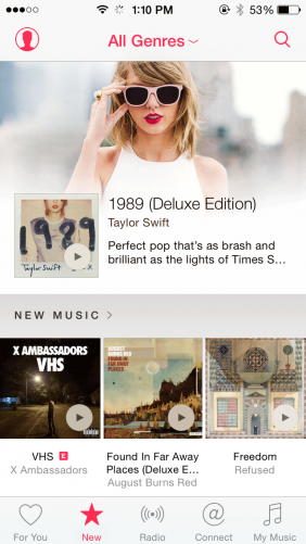
While the overall design of Apple Music is graphically rich and inviting, the app feels cluttered. There’s an almost hurried or haphazard feel as all manner of playlists — curated, algorithmic, activity-based, popularity-based — get squeezed next to a live radio station, a social media network still in its infancy, and your purchased music in iTunes. Thankfully, it retains the best feature of Beats Music without trying to jam too many features into it. Apple is offering a free three-month trial to woo the Spotify faithful and subscribers to other music streaming services and, as we now see after using the app for a few days, to give all users a chance to figure out what’s available and where it’s all located.

AppleMusicStart-282x501After the trial, Apple Music costs $9.99 a month for individual users, the same price as Spotify and Google Play. Apple Music offers a better family deal than Spotify, however, letting you and up to five others share an account for $14.99. Apple Music is available for iOS devices and via iTunes on Macs and PCs; an Android app will be out in the fall. It should be noted that Apple Music was tested on an iPhone 6 for this review.

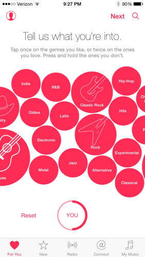
If you used Beats Music for any length of time, you’ll be immediately familiar with Apple Music. Like its precursor, Apple Music displays a bunch of bubbles upon startup to begin learning your music tastes. You’ll first tap on genre bubbles — one tap to like a bubble, two taps to love it. After tapping your favorite genres, Apple Music will then offer you artist bubbles. After you choose the artists you like and love, you’ll be deposited in Apple Music.

For You

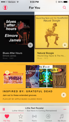
The first of the five tabs along the bottom of Apple Music is labeled For You, which is nearly an exact replica of the Just For You section of Beats Music. It serves up a mix of playlists and albums based on the genre and artist bubbles you tapped during setup, your listening habits, and the music already in your iTunes library.

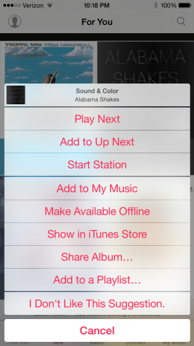
When not searching for a specific song, album, or artist, this reviewer spent the majority of his time in the Just For You section on Beats Music and is happy to see it live on in nearly the same form. My only complaint is that now you need to return to the top of the list and swipe down to refresh, which is the opposite of the refresh function in Beats Music that let you refresh simply by continuing to scroll down. For You offers the same mix of albums from familiar and unfamiliar artists along with playlists that hit the mark more often than not. The Intro to and Inspired by playlists, for example, are nearly always strong. If you don’t like one of the included songs, long tap on and select I Don’t Like This Suggestion.

ForYou-282x501 IDontLikeThis-282x501

You’ll also see that this is far from the only option on this menu; an indication that perhaps Apple Music is trying to do too much. You can access this same menu by tapping on the three dots to the right when you’re in an album; this brings up the More menu which offers additional choices for playlists.

Keep in mind this is only the first generation of the app! What happens when Apple gets ideas for new features? Oh, please don’t let Apple Music turn into the bloated mess that iTunes became when it went from a simple yet powerful way to organize a music library to a clearinghouse for music, movies, apps, and more.

New

NEWThe New tab essentially replaces the vaguely titled Highlights section of Beats Music, and while its focus on new music is appreciated, it’s a fairly loose focus. What starts with a logical New Music section of new albums and a Hot Tracks section of popular songs quickly turns random. The app winds its way from playlists created by Apple Music editors and curators, various activities (holdovers from Beats Music that seems stuffed in the New section for reasons that escape us) back to New Releases, Top Songs, and Hot Albums that seem to only duplicate the New Music and Hot Tracks sections we’ve just seen.

Further down you’ll encounter Connect-related discoveries — one for audio tracks and one for videos — and a New Artists section. We plan on ignoring the Connect-related lists but would argue the New Artists section deserves a spot at or near the top of the New tab.

The New tab ends in truly bizarre fashion with a list of “Alternative Essentials” … none of which are new or even can be since it requires the passage of time before an album can be deemed “essential” to a particular genre of or movement in music.

Radio

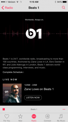
With this tab, Apple Music takes iTunes Radio and adds a live radio station with actual human DJs as the headliner. Apple Music introduces Beats 1, a 24-hour global radio station with live DJs playing songs and interviewing artists (Zane Lowe recently interviewed Eminem, for example), artists will guest-host blocks, and you can even find the occasional chart countdown show.

Radio_Beats1-282x501Beats 1 feels like a throwback for the very nature of radio being live and having humans talking in between songs. We have grown accustomed, however, to skipping back if we miss a song because we’re working or otherwise distracted or skipping ahead if we don’t like the current song playing, and neither move is available with Beats 1. It’s an honest-to-goodness terrestrial radio station but one without a format and that plays inside your iPhone.

The Beats 1 broadcast DJ roster goes three deep. Zane Lowe in Los Angeles, Ebro Darden in New York City, and Julie Adenuga in London each broadcast a two-hour show Monday through Thursday. Beats 1 is always on but isn’t always live; the shows from our gang above are rebroadcast 12 hours later each day.

In addition to the three main Beats 1 DJs, the Radio tab features shows hosted by guest artists. Although you can’t skip tracks when listening to Beats 1 radio, you can go back and find the songs played during some previously aired shows, neatly organized into playlists for your listening pleasure and ease. That option lets you get just the songs and none of the DJ chatter.

We aren’t sure how Beats 1 will attract regular listeners after the excitement surrounding the launch of this admittedly unique feature for a streaming music service begins to wear off. Granted, we have been using Apple Music and listening to Beats 1 for less than a week, but song selection is all over the place (Elton John and Jaden Smith are hosting shows in the same week, for example; name another radio station where that could or should happen). One of the DJs will need to grow on us to make it habit forming, although we plan to mine the playlists from the previously aired shows to uncover new discoveries and find old favorites.

In addition to Beats 1, the Radio tab features the old stations from iTunes Radio, which has otherwise gone the way of the dodo and Beats Music.

Connect

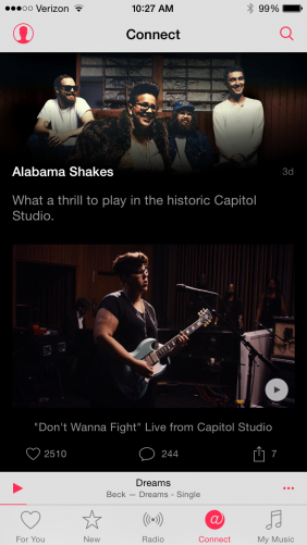
Connect-282x501In its fervor to distinguish itself among streaming music services, Apple also added a social network to the mix. Connect is a spot where artists and fans can interact. Artists can post updates, photos, videos and more, and fans can like, comment on, and share their posts.

You are set up by default to follow the artist whose bubbles you tapped when setting up Apple Music but you can follow and unfollow to more or less fine tune your Connect feed.

As with any social network that is in its infancy, it’s difficult to pass judgement on Connect until this network of artists and fans becomes more fully formed. And if you aren’t connecting with Connect, you can replace this tab with a Playlists tab. (To do so, go to Settings > General > Restrictions and turn the slider off for Apple Music Connect.)

My Music

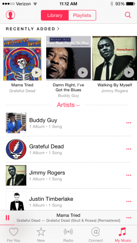
The fifth tab acts as an escape hatch from the dizzying world of streaming music and to the familiar comfort of your iTunes library and playlists. Apple Music lets you add music you find in the app to the My Music tab via the cluttered More menu. You will have access to the My Music tab without paying for a subscription, along with the Connect network and Beats 1 and Apple’s other radio stations.

Conclusion

MyMusic-282x501Apple Music brings a lot to the streaming music table — including a library of more than 30 million songs, which is on par with Spotify and Rdio — but it feels like Apple just dumped the contents of its bag of streaming music tricks on the kitchen table and walked away. There’s a ton to sift through. On that note, Apple Music lets you use Siri to demand that a song or artist be played; which helps you cut through the clutter.

We are happy to see that the For You streaming of recommended spot-on playlists and albums survived from Beats Music, and we are curious to check out Beats 1. We are less sure if the Connect network will connect with us, but we say this as someone who has a mortgage and dependents rather than as a teenager with a new found passion for music and lot of free time to indulge in such pursuits.

It is our hope that the next update to Apple Music brings a more logical structure to its many features rather than simply more features. Really, we just want the New tab to be straightened out to ease music discovery. Many of its lists feel redundant and not all of the music contained within is “new.” It feels like it should be split into two tabs: one for New music and another for various Charts, with older playlists moved to the Playlist tab.

With the contents of the New tab better organized combined with the already rock-solid For You tab, we would give serious consideration to switching from Spotify to Apple Music at the end of the three-month trial … even if we never find a show on Beats 1 that resonates.


The post Apple Music Review: A Mess of Features or Just a Mess? appeared first on Brighthand.com.

Acer Liquid M220 Review: The $80 Smartphone

At a certain point, a deal is so good that certain sacrifices become acceptable, right?

Acer Liquid M220, an $80 smartphone

Acer Liquid M220, an $80 smartphone

That would at least appear to be Acer’s philosophy with its first US smartphone offering, the Windows Phone-powered Liquid M220. For a mere $80 off contract, users can get their hands on a full-fledged smartphone, albeit an entry level one. Emerging markets are undoubtedly at least part of the target audience here, but that’s still a solid deal no matter how you slice it.

It’s important to remember that you get what you pay for — at $80, this simply isn’t a top-notch, high-end device, nor was there any way Acer could have made it one.  But that doesn’t mean that there isn’t some decent bang for your buck to be found here.

Build & Design

The build of the Liquid M220 is simple, but it also has a certain understated appeal to it. Sharp-angled edges and rounded corners make for a straightforward slab of a phone that, while unadventurous, is comfortable in its familiarity. It’s also very low-profile, weighing in at 4.2 ounces (119 grams) and sporting a nice, small footprint that measures only 4.92 x 2.52 x 0.38 inches.

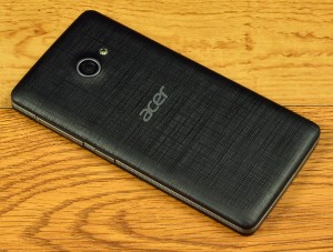
Acer Liquid M220 back panel

Acer Liquid M220 back panel

That said, it feels like Acer made the bezel unnecessarily large, especially below the display, given that Windows Phones no longer place capacitive navigation buttons on the hardware itself, instead opting to display them on screen. It’s not a huge deal; it just seems like wasted space.

Though the removable backing is cheap, flimsy plastic that has only the slightest of textures to it, a ridged band snakes its way around the edges of the phone, thankfully lending the user something to grip. Underneath the back plate lies access to the unit’s removable battery, microSD card slot, and two SIM card slots. The two SIM card slots are different sizes, with one for a regular-sized SIM and one for a microSIM.

The arrangement and selection of the phone’s buttons and ports is standard, with the 3.5mm headphone jack and microUSB charging port located on the top edge, and the volume rocker and power button located on the right. The left and bottom edges are devoid of any features, while the Liquid M220’s 5-megapixel rear-facing camera is centered towards the top of the phone’s back, and the 2-megapixel front-facing shooter is located in the upper right corner above the display.

Acer Liquid M220 microUSB input

Acer Liquid M220 microUSB input

Acer Liquid M220 mic

Acer Liquid M220 mic

Acer Liquid M220 side

Acer Liquid M220 side

Acer Liquid M220 volume rocker

Acer Liquid M220 volume rocker

Display

As mentioned, with such a low off-contract price point, it’s to be expected that many aspects of the Liquid M220 will be lacking in quality, and in few places is it more apparent than the device’s display.

Before I really lay into it, though, I would like to point out that I find the smaller screen size refreshing; this reviewer is particularly averse to the unstoppable trend of smartphones becoming increasingly large in the name of massive displays. So the Liquid M220’s 4-inch display is perfectly comfortable for me, but the compliments end there.

Graininess abounds on the display, which is to be expected when the resolution is a mere 800 x 480 pixels. Colors aren’t particularly crisp, and the brightness is very poor. Even on its highest setting, the brightness of the Liquid M220 is underwhelming at best, and it makes viewing the display outdoors in high-light situations nearly impossible.

The post Acer Liquid M220 Review: The $80 Smartphone appeared first on Brighthand.com.

50 Million Downloads Later, Google Keep is the Best Note Taking App

It’s a rare occasion that we review productivity apps which have been around for two years, but the fact is that some apps are like wine. They get better with age. The fact that Google Keep has topped 50 million downloads in the two years since its launch gives credence to the fact that it runs circles around other apps that claim the same capabilities. Here’s what we have (re)discovered.

In case you aren’t already familiar, Google Keep is a free note taking and reminder app available for Android devices that works a lot like Evernote – only in our opinion, it’s a lot simpler to use. If you’re already dialed in to the Google/Android ecosystem, it’s practically automatic and comes with a learning curve equivalent to taking baby steps.

Google Keep on a smartphone

Google Keep on a smartphone

To get started, all you do is tap the intuitive “plus” icon on your mobile device. From there, you’ve given four choices: microphone dictation, camera view, bulleted list and document entry. Tapping the microphone icon launches Google’s speech recognition, which automatically translates your spoken words into text and also saves the audio, albeit in poor quality. Speech entry also works for creating bulleted lists or documents, which can alternately be created manually using your smartphone’s keyboard. The camera icon lets you snap a picture or import an existing one from your gallery, after which you can tag it with a related note.

All of these note taking options enable you to set timed reminders – but it’s the location reminder option that really rocks a bit. When you set a location reminder, you’re basically programming your mobile device to pop up with a notification once you’ve reached a certain destination. Like the grocery store. Or work. Or home. Or anywhere else that can be recognized by your GPS. It’s like telling Keep, “Remind me when I get there and not a moment sooner.” Reminders can also appear just about anywhere you have Google, including your browser, Google Now, and your Android smartphone.

Saved notes can be color-coordinated, all the better to separate your professional to-dos from your personal ones. Notes can also be labeled for easier categorization, or searched by keyword. As if keyword searchability weren’t enough, finding your notes is further simplified by the ability to filter by list category, assigned color, recorded audio files, or photos. You can also filter your search by notes that have had reminders attached to them, and notes you’ve shared with others.

Which brings us to what just might be the app’s greatest perk: sharing and collaboration. It probably comes as little surprise that any note, document, audio recording or snapshot you take in Keep can be easily synced to your Google Drive account. Tapping the “send” option in your preferences also lets you forward a note via email or any other installed platform on your mobile device. But beyond that, Keep is also capable of facilitating real-time sharing and collaboration with anyone on your contacts list. Simultaneous note editing is possible – and the best part is, you can unshare at any time or remove yourself as a collaborator.

Google Keep on a browser

Google Keep on a browser

Another selling point of Google Keep is its cross-functionality with other platforms and devices. Like the other popular note-taking services, Google Keep gives you the freedom to add and access your reminders from practically any location.

Say you’re on your computer and you suddenly remember that you need to pick up a bag of dog food before sundown so the pups don’t starve. All you do is navigate to keep.google.com and create a reminder. That note will then automatically sync across all of your Android devices with Keep installed. It will also sync across to any computer on any browser – the only catch is that you have to be logged in to your Google account. If you’re already a Google Chrome user, you can add the Keep app to make note taking even easier when you’re browsing the web.

In testing, we discovered that syncing occurs in real-time and were able to watch the words we typed into our laptop magically appear on the mobile app interface. The reverse also worked, with notes added on an Android mobile device immediately appearing on the browser-supported portal. The only drawback is that you can’t add audio or photo notes using the online portal.

Other cool features include a feature called “grab image text” which uses OCR to digitize text from images, and homescreen and lockscreen Android’s widgets to make the app faster to access. Google Keep’s appeal is aided by a minimalistic design and ridiculously simple ease-of-use. Although it’s available only for Android mobile devices, there are third-party apps available to iOS users who prefer coexistence over disharmony. Apps like GoKeep and TurboNote help bridge the gap, and you can also access Google Keep through your Safari browser. If you’re an Android user, pick up Google Keep for free at Google Play and let us know what you think.


The post 50 Million Downloads Later, Google Keep is the Best Note Taking App appeared first on Brighthand.com.

iPhone App of the Week: Do

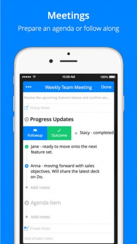
Already an established platform for setting up and navigating through meetings, Do recently revamped its iPhone app to be more informative and efficient in simplifying your scheduling needs. Here’s a rundown of what’s new, and why it makes the app better at getting you and your coworkers on the same page without much effort.

Do app for iPhone

Do app for iPhone

The redesigned Do includes new quick action options that make organizing and following up on meetings a breeze. A new meeting timeline also delivers real-time updates on your daily work progress and makes it easy for you to seek out any periods between meetings that you can use to get work done. You can now receive these updates and manage your daily schedule directly from your iPhone’s lock screen as well.

Scheduling meetings and inviting attendees with Do is similarly simplistic. If you’re comfortable giving the app access to your iPhone’s list of contacts you can bypass the rigmarole of keying in individual addresses, while doing the same with the phone’s location services lets the app quickly note where your get-togethers can take place. Beyond that, Do also lets you to share custom notes or meeting agendas with all or some of your coworkers through one touch of a straightforward menu. You can take those notes through voice dictation, too.

Do is particularly adept when it comes to scheduling follow-up meetings. This can be a task that’s fraught with complexities, often requiring a lengthy email chain to fill in details on who gets what notification, what information to share from past meetings, and exactly what time the follow-up should take place. With Do, though, this is all taken care of by tapping the “Schedule Followup” button and choosing given options for the next day, the next week or the following month.

Once that’s done, notifications are sent out to all attendees and a new calendar event is automatically named and created. The app is integrated with most major calendar apps, including Google Calendar, iCloud and Microsoft Office 365. When meeting notifications are sent out, recipients have the option of either keying in a custom response message or picking from one of a handful of template replies like “Confirm meeting” (if further information is required), “What are we discussing today?” (if you need clarification) or “I’m running late” (if you need a moment to catch a breather).

Ultimately, Do is an app that understands how quickly your workday can fill up with commitments and obligations. If you’re someone who finds themselves spending on much time scheduling work as much as actually doing it, the way Do automates typical meeting minutiae gives you a leg up in negotiating through your day without leaving a bunch of stuff undone. The updated version is available now as free download and requires iOS 8.1 or later.

The post iPhone App of the Week: Do appeared first on Brighthand.com.

Android App of the Week: Google Handwriting Input

Someday, the brains that power the apps we use on a daily basis will be able to develop a speech to text technology that consistently works well. In that hopefully not-too-distant future, we won’t need things like Google’s new Handwriting Input tool. Instead, we’ll just tap a button, rattle out what we want to say, and have our words perfectly understood, all the time, under any circumstance. Until then, the state of alternative text entry continues its slow but necessary march toward improvement.

Google Handwriting Input

Google Handwriting Input

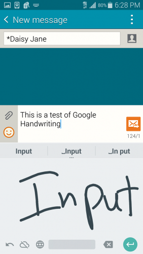
Google Handwriting Input demonstrates one of those forward steps: an app for your Android smartphone or tablet that replaces traditional QWERTY typing, speech to text, and Swype with the tip of your finger–or a stylus, if you’ve got one. However you use it, Handwriting Input is a welcome change of pace for those who find using a standard mobile keyboard to be a maddening challenge, or for those who think their usual input method is just getting boring.

The app is surprisingly adept at deciphering both printed words and cursive handwriting, even if said handwriting looks more like chicken scratch than any actual language. Once it’s downloaded, you have the option of selecting it as the default writing tool within your Android’s “Language and input” settings, alongside typical input methods like Google voice typing or your device’s downloaded keyboards.

Once selected, you can use Handwriting Input to write texts, compose emails, take notes, create Word documents, or perform just about any other application into which you insert text. Instead of the standard Google Keyboard, you’re given a blank space that’s just big enough to drag the tip of your finger or stylus across and scrawl out the words you want.The whole thing uses the same light grey and teal aesthetic as the regular keyboard by default, so the visual shift isn’t too jarring within the context of Lollipop.

You can have Handwriting Input translate your text in two ways. With its “auto selection” option turned on, the app will automatically jot down its best guess at whatever word you’ve written. With it off, the app presents you with a few scarily accurate suggestions, then lets you quickly convert them to typed text with a single tap. The tool supports 82 different languages at the moment, and, at least for English, we found it to be supremely capable in translating whatever scribbles we threw at it.

Google touts the app’s ability to recognize hand-drawn faces and convert them to emojis as well, but in our testing we had difficulty making that particular feature fly. That’s ultimately not a huge deal, but it does point to some potential bugs that have yet to be worked out.

Popping open Google Handwriting Input’s Settings menu gives you just a handful of options, the most useful of which are picking a different language and switching the writing pad between light and dark themes. There’s also the aforementioned auto selection control–which includes a slider for fine-tuning how quickly it translates your words to text–in addition to an option for sending your scribbled data to Google to help hone their algorithms.

Handwriting Input isn’t the kind of productivity app that’ll turn the professional world on its ear or cut your work time in half, but it’s a sign that language recognition continues to remain something of a priority for Google. This isn’t the first time the company pushed handwriting recognition, but it’s the most dedicated attempt it’s taken on Android. That can only be a good thing for this kind of tech. If nothing else, it’s all one more way to goof around with your phone. The app works on Android devices running version 4.0.3 and up, and is available now as a free download from Google Play.

The post Android App of the Week: Google Handwriting Input appeared first on Brighthand.com.

iPhone App of the Week: (The Updated) Dropbox

Dropbox isn’t new. The popular cloud storage service has been around for almost seven years now, which is just about an eternity in app years. But a recent update to its iOS app has brought a handful of productivity-oriented features that make the service a little bit more than just a simple locker for your files. We took the bulked-up Dropbox for a spin to see how so.

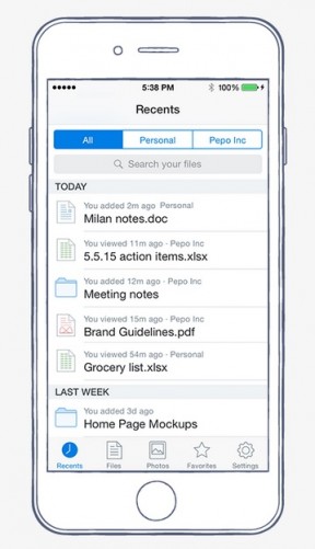
Dropbox for iOS Recents tab

Dropbox for iOS Recents tab

First off is the inclusion of a new tab called Recents, which replaces the traditional alphabetized list of items and with a quick and easy view of your most recently accessed files, placed in descending order by date. In practice, it serves as something of an evolving favorites list (though it doesn’t get rid of the traditional one) and makes navigating any heap of cloud files a little more convenient.

iOS users now also have the ability to leave comments on files, a la Google Drive. To add a comment, you just tap a dialogue bubble at the bottom right corner of your screen and begin typing. Comments can be kept strictly for private reference, or you can tag others with the usual @ symbol. Anyone you tag then receives an automatic email notification that includes a link to the file in question.

These “mentions” aren’t limited to existing Dropbox users, thankfully–you can bring other users into the fold, too, just by tagging their email address. When you do tag someone in a comment, they can then leave remarks of their own. You’ll receive email notifications in kind when an invited party does so, but if you’d rather not litter your inbox with notifications, you can turn those off by tapping the “Notify Me” icon at the top left corner of the Comments menu. This is as simple as it should be.

These aren’t the only ways Dropbox plans on making its app handier for work. According to the company’s official blog, you’ll be able to open Microsoft Office documents from inside the app itself sometime in the coming weeks. Tapping “Create New File” will launch whatever Office program you want, including Word, Excel or PowerPoint. Any changes you make will be automatically saved to your Dropbox cloud. The app currently lets you open Office files from your Dropbox in Office Online, but this would appear to be a much more integrated solution–not to mention a beefier way for the service to match the online productivity gains made by Google Docs and the like.

As for the upgrades available now, we found them to work seamlessly in testing; the light additions to the UI were just that, light. This is good, as the last thing anyone wants is to have to relearn to use an app they may rely on daily.

The new and improved Dropbox iOS app (version 3.9, officially) is available now as a free download from the App Store. It requires iOS 7.0. There’s been no word on when these changes will be coming to Android, but the new commenting feature is also currently available for the web version of the service.

The post iPhone App of the Week: (The Updated) Dropbox appeared first on Brighthand.com.

Logitech’s Keys-To-Go Is a Better Touch Cover for Android, iOS, and Windows

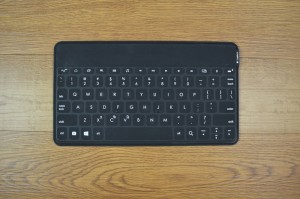
Logitech Keys-to-Go keyboard

Logitech Keys-to-Go Bluetooth keyboard

How do you make something as inherently portable as a Bluetooth keyboard even more convenient? According to Logitech’s Keys-To-Go, you detach it from any burdensome covers, give it an spill-resistant and easily cleanable finish, add a bunch of nifty device shortcuts, and make the whole thing really, really thin.

Indeed, the $70 board—which launched late last year as an iOS-tailored accessory but is now available in Android/Windows form—nails much of what it’s going for, but it also presents a few problems that naturally arise when a keyboard prioritizes portability above all else. We’ve been using the Keys-To-Go with a handful of phones and tablets for the past few weeks, so let’s explain what we mean.

The basic premise of the Keys-To-Go is to replicate the compactness of something like a Surface ‘Touch Cover’ without spoiling the tactile feedback of a traditional typing experience. If you judge it by that vision, it’s a success. It measures a tight 5.39 x 9.53 x 0.24 inches, and at 6.35 ounces, it never feels like something you’re lugging around.

Logitech Keys-to-Go keyboard

Logitech Keys-to-Go Bluetooth keyboard

That 0.24-inch mark is the key here—that’s an exceptionally slight number for an accessory like this. The whole thing isn’t full-size, but it’s wide enough to give each key a comfortable amount of room; we never found ourselves hitting too many buttons by accident. It looks most natural next to a full-size iPad or 10-inch Android tablet, but its wireless nature makes it work with smaller phone screens as well.

To obtain that level of thinness, the Keys-To-Go uses flattened keys that barely rise above the board’s surface. Again, it’s very much similar to the look of Microsoft’s Touch Covers—look at the device from the bottom edge and you’ll barely see anything jut out.

The difference is that these keys are, well, actual keys, not touchpads. There’s a give to them, and you don’t completely lose the fleeting sense of satisfaction that comes with physically clicking a button. There’s a pleasantly surprising feeling that comes with using this for the first time. If nothing else, it’s an impressive feat of engineering. It’s also extremely quiet, making it a little more useful for late-night or office sessions.

Logitech Keys-to-Go keyboard

Logitech Keys-to-Go Bluetooth keyboard

All of this is aided by the soft, felt-like material that covers the front of the device. Logitech calls it “FabricSkin,” and, goofy branding or not, it feels more pleasing against your fingers than typical hard plastic. It’s the kind of thing you’ll find yourself absentmindedly rubbing your hand across when you’re not using it, something that isn’t usually said when describing a keyboard. Our unit came in black, but red, teal, and navy blue options are also available, depending on which model you buy.

The fabric also comes with the big benefit of being spill-resistant, so you won’t have to worry about any liquid-related mishaps sending your text into a tailspin. Drop some water on the keys and it’ll just sit there in a blob until you wipe it off. Having pressed-down keys makes cleaning the Keys-To-Go a breeze, too—without any crevices between the buttons, there’s no room for random gunk to burrow into.

As mentioned above, the Keys-To-Go doesn’t come connected to a full-on cover, so you can use it wherever without having to sacrifice any phone or tablet stand you may already own and enjoy. It does come with an attachable one of its own, and that’s serviceable enough, although it can’t hold a phone or tablet in place as sturdily as a more dedicated contraption.

Logitech Keys-to-Go Bluetooth keyboard

Logitech Keys-to-Go Bluetooth keyboard

The front of the board is a familiar, no-frills affair, with the usual QWERTY setup joined by a number of shortcut keys tailored for either iOS or a combination of Android and Windows. We used the latter, which has buttons for returning to the home screen, bringing up the recent apps menu, opening your preferred email app, controlling music playback and volume, taking a screenshot, and checking the status of the keyboard’s battery and Bluetooth connection (via a small LED on the top bezel) in a row above the number keys. Towards the bottom of the device is a dedicated Windows key—which serves as a Google Search shortcut on Android but still looks awkward—and an in-app search key, along with quick options for copy, cut, and paste.

These shortcuts work as expected, save for the recent apps key, which automatically takes you to your last used app instead of displaying the usual list of open apps together. Most of them take up the spots typically occupied by the Fn keys, but the only worthwhile casualty there is the lack of a refresh button, which we missed while web browsing.

They also make it possible to navigate a fair amount of your phone or tablet without ever touching it, but since most apps are (naturally) tailored for touch, you’ll still wind up reaching out to access a particular menu every so often. That’s a strike against wireless mobile keyboards in general, but a minor one here, as you can largely use a browser, word processor, or email app (the things for which you’d want a keyboard in the first place) without having to move back and forth repeatedly.

Logitech Keys-to-Go keyboard

Logitech Keys-to-Go Bluetooth keyboard

The back of the Keys-To-Go is made up of unicolor matte rubber, which has enough grip to keep the device from wobbling around on a flat surface. It’s a little less stable in your lap, however: We ran into a consistent, albeit minor, bit of shaking when using it on our person. It’s not severe enough to ruin things, but it’s an annoyance worth noting, especially since Logitech is selling the device on its portability. Cosmetically, it’s just as simplistic as the front, with only a faint Logitech logo at its center.

The sides of the device are almost entirely barren, with just a small on/off switch and a micro-USB port near the top of its right edge. Don’t expect to use the latter too often: Logitech claims that the Keys-To-Go’s battery can last up to three months on a single charge. We didn’t have our test unit long enough to verify that claim, but we can say that the device showed no signs of slowing down after being used off and on for three and a half weeks.

Almost everything we’ve described thus far—the thin and wireless build, the flat yet clickable keys, the water-resistant fabric, the built-in shortcuts—exists to make the Keys-To-Go supremely portable. All these features serve their purpose well, and they all allow the device to bypass many of the annoyances typically involved with Bluetooth keyboards.

Logitech Keys-to-Go keyboard

Logitech Keys-to-Go Bluetooth keyboard

The problem is that “being supremely portable” shouldn’t be the primary goal of a keyboard in the first place. At least, it shouldn’t be to the extent that it is here. The softened keys have their benefits, but they come at the expense of truly comfortable travel and feedback. The fact that Logitech’s managed to give them some amount of give makes everything manageable, but they’re still an abridged version of the real thing. There’s a sense of uneasiness that comes with using the Keys-To-Go as a result, and it makes typing feel less like second nature. Too often we had to look down at our hands while typing in a way that’d be instinctual anywhere else.

The point of a keyboard is still to be something that easily facilitates typing—if you sacrifice too much in that direction to improve secondary concerns, those improvements are going to feel moot. In other words, using a keyboard this thin is great until you realize how little room it leaves to press things. The shallowness of the Keys-To-Go means that you have to hit everything with some solidity; hit the edges of certain keys in an attempt to type quickly and you’re likely to end up with a few missing letters. It’s something you can get used to over time, but applying a learning curve to something as basic as a keyboard feels like a step backwards, regardless of how nice that FabricSkin may feel.

Logitech Keys-to-Go keyboard

Logitech Keys-to-Go Bluetooth keyboard menu

These issues would be more digestible if the Keys-To-Go was any cheaper, but with a current retail price of $70, it’s a much harder sell. There are alternatives with far superior action that cost anywhere from $10 to $40 less, and while many of those come attached to a case, we don’t think that lack of flexibility is more annoying that the lessened typing experience here. It’s not like the majority of them are outright thick either.

The Keys-To-Go is a worthwhile choice for people who don’t necessarily use their mobile device to get work done, but still want something more responsive than a virtual keyboard when browsing the web or typing out the occasional email. It’s low-maintenance and convenient in many ways, and ultimately, whether or not you’ll like it will depend on what you want out of device like this. For us, it sacrifices too much typing comfort to get to those conveniences, and it costs too much to have that sort of problem. It’s a higher class of Touch Cover, but that’s only worth so much.

The post Logitech’s Keys-To-Go Is a Better Touch Cover for Android, iOS, and Windows appeared first on Brighthand.com.

Android App of the Week: Audvisor

Business advice isn’t exactly hard to come by, but professionals who are constantly on the run seldom have the time to sit still and take it in. Audvisor, a free new Android app, aims to solve that problem. Billed as delivering “sound advice from the world’s top experts in 3 minutes or less,” Audvisor is a lightweight platform through which you can listen to short speeches packed with useful information on a variety of business-related topics. Think of it like an enterprise version of the TED Talks app, sans video: part nuts and bolts, part inspiration, and wholly digestible in small chunks.

Audvisor app for Android

Audvisor app for Android

When you download Audvisor, you’re greeted with a quick tutorial that’s largely unnecessary, given how straightforward navigating the app actually is. Just swipe left or right to page between insights, or use the menu icon to search for audio clips by topic or speaker.

There are numerous topics available to peruse, with speeches on everything from sales tips to building better professional relationships to using social media more efficiently. The lengthy and searchable roster of contributing experts features plenty of names that are big in their respective fields, including Guy Kawasaki and Seth Godin. The utility of these speeches will vary depending on what you’re looking for, but the ones we listened to generally felt composed and insightful. They did a good job of getting a point across in their limited time frame.

Audvisor isn’t just a repository of collected audio clips, though. You can also personalize it to create a catered feed that brings you only the speakers and topics you want to hear about. Tapping on the previewed topic or speaker sections lets you establish your preferences, which then allows the app to populate a list of recommendations. You can also favorite talks yourself. If you’re not quite sure where to begin, though, the app comes with a shuffle mode as well.

The audio quality of these talks is generally very high, though a few inferior recordings managed to sneak their way in every now and again. Still, nothing was so bad as to be unlistenable. Playback controls are easy to figure out as well, with your basic play/pause and skip buttons, the latter of which lets you jump ahead or backwards 15 seconds at a time. Thankfully, you don’t need to stay within the actual app to continue listening to the talks, so you can get things done while you listen to tips about getting things done. Naturally, there’s Facebook and Twitter integration too, allowing you to share particularly inspiring recordings with your friends and followers with just one tap.

We discovered a couple of imperfections with Audvisor in testing, the most annoying of which being the lack of a proper exit function once you’re done with the app. In order to close it, you have to back out entirely and access your task manager to fully remove it from your notifications window. Audio playback also proved to occasionally take on a will of its own, launching playback automatically instead of requiring you to tap the play button to begin. These are minor complaints, however, especially considering this is (thus far) an ad-free application.

According to Audvisor (the developer), all of the app’s audio segments are exclusively produced for Audvisor, with new entries to be added on a regular basis. Currently, there are around 1000 audio clips from some 100 thought leaders, and the company says it’s working on a pro version that will give paying users access to a full library of audio. Audvisor requires Android 4.1 and up and can be downloaded for free from Google Play. It’s also available for iOS devices.

The post Android App of the Week: Audvisor appeared first on Brighthand.com.

Windows Phone Home: Breaking Down Microsoft’s App Problem

Windows Phone has been plagued with many problems over the years—its lack of an obvious flagship like the iPhone or Galaxy S, its miniscule third-party OEM support, or just the fact that it tried joining the market after the Android-iOS reign had already begun to take shape—but the most immediate issue facing any user of Microsoft’s mobile OS remains the general shoddiness of its app selection.

Windows Phone 8.1 home screen

Windows Phone 8.1 home screen

It’s a strange world where Microsoft—with various antitrust cases not far off in its rearview—can be considered an underdog, but such is the state of a smartphone industry where close to 95% of people are centralized in two controlling powers. Regardless of how comfortable we may be without our smartphones today, there is danger in getting too comfortable with a duopoly, and Microsoft still stands in the best position to provide some sort of competition.

Its OS, Windows Phone 8.1, is genuinely unique, with a clean, easy-to-use interface and a growing feature set that’s at least competitive with its two larger rivals. Many of those who use it like it. Many of those who’d give it a chance probably would like it. It just needs the apps to convince anyone to give it that chance.

Still, saying “it just needs the apps” sells the extent of Windows Phone’s dilemma short. Microsoft has made strides to get more developers onto its system, but sheer numbers have only been a minor part of its problem. Things could all change with the forthcoming Windows 10 update and its “universal apps” initiative, but for now, the issue is more multi-faceted.

To show you what we mean, let’s take a look at five of the most recognizable apps that Windows Phone still lacks. With each one, we’ll glean a different angle to the app woes that are helping to keep Microsoft from being a competitive alternative to the dual kingdoms currently in place.

Snapchat and the Chicken/Egg Problem

The saga of Snapchat and Windows Phone has been well-documented, but it probably best exemplifies the basic chicken and egg problem at the heart of the Microsoft’s mobile endeavors. The video/picture messaging app is one of the highest-profile programs to outright ignore Microsoft’s platform, mostly because it doesn’t feel like it has to, thanks to Windows Phone’s small market share (roughly 3% worldwide, per IDC). This is a case where Microsoft really isn’t even at fault—it’d probably love to have Snapchat onboard, but it doesn’t have enough leverage when developers don’t need it to succeed.

So we get a situation where a big company doesn’t want to build for Windows Phone because it’s unpopular, which in turn keeps Windows Phone unpopular, which in turn helps keep some developers from building for it, and on and on and on. Snapchat’s version of that cycle is particularly stinging for Windows Phone users, because it’s blocked any third-party alternatives (including WP developer Rudy Huyn’s popular 6Snap) for apparent security issues.

YouTube and the Third-Party Alternative Problem

Windows Phone 8.1 app store

Windows Phone 8.1 app store

Speaking of third-party alternatives to culturally significant apps you can use without a hassle on Android and iOS, YouTube is another app that isn’t available on Windows Phone. At least, not officially. Forget for a second that YouTube is run by Google—we’ll get to that bag of worms in a bit. The more pressing problem highlighted by YouTube’s absence is the number of shoddy, sometimes barely functional clones that have spawned in its wake.

The lack of key partnerships has led Windows Phone to rely on these sort of alternatives to widely-used programs, and while it’s not impossible for them to be great (the aforementioned Huyn is an example of someone who usually gets them right), more often than not they’re inferior by comparison, and come with a higher risk of breaking or losing support down the road. How could they not be?

It’s not just one or two of these things either—searching for something like YouTube on the OS returns a flood of knock-offs, all vaguely described in the hopes of being downloaded, each one more bumbling than the last. Android can have this problem too, but it usually winds up giving you the app you want. Windows Phone is not a minor league OS, but it certainly feels like one when you see some of the messes its lacking app store has caused.

Twitter and the Dead App Problem

Windows Phone has a Twitter app, which you can download and use and delete as you see fit. But it doesn’t have the Twitter app, the updated, more heavily-featured one that Android and iOS users have been treated to for the past few months. That version is more consistent with the full-on Twitter website, supports GIFs, lets you create and check lists, comes with dedicated sections for certain special events, and generally runs smoother than its Windows Phone counterpart.

This is the “dead app” problem, in which developers put updating the Windows Phone versions of their apps on the tail end of the backburner because they figure not enough people are using them. Twitter is far from the only popular app to do this, too—Bank of America, for instance, recently killed off any support for its Windows Phone variant, outright telling users to “just go to” its mobile website instead. Instagram, Vine, LinkedIn, and others have had their moments as well.

Windows Phone 8.1 Twitter app

Windows Phone 8.1 Twitter app

This is one issue that could feasibly be solved by Windows 10’s universal apps solution, because Windows PCs are treated with more respect than their mobile counterparts. For now, though, it demonstrates how Windows Phone’s apps conundrum doesn’t solely come down to what it doesn’t have.

The Gaming Problem

Instead of naming one particular hit game Windows Phone is missing, it’s more accurate to just cite the category as a whole. Few companies have had the kind of success in the living room that Microsoft has had with its Xbox consoles, but when it comes to mobile gaming, Windows Phone is a wasteland.

You’re just not going to find things like Threes!, Superbrothers: Sword & Sworcery, or Kim Kardashian: Hollywood on Microsoft’s OS; if you do, it’s usually going to come months or possibly years after they launch for Android and iOS. These kinds of games routinely top the “most downloaded” charts on Google Play and the App Store, so it goes without saying that their absence here is a big loss, both for Windows Phone users and Windows Phone itself.

More importantly, you’re far less likely to find the next hit game on Windows Phone—similar to how you’re far less likely to find the next Tinder or Uber or Meerkat or any other would-be hit from a smaller startup. We single out gaming here because it’s particularly flush with independent studios, but if the companies with cash can find little incentive to create for Microsoft, it’s hard to imagine the ones without it doing any different. There’s a feeling of hopelessness that permeates the experience of owning a Windows Phone in that sense, and it’s strong enough to keep people from ever wanting to jump onboard.

Microsoft has taken some steps towards making developing for Windows Phone less of an involved process, but it must continue to realize that very few people will go out of their way to make something specifically for its struggling platform. It needs to try to level the playing field, then use Windows Phone to accentuate its particular reach and strengths.

Windows Phone 8.1 app store

Windows Phone 8.1 app store games

For all intents and purposes, the Redmond company understands this. And again, its universal apps strategy could prove especially fruitful when it comes to gaming, since it doesn’t need to do nearly as much convincing to get studios to create for Windows PCs or the Xbox One. Earlier this year, the company noted that Windows 10 would allow for Xbox One games to be streamed on Windows 10 computers or tablets, but if it can get those sort of console experiences over to phones (or get developers to carry them over smoothly), it could give Windows Phone a noticeable boost with the game-loving crowd.

Gmail and the Google Problem

Because this is Windows Phone, we’re not going to end on hope and promise. Instead, we’ll turn to something that doesn’t have a possible resolution on the horizon: Windows Phone’s relationship, or lack thereof, with Google.

It’s the simplest of all the issues here, and it’s another one that’s been plenty harped on by now: There are no official Google apps on Microsoft’s mobile OS. Gmail is the most used email service in the world, Chrome is its most popular browser, YouTube provides the fodder for so much of popular culture’s conversations, Google Maps guides millions every day—and they’re all nowhere to be found. This is despite the fact that they’re all on iOS, and the fact that Microsoft has ported a handful of its big-name programs over to Android.

It’s that last thing that gives off the greatest sense that, at the very least, it might be a long time before Windows Phone has a chance of ever getting on the same level as Android or iOS. It’s not dumb of Microsoft to say, “If you can’t beat them, join them,” but it’s the kind of thing that can alienate the people who’ve already committed themselves to the company’s OS. Microsoft has gained some momentum in recent months, and Windows 10 may spark a rejuvenation of its mobile efforts, but as it stands today, we’re entrenched in a system where your choices are effectively limited.

The post Windows Phone Home: Breaking Down Microsoft’s App Problem appeared first on Brighthand.com.

Huawei P8 Hands-on Preview

Huawei revealed its latest flagship smartphone, the P8, at an event in London this week, and we were on hand to give it a whirl. Keeping up with what appears to be the leading trends of this year’s Android phones, the Chinese firm improved the craftsmanship and camera with this new device, alongside the expected incremental gains over last year’s Ascend P7 with regard to its display, chipset, battery, and the like.

Huawei P8

Huawei P8

More specifically, the P8 comes has a full aluminum unibody (losing its predecessor’s glass back cover) and is equipped with a 5.2-inch 1080p display. Internally, it features Huawei’s own octa-core Kirin 930 SoC, aided by 3 GB of RAM and 16 GB of memory storage, the latter of which is expandable with microSD cards. (A 64 GB model will also be available.) The device also carries a 2680mAh battery, a 13-megapixel rear-facing camera with optical stabilization, and an 8-megapixel selfie camera.

Huawei has proven itself capable of producing phones that rival the quality of more established players in recent years, and P8 does nothing to dispel that idea at first glance. Its aluminum body feels exceptionally elegant in the hand, and actually comes off as lighter than its stated weight of 144 grams suggests. The phone is just 6.4 millimeters thick, a hair thinner than the already-slim Ascend P7, and its strict, squared shape feels cool and solid, although its lack of curves makes it less ergonomic than some of its competitors. Still, despite the sharp edges, it doesn’t feel particularly uncomfortable or awkward in practice. In fact, its display-to-surface ratio is nearly 80 percent, so it isn’t too tough to use that large display with one hand.

Huawei P8 back

Huawei P8 back

The P8’s design language mostly follows in the footsteps of the Ascend P7, which followed the Ascend P6 before it. Those phones weren’t too shy about their aesthetic similarities to various Other bits and pieces recall the HTC One and Samsung Galaxy S6, but everyone borrows from everybody in the smartphone industry, and if it all results in hardware as pleasing as the P8’s, that’s a good thing.

Apart from the design, Huawei has put most of its energy into the P8’s camera. The company says that its OIS-enabled lens can rotate up to 1.6 degrees, allegedly twice as much as the OIS of the iPhone 6 Plus, theoretically allowing it to handle greater bumps and general instability without bringing more noise into a given photo. Additionally, Huawei says the P8’s camera is the first to feature a four-color RGBW (Red-Green-Blue-White) sensor matrix, making it possible to gather more light and provide more accurate contrast (again, theoretically).

All told, Huawei hopes this will all enable the P8 to take clear and detailed shots in poorly lit conditions. And indeed, after briefly testing the shooter out in various lighting conditions, the results appear to be promising, virtually on the level of most top-class flagship cameras. We’ll dig deeper in our full review, but so far, the only noticeable shortcoming we came across was some trouble focusing on darker objects against a brighter background. (And even then, that’s not a totally uncommon problem for these kind of cameras.) Going back around the device, the P8 supports dual SIM cards, which is convenient. Doing so prevents you from using a microSD card, however, as there are only two slots for the two cards.

Huawei P8 side

Huawei P8 side

The P8’s 5.2-inch Full HD display also looked good during our demo. Its pixel density of 424 ppi means it’s plenty sharp, and because it’s an IPS panel, it comes with high-quality contrast and wide viewing angles. It tends to place more emphasis on darker and colder colors, making blacks more prominent than whites, but in general tones are well saturated.

The same thing goes for the device’s software and performance, at least based to our brief hands-on session. It runs Android 5.0.2 (Lollipop) underneath Huawei’s Emotion UI 3.0 skin, which doesn’t stray far from its earlier iterations. It still uses an iOS-esque look that eschews any app drawers in favor of placing your apps across various home screens. As far as Android skins go, it’s a rather dramatic alteration, but it’s been easy to use and sufficiently smooth in the past.

Huawei’s eight-core Kirin 930 chipset played nicely with the company’s UI, smoothly performing all tasks we tried. Part of that is probably aided by the relatively undemanding (by today’s standards) 1080p resolution and the generous 3 GB of RAM.

Huawei P8 bottom

Huawei P8 bottom

Perhaps the biggest selling point of the P8 is its price: As it did with the Ascend P7, Huawei will try to undercut its competition by starting the phone at €499 (or about $530 or £360), around €100 to €150 less than most other flagships. The aforementioned 64 GB storage option costs €100 more.

The phone will go on sale in over 30 countries throughout Asia, Europe, and South America in a few weeks, with a release for other countries sometime in May. Huawei hasn’t provided any specific plans to sell the P8 in the US, but it did note that a variant of the phone will launch stateside in the couple of months. A massive 6.8-inch version of the phone titled the P8 Max was announced during the event as well, and that phablet will start at €549.

The post Huawei P8 Hands-on Preview appeared first on Brighthand.com.