Kodak IM5 Hands-on Preview: Keeping It Simple

Kodak, with the help of UK phone manufacturer Bullitt, is trying to make a smartphone for people who don’t use smartphones. The Kodak Instamatic 5 won’t be the first device with that ambition, but it will be one of the first to wear the name of a brand many smartphone neophytes recognize from their youth. In other words, Kodak is aiming for older folk – and the young children they may watch over – who presumably still use feature phones, by giving them a device that lets them jump into the smartphone world without dealing with the perceived complexities of a modern smartphone UI. We took it for a spin at CES last week.

Kodak IM5

Kodak IM5

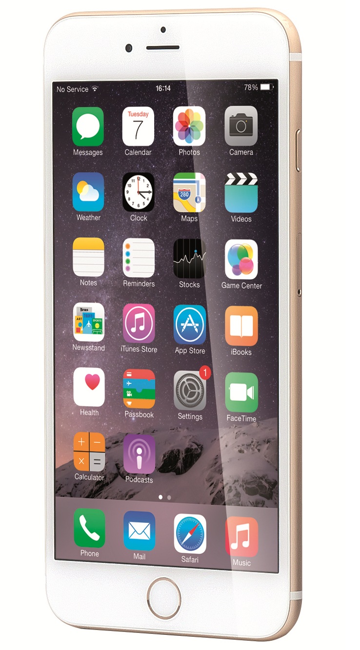
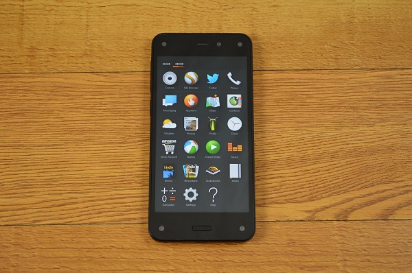
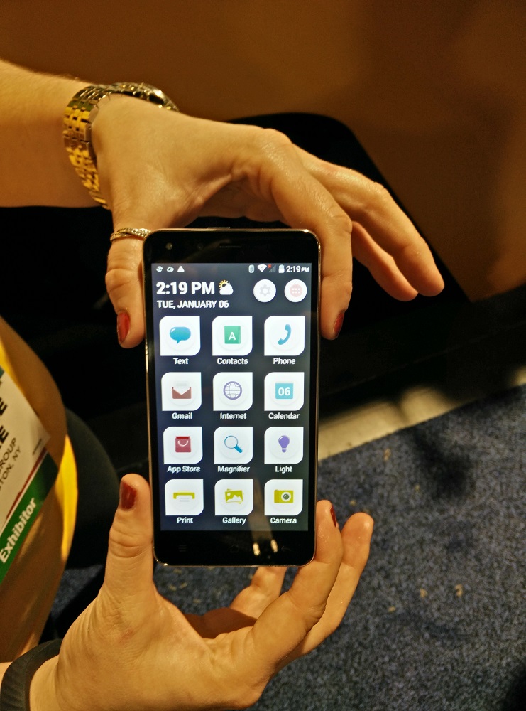
Kodak’s philosophy manifests itself in the IM5 in two core ways, neither of which will be appealing to those who follow the mobile industry. First, its launcher is dead simple, more or less looking like a blown-up version of your typical dumbphone’s UI. The 12 icons that make up the lone home screen are huge, as are the various programs in its app drawer. Ordinary tasks like texting, emailing, and using the camera are front and center, along with other basics like the flashlight, magnifier, and shortcut to use Kodak’s printing service. If you need any more evidence that the IM5 isn’t made for the tech savvy, look no further.

All of this runs over Android 4.4.2 at the moment, but Bullitt says it’ll be upgraded to Android 5.0 Lollipop when the IM5 launches. Full access to the Google Play store is included, but is stuck within the app drawer. Instead, the home screen points you to a Kodak-made app store that Bullitt reps weren’t willing to detail other than saying that it’ll include “apps tailored to your interests.” (Its icon took us to Google Play on our early demo unit.) Whether that means Kodak will curate the store itself or that it’ll give more personalized recommendations based on your usage still isn’t clear.

This interface isn’t pretty, and not nearly as flexible as regular Android – we weren’t able to move an app from the app drawer to the home screen on our demo unit, for instance – but it’s painfully simple to read, which is the point. Its lock screen can display a pretty looking collage of your gallery’s photos, and Bullitt reps detailed an ability to have a friend remotely control the device on a PC or tablet if you’re having trouble (like a more personal version of Amazon’s “Mayday” feature), but extra software tricks are otherwise kept to a minimum. The stock camera app is particularly sparse, only auto-focusing on its own and offering very few editing options after you take a shot. It does, however, offer another shortcut to print your photos.

Kodak IM5

Kodak IM5

The one complaint we have about all of this is that its simplification pretty much begins and ends with the reworked launcher. The settings menu and notification shade are the same as they are on any other KitKat device, and most of the apps on the home screen are the same stock Google programs you could find anywhere else. The latter issue is likely contractually obligated given that this is an Android phone, but it means that anyone who’d be confused about using such software on a regular Android phone will probably still be puzzled here. It also makes the UI aesthetically inconsistent.

Bullitt says that you’ll be able to use the stock Lollipop launcher when the IM5 hits the market, but you probably won’t want to given how underpowered the phone appears to be. We’re still a couple months away from launch, so we can’t critique the general sluggishness of our demo unit too harshly. We can say that the IM5 will run on an octa-core 1.7 GHz MediaTek MT6592 chipset and 1 GB of RAM, though, a combo that doesn’t sound very promising on paper. The same goes for its 2150 mAh battery and 8 GB of included storage, though Kodak says the latter can be upgraded by 32 GB through microSD.

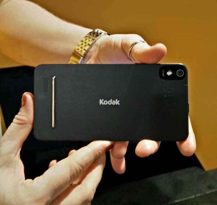
This worry applies to the IM5’s display and camera as well. The former is a 5-inch, 720p panel that came off as too grainy on our demo unit. It was just okay, with average coloring and unspectacular viewing angles. As for the device’s 13-megapixel main camera and 5-megapixel front shooter, both were serviceable, but neither were anything beyond decent. Moving objects blurred a bit, and brighter colors washed out more easily than they should. Despite the name on its backside, Bullitt reps were clear that this is not a “camera phone,” and that’s true.

Kodak IM5

Kodak IM5

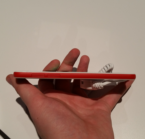
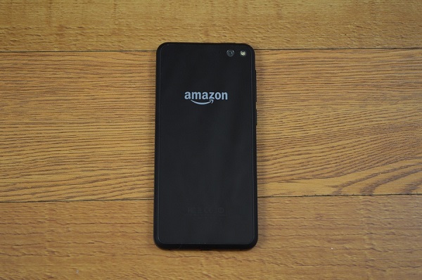
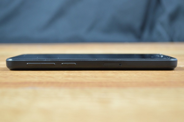
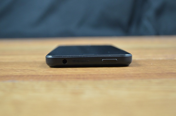
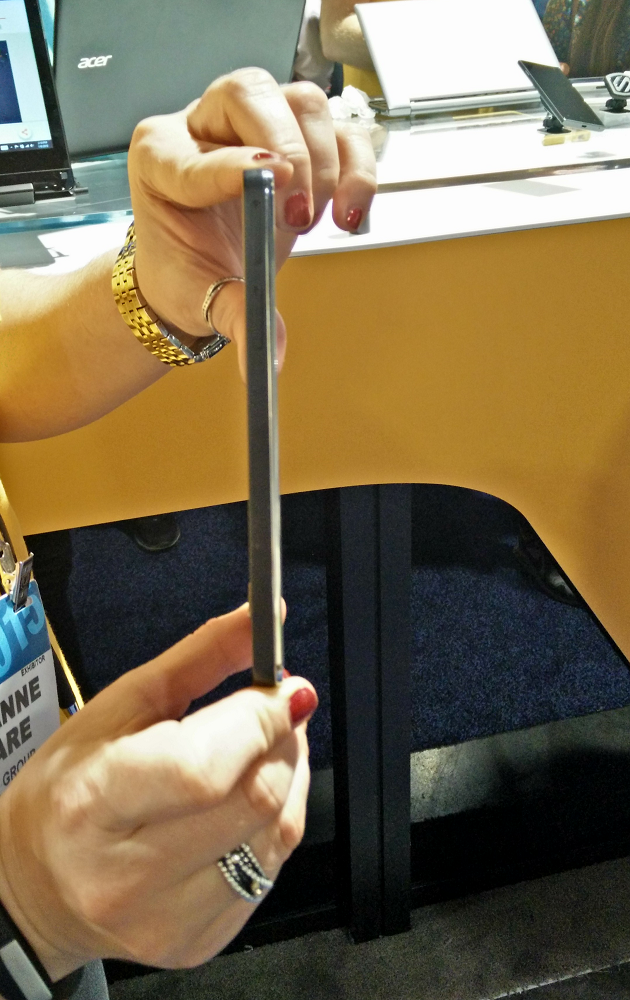
The IM5’s build isn’t anything to drool over, but it is wonderfully light at 120 grams. It’s a plain black rectangle, for the most part, unimaginative yet not garish. Its bezels are nicely slim, the logo and camera on its back are understated, and the chrome trim around its edges lends a smidge of liveliness to the whole thing. It’s handsome for a budget device, but it still feels like its price when held in the hand. It’s made of flimsy plastic all the way around, with cheapish buttons and not-so-thin sides. Bullitt’s also put the power button on the top of the phone, which is always inconvenient. But it’s easy enough to hold.

Kodak and Bullitt say that they’re aiming to launch the IM5 in Europe sometime during the first quarter. It’ll make its way to the US sometime after that. As its specs and build materials would suggest, it’s going to be inexpensive: €229 or $250 without a contract. There’s no word yet on carrier involvement, but the IM5 does support dual-SIM, and Bullitt reps say that it should work on CDMA networks. (It isn’t likely to feature LTE, though.) They also tell us that this is meant to be a start for these sorts of devices, with a Kodak-branded tablet planned for later in the year.

While we like the idea of a super user-friendly smartphone designed for anyone who can’t get their head around today’s tech, we’re not yet sure if the IM5 will provide enough incentive for baby boomers to leave their dumbphones behind. Either way, it shouldn’t be one for the phone geeks. We’ll save any other final judgments for our full review.

The post Kodak IM5 Hands-on Preview: Keeping It Simple appeared first on Brighthand.com.

ZTE Grand X Max+ Hands-On: Bigger and Better?

Phablets are the new black these days, and ZTE hopes to further the big-screened craze with its Grand X Max+. The 6-inch device, which ZTE dubs the “next-generation version” of last year’s Grand X Max, is coming exclusively to US prepaid outfit Cricket Wireless on January 9, for an affordable $200 off contract. We were able to get our hands on the phone shortly after it was announced at CES this week.

Given that its name has three separate synonyms for the word “big,” it shouldn’t be surprising to hear that the Grand X Max+ is a large smartphone. Or rather, still a large smartphone, as it more or less shares the same mostly rectangular build as its predecessor. Its 6-inch screen is sizable even when compared to most other phablets, and the body that houses it is rather thick, so it’s never going to be totally usable with one hand.

The ZTE Grand X Max+

The ZTE Grand X Max+

However, we’ve said before that’s not the worst thing in the world, and the Grand X Max+’s design doesn’t feel as overwhelming as its screen size would suggest when held in the hand. That’s mostly due to how light the whole thing is. At 171.8g, it’s not petite, but it’s not as much of a burden to carry around as a Galaxy Note 4 or iPhone 6 Plus.

Part of that comes down to the cheap-feeling plastic that makes up much of the device, but for $200 it’s not overwhelmingly offensive. The look here is plain but clean, and the glass panel on the back, while something of a fingerprint magnet, lends some semblance of a higher-quality feel. We also approve of the rounded top and bottom edges, as they help the phone come off as a little less like your everyday black slab.

The Grand X Max+ has seen some upgrades on the spec sheet, though they’re mostly modest. It now runs on a 1.2 GHz quad-core Snapdragon 400 chipset alongside 2 GB of RAM, which is fair enough for a phone of its price. We didn’t notice any major issues scrolling through the OS or opening up apps, but it’s definitely not something we’d call fast either. It’s still a $200 phone, just

Outside of that, the device now comes with 16 GB of internal storage (up from 8 GB), with up to 32 GB addable through a microSD slot, as well a 3,200 mAh battery. The latter sounds fine on paper, but ZTE’s only promised 6.5 hours of talk time, which is strangely low. The company says it’ll feature Qualcomm’s rapid charging tech as well, however.

The software setup is the same as before, with ZTE’s inoffensive but somewhat boring skin sitting over the slightly outdated Android 4.4.4 KitKat. It doesn’t mess much with the basic usability of the OS, but it doesn’t add much either, and it’s got a rather generic aesthetic. Our demo unit was also loaded up with a fair amount of bloatware, which is unfortunately common amongst carrier exclusives like this.

The 6-inch elephant in the room is still in the Grand X Max+’s display. It’s spacious, and ZTE’s done a good job surrounding it with nicely thin bezels, but it’s only 720p. That’s only good for a pixel density of 245 ppi, which is pretty rough. It’s understandable if ZTE felt it couldn’t meet that $200 price point with a 1080p panel, but there doesn’t seem to be much point in the display being 6 inches (instead of even 5.5) if the only thing that size is going to do is make the screen grainier and make the body less convenient to hold.

The back of the ZTE Grand X Max+

The back of the ZTE Grand X Max+

Inexpensive phones like the Moto G get away with this explicitly because they’re smaller; it’s a harder sell when something this big tries to make the same sacrifices. The panel looked decent enough during our demo, with serviceable contrast and solid brightness, but viewing angles were subpar, and the lack of sharpness hung over the whole experience. If we want to be positive about it, the low resolution should ensure at least decent battery life.

In any case, the “+” part of the Grand X Max+ derives from two welcome upgrades. One is that the phone now supports LTE — the previous model was HSPA+ only — which is always great to see at a price this low. The other boost comes to the cameras, which have gone from 8- and 1-megapixels on the Grand X Max to 13- and 5-megapixels here. We found both new cams to wash out bright colors a little bit, but on the whole their performance was much better than usual for a device this cheap. The front camera seemed particularly admirable, with a good eye for detail and a wide-angle lens capable of capturing lots of space in each shot.

ZTE wouldn’t confirm or deny whether the Grand X Max+’s arrival will boot the original Grand X Max from the market or lower its price tag even further, but either way, the former looks to be a respectable midrange device. It’s not premium, and it’ll be hard to justify its massive size when its display resolution only meets the minimum, but those who want the other benefits a phablet can provide and prioritize price above all else should find enough to like here.

The post ZTE Grand X Max+ Hands-On: Bigger and Better? appeared first on Brighthand.com.

LG G Flex 2 Hands-on Preview: Curved, Because Why Not

There aren’t many phones like LG’s G Flex 2. Formally introduced at this year’s CES, the Korean firm’s latest mobile device keeps the original G Flex’s weird banana-like curves, but compliments that idiosyncrasy with a phone that feels noticeably more stable across the board. It still doesn’t make an immediately compelling case for why it needs to be bent in the first place, but it’s at least easier to accept that when most of the phone is so high end.

LG G Flex 2

LG G Flex 2

That said, the G Flex line is always going to be defined by its truly weird shape, if only because very few devices share its form factor. Like its predecessor, the G Flex 2 is curved inwards from top to bottom. The effect is a little less dramatic than it was on the original, and because the display has shrunk from an unwieldy 6 inches down to a more reasonable 5.5, this year’s version is much less of a hassle to use for everyday tasks.

On paper, the point of the bend is to make the phone feel more natural when held up to your face, and to provide a more “immersive” experience when looking at its big display head on. In practice, it makes the device feel like a fancier LG G Vista. It’s a marvelous piece of mobile design, for sure, but many of the things it appears to excel at could very well exist without the bend being there.

Yes, the way it contours around your cheek when taking a call is neat, but that wasn’t much of a pressing problem for phones to begin with. That it makes the device more difficult to view from the sides, and that it makes the phone harder to use with one hand compared to other phablets, doesn’t help LG’s case.

Neither does the polymer that makes up much of the G Flex’s back. It’s a glossy plastic straight out of the Galaxy S III era, and though it’s got the same weaved aesthetic (and wonderful rear-mounted buttons) as the flagship LG G3, it doesn’t feel much better than all the slimy phones we complained about three years ago. It’s also a bit thicker (9.4mm) than we’d want a higher-end device to be – again, it’s more G Vista than G3 — though one benefit of the plastic is that it also makes the phablet noticeably light (152g) in the hand.

Besides the bend, the other hook here is that the G Flex is more durable than the usual media consumption device. LG says it’s fused the Gorilla Glass on the front with a special chemical treatment to make it 20 percent more durable than usual, while the rear of the device is still capable of “self-healing” from light scuffs.

All of that does appear to have a positive effect: We were able to bang and knock the phone around without any consequence, and the back did indeed wipe away a few minor scratches from our keys within seconds. We do mean minor, though, as heavier markings are still capable of permanently scarring the machine. None of this requires that the phone be shaped like a banana, but it’s still a gimmick that should make you feel at least a little more comfortable using the device.

LG G Flex 2

LG G Flex 2

Questionable design aside, the rest of the G Flex 2 brings some noticeable spec bumps over last year’s model. The G Flex’s painful 720p display has been replaced with a 1080p panel, for one, which looked plenty solid in our short time with the device. It was sharp, coloring was comparable to that of the G3’s display, and viewing angles were fine when the bent sides weren’t totally in the way. One area to look out for is how it looks in low brightness settings – that was an issue for the original G Flex, and LG strangely locked its demo units from going below a certain brightness point during the show.

Internally, the G Flex 2 is the first of what will be many phones to run Qualcomm’s latest Snapdragon 810 chipset. That’s complimented with 2 GB of RAM and either 16 or 32 GB of internal storage, which can be upgraded with up to a whopping 2 TB of extra space through microSD. The iffy camera of last year’s model has been replaced with what’s essentially the same 13-megapixel shooter of the G3, which should be a good thing, while a 3,000mAh battery should provide the usual longevity we’ve come to expect from today’s phablets. LG claims that battery will be able to get up to halfway charged in under 40 minutes as well.

We’ll hold off on making any final judgments until we’ve spent more time with it, but the G Flex 2 should at least be able to compare to most other high-end phones on the market. It didn’t feel any faster than what we’ve seen from recent flagships during our demo, but we’re still a few weeks away from launch, and what was there was more than serviceable. It’ll be hard for it to go wrong with that kind of power onboard.

On the software side, we’re looking at Android 5.0 over what’s pretty much the same skin LG used with the G3. That, again, should be fine. The one noticeable upgrade comes with the addition of a “glance view” mode, which lets you swipe down from the top of the screen while the phone is asleep to peek at the time and notifications bar. This took a few tries to work in our preview, but it’s a nifty enough way to check for alerts without diving too deeply into the device.

LG deserves praise for pushing a something that’s genuinely weird in today’s worryingly homogenous mobile world, but without an obvious incentive for using a curved phone, it’s hard to say what will make the G Flex 2 more useful than the inevitable LG G4. This is especially the case given that LG plans to sell the phone at a flagship price — though it wouldn’t give us any specifics — despite the all-plastic build. If you’re determined to be different, though, LG will begin selling the G Flex 2 in its native Korea later this month, with AT&T, Sprint, and US Cellular to sell it in the States sometime thereafter.

The post LG G Flex 2 Hands-on Preview: Curved, Because Why Not appeared first on Brighthand.com.

Don’t Fear the Phablet: 5 Reasons to Make Your Next Phone a Big One

Phablet. It’s a funny word, isn’t it? Like a demon spawn from buzzword hell. Today, though, big is normal. The flagships we called huge just two years ago are now considered “compact” versions of their evolved, larger selves, and devices that straddle the line between traditional smartphone and small tablet are more en vogue than ever with popular phone makers. Now that Apple – the purveyor of mainstream tech taste in America, for better or worse – has followed the trend with its iPhone 6 Plus, more people than ever are seriously considering a large-screened smartphone as their next daily driver.

Apple iPhone 6 Plus

Apple iPhone 6 Plus

But with that consideration comes increased skepticism. “Aren’t these things just too big?” a prospective phablet buyer may ask. And for some, they may well be — they’re never going to fit too snugly in your pants pocket. For the most part, though, we think anyone who is looking to upgrade to a higher-end phone over end of the year period shouldn’t talk themselves out of the phablet discussion. Here’s why.

1. More comfortable media

Generally, the best aspect of any phablet is also the thing that makes it a “phablet” in the first place: its mammoth screen. We usually put anything with a 5.5-inch display or bigger into the phablet category, and while the extra half-inch or so it adds to a standard flagship’s screen doesn’t sound like much on paper, it makes a noticeable difference in practice.

Watching a movie or playing a game on a larger 1080p (or higher) smartphone screen is simply more luxurious than watching it on a smaller one. It’s like how viewing a bigger HDTV is more comfortable and engrossing than hunching over a littler one; multimedia just has more room to breathe on these things, and you don’t get that mental barrier of “I’m watching this the wrong way” as much as you would with a slightly smaller screen as a result. With games, you also have more space to navigate any onscreen controls. You can simply enjoy your stuff.

The idea is to give you the best of both worlds, phone and tablet, and the best phablets do this spectacularly. Devices like the Google Nexus 6 and Samsung Galaxy Note 4 have gorgeous, probably too sharp quad HD (2560 x 1440) displays, but are easy enough to throw in a coat pocket or carry around with one hand. Taking in media on a high-end TV or laptop screen still looks better, but for those instances where you’d normally use a smaller smartphone or more unwieldy tablet – say, a cramped flight — a good phablet finds the sweet spot between quality and convenience.

2. Better battery life

Google Nexus 6

Google Nexus 6

It’s not a universal thing, but most popular phablets keep those big screens going by packing in batteries that make the most of the room provided by their larger chassis. Battery life is one of the few aspects of today’s smartphones where there’s obvious room for improvement, but with handsets like the OnePlus One and the aforementioned iPhone 6 Plus, it’s not uncommon to get through the majority of two days off of a single charge. This is one instance where phablets’ propensity for overkill works to your advantage; unless you’ve been totally careless, you rarely need to worry about making it through the end of the day with a phablet in tow. They’re a step forward for mobile tech in that way.

3. Frustration-free typing

Typos are right alongside taxes and paper cuts on the list of “Things Nobody Likes,” but the wide body of a phablet makes it far less likely to fudge up your texts. The keys on a phablet’s virtual keyboard are naturally fatter and wider, which greatly lowers the chance of you asking your friends “wgata ip” instead of “what’s up.” Normal smartphones make typing difficult for those with large hands or chubby fingers, but with a phablet, everyone can avoid that frustration.

4. Less device clutter

As we said above, the best phablets successfully bridge the gap between the convenience of a phone and the luxuriousness of a tablet. So for those who don’t want to (or can’t) burn the cash to get both types of devices, a phablet can actually represent good value. Yes, on their own, they’re quite expensive – the Note 4 and iPhone 6 Plus cost an extra $100 down on contract compared to their smaller counterparts – but a good phablet makes a good tablet far more redundant than a good smartphone does.

Huawei Ascend Mate7

Huawei Ascend Mate7

Now, if you’d rather your tablet be a more work-oriented tool like a Surface Pro, today’s phablets aren’t going to replicate that kind of heavy duty functionality just yet. They’re still far closer to smartphones than laptops. But it’s harder to use something like a Nexus 7 or iPad mini, tablets that can get work done but are more oriented towards casual consumption, if you have a Nexus 6 or iPhone 6 Plus already. It’s not a 1:1 replacement, but because phablets are more accommodating to extended web browsing, gaming, and simple work tasks (like emailing and note taking) than a smaller smartphone, they can lessen the need to buy more stuff, which is always nice.

5. What’s your other hand doing anyways?

The biggest knock against phablets is that they’re difficult to use comfortably with one hand. We won’t deny that – trying to type with one thumb on a 6-inch screen like that of Huawei Ascend Mate7 only leads to repeatedly dropping the device. If we’re being completely honest with ourselves, however, the amount of time per day where we only have one hand free is pretty slim. Those instances where the need is genuine usually aren’t the best times to be staring into a smartphone screen either.

Samsung Galaxy Note 4

Samsung Galaxy Note 4

There have been countless books and articles written on the idea that people aren’t as busy as they think they are, and we think the notion that a smartphone needs to be usable with one hand to justify itself ties into that phenomenon. Are you really always on the go, holding a briefcase in one hand, typing up a crucial email in the other? It’s a great thing when something strong and convenient like the Xperia Z3 Compact rolls along, for sure, but needing two hands to type “fail vids” in the YouTube app probably isn’t the end of the world.

Most phablets aren’t so big that it’s impossible to take a call or unlock the device with one hand, and the power and comfort they bring to almost everything else more than makes up for the fact that you may have to put your coffee down every now and again while using it. Besides, typing something out with two hands is usually more efficient and error-free than doing so with one, regardless of screen size. People should only accept a smartphone that works for them, of course, but if you take a step back and think about how often your other hand is just lying there, you may find the concept of a bigger smartphone a little less intimidating.

The post Don’t Fear the Phablet: 5 Reasons to Make Your Next Phone a Big One appeared first on Brighthand.com.

HTC One (M8) for Windows Review: New Phone, Same Story

Windows Phone is defined by its failures. So entrenched is the mobile duopoly of Google and Apple that the only way to talk about Microsoft’s fledgling platform is by noting what it lacks in comparison to Android and iOS. Four years ago Microsoft poured resources into a race that was already half-finished, decided to try beating its rivals at their own game, and has found itself in a constant state of catch-up ever since. Most people don’t want it, justifiably.

HTC One (M8) for Windows

HTC One (M8) for Windows

The result is an OS that’s become perfectly usable, but has never been the best at anything other than pulling you into Microsoft’s ecosystem. It’s neither as fluid as iOS nor as functional as Android, and its app catalog still trails them both. And its device selection has long lacked parity, having been almost entirely dominated by Lumias for years now.

It’s that last shortcoming that the phones like the HTC One (M8) for Windows can help address. Released earlier this year, it’s a device that doesn’t do much to dissuade the notion that Windows Phone is a second-class citizen. On the outside, it’s almost entirely identical to the phone Android users had been privy to for months prior. The metal body, the big display, the weird cameras – all of it is back again. However, because the One (M8) is such a quality machine on its own, this is still mostly a very good thing.

And even if you can gather all of its changes from its name alone (and you can), the One (M8) for Windows is important, if only because it gives Microsoft something close to a level playing field on which it can compete with Android. In doing that, though, it also highlights some of the failures that have put Microsoft is in its current position in the first place. Let’s take a closer look at the device, which is available now for Verizon, AT&T and T-Mobile.

The Same Great Design

HTC One (M8) for Windows back

HTC One (M8) for Windows back

We’ve extolled the virtues of the One (M8)’s hardware a few times before, so there isn’t much more to say other than it’s still a fantastic feeling, supremely well-made phone. Its all-aluminum build is thin, cool, smooth and sturdy, and still has enough curve to the back to slide comfortably into your palms. Its look is consistent and professional, with that fine coat of brushed metal extending through its chamfered edges and clean, straight lines all the way around. Its buttons are still solid, its speakers are still the best in their class, and its 5-inch 1080p display is still sizable and vibrant. Simply put, this is one of the few designs that justifies that $650 price tag. It is a gorgeous intersection of aesthetic and accessibility.

That said, the same problems are also present. The power button is still placed awkwardly on the phone’s top, so even large-handed users will have to really stretch to reach it. The metal feels slippery compared to cheaper materials. The Verizon and Windows Phone logos on the back of our test unit are a tad distracting. There’s also a fair bit of wasted space around the screen, especially through its bottom bezel

These are all minor gripes in the long run, though. The design does nothing different this go round, but because Microsoft still lacks an obviously high-end flagship that it can parade alongside Apple’s iPhone 6 and Google’s Nexus 6, this version of One (M8) is the go-to choice for Windows Phone users seeking premium build quality.

But That Camera

HTC One (M8) for Windows camera

HTC One (M8) for Windows camera

HTC’s refusal to tinker with the One (M8)’s hardware is mostly a good thing, but it also means that its iffy main camera has reared its mediocre head again. As a reminder, it’s a 4-megapixel unit with HTC’s “UltraPixel” tech, which uses fewer pixels than you’d usually find on a flagship but blows them up in an effort to capture more light and take better shots in the dark. Just above the rear shooter is a “Duo Camera” sensor, which can be used to add depth of field and 3D-style effects to your photos after they’ve been taken.

HTC has already started to move away from the UltraPixel project in the months since the One (M8) launched, and with good reason: This camera just isn’t very good. In fact, it seems to have taken a slight step back with the OS switch. The larger pixels tend to let in too much light in daytime settings, often washing out colors enough to look less accurate than we remember. It also has a hard time staying totally in focus (there’s no OIS here), and it isn’t able to take in the amount of detail we’ve come to expect from today’s flagship cameras. Nighttime shots are better, predictably, but still could stand to be sharper.

All of this can be used through the “HTC Camera” app, which almost entirely recreates the camera UI from the original One (M8). (The default WP camera app is still there too, of course.) It looks out of place with the rest of the Windows Phone aesthetic, but it’s still useful, tucking away a bunch of special editing features without cramping up the viewfinder. It shoots fast and is easy to pick up, though it is missing the “Zoe” clip-making tool that’s become popular on Android, unfortunately.

HTC One (M8) for Windows sample photo

HTC One (M8) for Windows sample photo

The aforementioned Duo Camera contributes to those effects with tricks like “UFocus,” which allows you to add a bokeh effect and change a photo’s point of focus, and “3D Dimension Plus,” which lets you tilt around the objects in a shot through a 3D-esque perspective. The Duo sensor still doesn’t have much of a purpose outside of letting you screw around with stuff, but it’s a fun diversion either way.

Things like this help make the camera more tolerable for a casual pic every now and then, but that’s about as far as it can reliably go. Its shortcomings look worse than usual now that it’s in the library of Windows Phones, where Nokia (or Microsoft, now) has consistently produced excellent cameras with its Lumia devices. It’s worth noting that the 5-megapixel unit on the front of the One (M8) for Windows is still one of the sharper cams around, but if you’d like more than selfies from your Windows Phone, stick with a Lumia.

The post HTC One (M8) for Windows Review: New Phone, Same Story appeared first on Brighthand.com.

Best Black Friday Smartphone Deals 2014

Black Friday is a time where we celebrate our probably unhealthy love of loading up on stuff. It’s also really, really convenient. Naturally, lots and lots of smartphones will see fairly significant discounts as part of the festivities, but only a handful of devices are really worth considering. So in the interest of your wallet and sanity, we’ve compiled some the weekend’s best deals for the year’s best smartphones.
Black Friday Brighthand
Before we dive into the discounts, though, a word of warning: Many of these offers aren’t as generous as they first seem. Most of the major US carriers will use these discounts to rope you into a two-year contract or deceptively pricey early upgrade plan, actively resisting the more consumer-friendly unsubsidized payment structure that’s been pushed by companies like T-Mobile in recent months.

They’ll shave a good chunk off your down payments, and that’s great, but they’ll want you to commit all the same. If you’re cool with locking yourself down for a couple of years, you’ll find some mighty enticing options below, but it’s worth remembering that the big boys of the mobile world aren’t being totally altruistic here. With that of the way, savings are savings, so let’s get to the madness.

iPhone 6

Apple has never been fond of discounting its flagship handset, but there’ll be a handful of retailers looking to make the year’s most sought after smartphone a little more affordable either way.

Apple iPhone 6

Apple iPhone 6

Sam’s Club has the best deal of the bunch, as it’s taking $100 off any model (16, 64, or 128 GB) purchased with a two-year contract. You’ll have to find a store to grab one, though.

RadioShack, meanwhile, plans to make the 16 GB model free with a two-year contract on Verizon, AT&T, or Sprint, but you’ll need to trade in a working iPhone 5 to take advantage of the price cut.

Both Walmart and Target will sell a 16 GB model for $180 with a two-year contract on Verizon, AT&T, or Sprint, $20 less than usual. The former will throw in a $75 gift card, however.

Best Buy’s also selling the 16 GB model for $100 with a two-year contract on the same carriers, but you’ll need to trade in an older functioning iPhone to make it happen. That isn’t much of a deal given that you can do that with most carriers by default.

LG G3

The well-rounded powerhouse with a 1440p display is currently going for as low as $0.01 with a Verizon, AT&T, or Sprint two-year contract at Amazon. That’s a $200 savings.

LG G3

LG G3

On the same site, you can get an off-contract version for $500 on AT&T, or $600 on Verizon or Sprint. It normally costs $700 without an agreement.

Best Buy is selling the flagship for $50 with a two-year contract on the same carriers today, but that’ll go down to $1 on Black Friday.

If you’d like what essentially amounts to a budget version of the G3, Walmart plans to sell the serviceable LG G Vista for $1 with a two-year contract on Friday too. That one normally costs $50 with an agreement.

HTC One (M8)

HTC’s gorgeous, all-metal flagship is also $0.01 with a two-year contract on Amazon right now, and will be through Black Friday itself. Again, that applies to Verizon, AT&T, and Sprint, and again, it’s a $200 savings.

HTC One M8 for Windows

HTC One M8 for Windows

Without a contract on Amazon, it’s currently available for $600 for Verizon and $650 for Sprint. It too is normally priced at $700.

Best Buy’s deal sees it priced at $100 with a two-year contract for the same three carriers.

Like many popular flagships, the One (M8) has a handful of variants, and a couple of those will see discounts as well. The Sprint-exclusive One (M8) Harman Kardon edition is now free with a two-year contract there.

The One (M8) for Windows, meanwhile, is available for the same $0.01 deal described above at Amazon. We’ll have more on this phone in the very near future, but suffice it to say that it’s a fantastic option for Windows Phone users. The offer goes for Verizon and AT&T.

Samsung Galaxy S5

The latest in Samsung’s ever-popular Galaxy line may be the most widely discounted of any phone this holiday season.

Samsung Galaxy S5

Samsung Galaxy S5

Over at Best Buy, the Verizon, AT&T, and Sprint versions of the flagship are now $1 with a two-year contract.

Target is selling the same editions for $50 with a two-year contract, but it’s also giving a $50 store gift card along with the purchase. You can reason that out to equal “free” if you’d like.

Even T-Mobile has a pulse here, as it’s selling the device for $510 unsubsidized, which is good for a $150 savings.

Verizon will sell the phone for free with a two-year contract on Black Friday only, but it’ll only come to that after a $50 mail-in rebate.

Walmart plans to offer it for $100 with a two-year contract.

Finally, a few of the Galaxy S5’s carrier-exclusive variants will see the same Best Buy sale as their older sibling. These include AT&T’s Galaxy Alpha and Galaxy S5 Active, as well as Sprint’s Galaxy S5 Sport. We’d recommend the original over all of them.

Samsung Galaxy Note 4

Samsung Galaxy Note 4

Samsung Galaxy Note 4

Samsung’s other big-time flagship isn’t getting as much love. Verizon will shave $100 off the phablet’s subsidized price on Black Friday only, bringing it from $300 with a two-year contract to $200.

Best Buy is selling the handset at full price and offering $50 of store credit with your purchase, but you’ll have to sign up for one of those tricky early upgrade plans we mentioned above, including Verizon Edge, AT&T Next and Sprint Easy Pay. If you’re aware of the risks with those, feel free to take advantage, but we’d say it isn’t worth it.

Sony Xperia Z3v

Sony continues to have trouble getting its genuinely great Xperia lineup to latch on in America, so it doesn’t have many deals to parade this weekend. The only noteworthy one is for the Xperia Z3v, a Verizon-exclusive variant of its Xperia Z3 flagship. The device’s native carrier will offer it for free with a two-year contract on Black Friday only, which is a $200 savings off its down payment.

Moto X

Again, expect more from us on this superb hero device in the near future, but for now there are a handful of good discounts for Motorola’s already affordable (relatively speaking, at least) creation.

Moto X (2014)

Moto X (2014)

That $0.01 Amazon deal applies here too, this time for a two-year contract with Verizon or AT&T.

For the weird intersection of Android geeks and NFL fans, Verizon will offer its “Football Leather” version of the device for free with a two-year contract on Black Friday only. It’s up for $120 with an agreement now, but is normally priced at $170. Here’s hoping you don’t snap an ACL trying to get one.

If you can wait three whole days until Cyber Monday rolls around, Motorola will take $140 off any unlocked version of the device on its website, which means that you can grab the 16 GB model for $360. That’s a great deal, but Motorola tried something similar to this with last year’s Moto X and failed miserably, its site crashing in the process, so proceed with caution.

Motorola Droid Turbo

Verizon will sell its exclusive, big battery-having powerhouse for $100 with a two-year contract all throughout the weekend. That’s $100 less than usual.

OnePlus One

OnePlus One

OnePlus One

This isn’t a discount per se, but the $300 OnePlus One is an awesome bargain in and of itself, so it’s worth highlighting any time you can get through its weird invite system. This weekend happens to be one of those times, as OnePlus will be holding a three-day sale of the high-powered Cyanogenmod vehicle on its website. This is another one we’ll have more words for very soon, but for now we’ll say that if you want the single best value in smartphones today, you should buy this phone.

Verizon

We’ve mentioned a few deals that hint as much, but the big red carrier is actually chopping $100 off any new Android phone purchased with a two-year contract on Black Friday only. So if you don’t fancy anything we’ve highlighted here, it’s worth checking out.

Nokia Lumia 635

We mentioned the One (M8) for Windows earlier, but outside of that, there aren’t many new and noteworthy bargains for good Windows Phones this weekend. The big exception is the Nokia Lumia 635, a solid little budget phone that brings Windows Phone 8.1 and LTE on the cheap.

Nokia Lumia 830

Nokia Lumia 830

Microsoft is looking after its own in this case, bringing the AT&T version of the 635 down to just $40 off contract. That’s $60 off its usual price. The device out of stock on the Redmond company’s site at the moment, but Microsoft has promised that it’ll have more available by Friday.

Best Buy’s cut isn’t quite as drastic, but it does drop the device to $70 off contract, or $1 with a two-year agreement. This is all for AT&T again. The phone is normally $50 with an agreement.

Nokia Lumia 830

At $100 with a contract or $450 without, Microsoft’s new Lumia 830 is already relatively affordable, so it isn’t getting any price cuts this weekend. However, Microsoft is giving away a free Fitbit Flex if you purchase the new flagship with a two-year contract on AT&T. That’s a $100 value, and a good choice for any of you who like Live Tiles and working out.

BlackBerry Passport

BlackBerry Passport

BlackBerry Passport

BlackBerry has hit the highest highs and the lowest lows, and at this point it’s more or less doing whatever it wants. That includes launching the truly strange Passport, a nice-feeling chunk of a phone with a perfectly square display and an impressive QWERTY keyboard. We had our share of issues with it, but the Passport deserves praise if only for fully embracing how weird it is.

So if you’re still fond of BlackBerry and want to give something new a shot, both Amazon and BlackBerry itself are selling the Passport for $500 unlocked this week, down from its usual price of $700. That’s still a bit expensive, but it’s a better deal for an interesting yet ultimately flawed smartphone.

Amazon Fire Phone

Did somebody say “interesting yet ultimately flawed smartphone?” Like the Passport, the Fire Phone brought a handful of different, dare we say forward thinking ideas to the mobile world. Unlike the Passport, it didn’t execute most of them all that well.

Amazon Fire Phone

Amazon Fire Phone

By all accounts, Amazon’s first smartphone has bombed spectacularly, so it shouldn’t be much of a surprise to see that it too is getting a heavy discount this holiday season. From now until December 1, Amazon’s selling an unlocked GSM version of the Fire Phone for just $200, way below its most recent $450 price point, and a far cry from its original $650 tag.

Buying the Fire Phone still nets you a free year of Amazon Prime (normally $100), so you could say that it’s even cheaper than that. We’d argue against picking one up because, well, it’s not that great, but if you’re looking for something inexpensive and different, here you go.

The post Best Black Friday Smartphone Deals 2014 appeared first on Brighthand.com.

Samsung Galaxy Alpha Review: One Small Step

There have been lots of phones like the Samsung Galaxy Alpha. Phones designed to be not too small but not too big. Phones built with smooth metal around chamfered edges. Even phones made to signify a sea change for a given company.

Samsung Galaxy Alpha

Samsung Galaxy Alpha

The difference is that none of those other devices come from Samsung, a manufacturer that, despite some recent struggles, has still staked its claim in more pockets than any other phone maker in the world. When an entity that massive even tinkers with its fundamental design philosophies the way Samsung has here, people are forced to take notice.

And so we get the particular sense of excitement that surrounds the Galaxy Alpha, a phone that poses a question long held by many tech enthusiasts: What if Samsung, with its infinite reach and resources, actually cared?

What if it cared about its phones’ build quality as much as their ad campaigns? Why can’t it launch a flagship whose design is as laudable as its performance and functionality? How would such a device affect what its millions of customers expect from their devices? Wouldn’t it force its many competitors to meet a higher standard?

The Galaxy Alpha only hints at answering such questions. Its tighter, metal-infused body is an improvement over the plastic-ridden Galaxy S5, but it doesn’t commit to its ideas fully. It’s strong and fast enough to stand with most other flagships, but its display and battery are rooted in other 4.7-inch devices that are $200 cheaper. And it still runs TouchWiz, which is as bloated as it’s always been.

The result is a phone that seems less like a final destination than a test run for something better to come. Let’s dig deeper into the Galaxy Alpha, an AT&T exclusive that’s available now and runs for $200 with a two-year contract or $613 without.

Build & Design

To be blunt, the Galaxy Alpha is what would happen if a Galaxy S5 had a child with an iPhone 5s. It’s a splendidly light (4.06 oz.), thin (6.7mm), and flat rectangle with aluminum sides, rounded corners, rear-mounted speaker grilles, and those aforementioned chamfered edges. Samsung’s inspiration here is no secret, but that’s hard to complain about given how well-constructed and easy to use the Alpha is.

Samsung Galaxy Alpha

Samsung Galaxy Alpha metal trim

The metal trim is an instant upgrade on the loose and airy chrome plastic that made past Galaxy phones feel more toy-ish than a $600 life tool should, and it gives off a chilly, industrial feeling that just screams higher quality. It keeps the buttons on the sides tight and clicky, and it’s joined by nicely thin bezels around the display. HTC did something similar with the One (M8) earlier this year, and the Alpha’s aluminum addition succeeds in much the same way.

With Apple relenting to the big screen craze with the iPhone 6, the Alpha is also as “compact” as any mainstream phone these days. That notion is ridiculous, but this is one of the rare new phones that’s always genuinely usable with one hand. The volume rocker on the left side is pushed up a bit too high for our liking, but nothing is ever out of reach, and the lightness of the whole thing keeps extended use from ever being a chore. The fact that you can comfortably wrap the Alpha in one hand also keeps the aluminum’s inherent slipperiness from becoming too much of a problem, an issue many One (M8) owners can probably attest to.

The Galaxy Alpha is more satisfying to hold than any phone Samsung has put together, but “amazing for Samsung” isn’t the same as simply “amazing.” The design here is a little overactive in spots, with odd bumps around the microUSB port and headphone jack, and unnecessary grooves around its rounded corners. Its 13-megapixel main camera is also too fat, which keeps the phone from ever lying flat on its back. None of this really affects how you use or hold the device, but from a pure design standpoint, it makes the Alpha seem uneven.

Samsung Galaxy Alpha

Samsung Galaxy Alpha “fleather”

Less avoidable is the fact that the Alpha still very much looks like a traditional Galaxy phone. It’s colored a dull shade of navy blue, the usual logos, sensors, and keys are in their familiar spots on the front, and the back is covered in yet another coat of plastic faux leather. It’s not ugly, just distinctly unremarkable.

That matte fleather (our word) is especially out of place here. It’s tighter than the creaky back of the Galaxy S5, and it keeps the overall weight down, but it retains some of the sliminess that made past Galaxy phones feel gross. It’s certainly less cheap than what’s come before — it even avoids looking like a large bandage — but again, we can’t judge the Alpha solely in relative terms. (It also loses the water resistance of the Galaxy S5.) We’d much rather have the Sony Xperia Z3’s glass, the One (M8)’s metal, the OnePlus One’s “sandstone” fabric, or even the less greasy plastic of a Moto X or LG G3 instead of this.

The truth is that design matters more in today’s phone market, because the specs and feature sets of most high-end devices are growing increasingly homogenous. What separates these things is how they look and feel. It’s great that Samsung has taken a tangible, positive step forward in this regard. But it’s only taken one step. Its smaller size and aluminum trim give it more mature and professional feel, but the Alpha still has one foot firmly planted in a humdrum formula.

Display

The Alpha’s OLED display is more uniformly disappointing. It’s a 4.7-inch, 720p panel, which equates to a pixel density of about 312 pixels per inch. As is the case with the iPhone 6, that’s not as big a deal as it sounds — at least in its own right. It’s very difficult for the naked eye to notice any lack of sharpness in practice, and the margins between this and a 1080p 4.7-inch screen, in a vacuum, are mostly minimal.

Samsung Galaxy Alpha

Samsung Galaxy Alpha display

That said, “full HD” is the standard for most other $600 phones now. Even if that’d mostly be overkill on a screen this size, the Alpha is content with only meeting expectations here.

The actual problem with the Alpha’s display is its reliance on Samsung’s PenTile subpixel tech, which has long been terrible, but here doesn’t have the super-high pixel count of a Galaxy S5 to mask its issues. It distorts the Alpha with a bluish-green hue that permeates every white tone on the display. It’s no accident that the Alpha’s default wallpaper is colored with a similar mix of purple and teal — the effect is immediately noticeable as soon as you start exploring the device, and it’s persistent even when you flip through Samsung’s handful of screen color modes.

This particularly wrecks the Alpha’s viewing angles; tilt this phone in even the slightest way and anything onscreen gets washed in a gnarly smokescreen. It’s more or less the same issue of older Sony phones: Look at it dead-on and the Alpha’s display is just fine, with sufficient brightness, deep and lively colors, and excellent contrast ratios — all of which are typical of Samsung’s displays. Do anything else, though, and all of that becomes difficult to appreciate. It’s a decided drop from the advancements so many panels (the Galaxy S5’s included) have made over the past year.

Finally, a minor gripe: This screen is narrower than we’d prefer. If you don’t have skinny thumbs, prepare to make plenty of typos on the phone’s inherently cramped keyboards. Something like the fatter 4.7-inch panel of a Nexus 4 is more accommodating for everyday utility.

The post Samsung Galaxy Alpha Review: One Small Step appeared first on Brighthand.com.

Best Android Apps: Pushbullet

Finding a way to unite the many devices we use has been one of the tech industry’s white whales for some time now. Companies sell us laptops and phones and tablets and watches, and those have made our lives simpler in many ways, but in our ongoing chase to consume everything, we fragment ourselves. The solutions beget new dilemmas, and we often have to cross extra digital bridges as result. To get from one device to another, your files need to be stored in a locker, your links have to be corralled together, and your texts…well most people just keep their texts where they are.

Pushbullet

Pushbullet

These inconveniences are nothing new, so there have been no shortage of developers eager to simplify our already-simplified digital doings. One of our favorite examples of this is Pushbullet, which doesn’t quite solve the device fragmentation dilemma, but makes the ride across our bridges much smoother. It’s available now for free on Android and iPhone, though we’ve been using it on the former.

Setting up Pushbullet is straightforward enough: Just download it from Google Play and sign in with your Google account to get started on your phone, then sign in again at Pushbullet.com and install its browser extension on either Chrome, Firefox, or Opera to connect it to your desktop. Pushbullet (the developer) says that native Windows and Mac apps are currently in the works, as is a Safari extension.

From there, Pushbullet does an excellent job of cutting out any middlemen between your phone, your computer, and your stuff. This is most evident in how easily it allows you to send files and links between your devices. Getting a document from your desktop to your phone is as simple as right-clicking the Pushbullet extension in your browser, selecting the “Pop out Push panel” option, dragging your file into the newly-opened window, and clicking it away.

Whatever you picked will then show up in your phone’s notification bar and start downloading within seconds, provided that your mobile device is connected to the internet. Files you send will open up in an appropriate corresponding app too — if it’s an image, it’ll pop up in your default gallery app; if it’s a PDF and you have Adobe Reader installed, it’ll go there; if it’s a Word doc, it’ll go to whatever your chosen document reader is. Videos, music files, APKs, and virtually anything else you’re holding on one device can directly go to the other, so long as its under the 25 MB file size limit.

Sending a link between the two is just as intuitive, though it isn’t as practical given that most browsers can remember your bookmarks and browsing history across devices already. It still works well as a more direct way of sharing a web page, though — sharing any link through the browser extension/web app will have it show up as a notification on your phone, which will open up the page as soon as it’s clicked.

It’s not all about files and links, though. You can create custom notes or to-do lists and send them right to your notification shade, and you can send over a Google Maps address and open it up directly in the Maps app too. All of this also works if you’re going from mobile-to-PC. The mobile app shows you a feed of all your activity by default (just like the web one), but clicking the hamburger icon at the bottom of the display allows you to make and push all the same things you can use on the desktop.

Pushbullet

Pushbullet Channels

Beyond all that, you can also integrate Pushbullet with other general internet things through its “Channels” tab. This lets you subscribe to certain outlets the way you would in something like Google Play Newsstand, then have them send you notifications whenever something newsworthy happens. Most of these channels lack broad appeal, but receiving an alert whenever one of your IFTTT recipes is triggered or when a Humble Bundle sale goes live can be helpful to the right person.

Pushbullet’s killer feature, though, is how tightly it’s able to weave your SMS messages together between your devices. Once you’ve set everything up, any text message notifications you receive on your phone will simultaneously show up on your desktop, greatly reducing the hassle of checking the former while using the latter. You can then reply directly to the text in a new window, or you can click it away and ignore it until later.

With its latest update, Pushbullet also lets you create and send messages straight from its browser extension, even without a prompt. You’ll need to put your phone online for it to work, but in other words, it lets you text without touching your phone. With all the tech we’ve welcomed into our lives, it’s astounding that this kind of annoyance-alleviating functionality isn’t widespread already. It’s the kind of thing that needs be built into every mobile OS on a native level.

Pushbullet doesn’t just push texts, though: It pushes everything. Emails, phone calls, and anything else you’ve allowed to notify you on your phone will show up as a browser pop-up, and they can all be looked over and dismissed in much the same way. Anything you swipe away on your desktop will be removed from your phone’s notification tray, and you can disable any app from sending you alerts in Pushbullet’s settings if ever get flooded. You can also make it so it only does all of this over Wi-Fi. It all works as advertised, bringing your phone and desktop (and tablet, by the way) in a closer union.

As hinted by the phrase “hamburger icon” up there, the Android version of Pushbullet recently updated its design to fit in with Google’s new Material Design kick. Like most apps that have bought into Android’s new style, it looks good and runs quickly. Its simple green and white aesthetic is friendly, its two slide-out tabs make navigating the app obvious, and the little animations it does while loading or closing a tab are cute.

Pushbullet genuinely streamlines the way you use your devices, but it’s not perfect. The app’s developers note how certain texting apps play nicer with the app than others, but any texts we sent through Pushbullet’s web app wouldn’t display in Google’s popular Hangouts app until we restarted the latter. The extension’s “Notifications” tab seems to be unresponsive, and dragging files into the aforementioned “Push panel” completely crashed our browser on a couple occassions. The app is consistently quick, but it’s not immune from the occasional performance issue.

Besides that, we also couldn’t find a way to see a thread of text messages through the app, which means you’ll still need to check your handset if you’ve received a series of messages and can’t remember them all. The app is also a bit handicapped on Android if you’re not running version 4.3 and up, as you won’t be able to swipe away and customize mirrored notifications on your PC in that case.

Finally, Pushbullet lets you add friends from your email/contacts lists and push items to them, somewhat like a more forward alternative to email, but it doesn’t show you which of your contacts actually uses the app. It’s also a bit too easy for would-be trolls to abuse you with this. If somebody knows the email address you used to sign up, it’s possible for them to send you messages and notifications from the app without your approval first, somewhat like a more forward alternative to spam. For now, just be sure to only add those you trust.

Still, most of that is excusable. Pushbullet executes on an obvious concept, and brings your personal ecosystem of devices into greater harmony as a result. It isn’t the first app to push files or notifications between the phone and the desktop, but it’s just about unrivaled in doing as much as it does in such a clean, self-evident package. Also, it’s free. If you want a better way to sync your smartphone with the rest of your hardware, download Pushbullet today.

The post Best Android Apps: Pushbullet appeared first on Brighthand.com.

5 iPhone 6 Cases That Protect and Meet Every Mobile Need

If you’re one of the millions who’ve hopped aboard the Apple train and picked up the iPhone 6, or you know Santa has one ready for you this holiday season, you probably agree with our assertion that the Cupertino clan’s latest is a joy to both hold and behold. If you care at all about the longevity of your shiny new phone, though, you’ve probably thought about covering it up with a protective case. And if you’re the klutzy type, you probably know you should have done it already.

HolidayGuide2014-320x204With the holiday shopping season fast approaching, we suspect that cases of all fits and finishes will make their way into many iPhone owners’ hands. Unfortunately, these protectors are a dime a dozen these days, and not all of them are created equal. This can make finding the best shield for your particular iPhone’s needs a real pain in the Lightning port. But the key word there is “can.”

That’s where we come in. Below we’ve rounded up five of our favorite iPhone cases available today, each one chosen for serving a particular purpose well. Although new cases for the most popular phone on the planet are released at a breakneck pace (go figure), we’re confident this five-pack will stand the test of time — and help your iPhone do the same.

For a Better Feel: Apple iPhone 6 Leather Case ($45)

Let’s start with something obvious. Nobody knows the iPhone’s fit better than the people who made it, so it’s hard to go wrong if you grab one of Apple’s first-party cases alongside its new device. This is especially true if you care about improving the feel of your iPhone 6 more than protecting it.

Apple iPhone 6 Leather Case

Apple iPhone 6 Leather Case

To that end, we recommend Apple’s Leather Case, which currently goes for $45 in the company’s online and retail stores. It’s a basic back-case and bumper setup, with small strips that carry over to the front bezels and keep the phone from lying flat on its face. It’s made of leather, obviously, and it provides little to no coverage for the device’s bottom edge, so it’s not an ideal choice for keeping your iPhone safe from heavier impacts.

You’re not paying for safety, though: You’re in this for how nice that smooth, seamless strip of premium leather, coated in one of five rich colors, feels in your hand. On top of that, you get something that fits snugly and, at just 16 grams, stays remarkably light. The case includes all the necessary port and button cutouts without any garish logos, and the soft microfiber on its inside does help the iPhone’s back avoid its share of scuffs. We’ve got our eyes on future leather builds from the likes of Grovemade and Nodus, but the Leather Case is a worthy choice for those who want their iPhone to feel higher-end.

For Protection: Urban Armor Gear Folio Case ($40)

Urban Armor Gear Folio Case

Urban Armor Gear Folio Case

On the opposite end of the spectrum is Urban Armor Gear’s Folio Case, which is all about heavy-duty protection without a hint of subtlety. Its fusion of rubber and plastic make it one of the few iPhone 6 cases to meet military drop standards, while its folio design and front-screen cover bring some safety to the front of the device as well. Its matte finish, which UAG dubs “Frogskin,” is easy to grip and water-resistant, with just enough room cut out for the iPhone’s cameras, speakers, and ports. It fits like a charm, and its inside even includes room to hold a few credit cards. The corners are heavily padded without being overly bulky too.

The only major downside with the UAG Folio is that its design isn’t for everyone. It’s the definition of industrial, with lines, holes, clashing materials, and a gigantic UAG logo that might as well come in neon lights. The construction site aesthetic fits with what the case is going for, but we wish it wasn’t played up to this degree. If this style is a no-go, we’d point you to the more subdued protective cases of Speck’s CandyShell line. If you do dig the style and crave safety from your clumsiness, though, this is $40 well spent.

For Replacing Your Wallet: CM4 Q Card Case ($40)

CM4 Q Card Case

CM4 Q Card Case

Now we turn to something a little more specific. Let’s say you want something close to the protection of the UAG case above, but don’t want too much girth added to your pockets. To give your pants some breathing room, you can opt for a case that doubles as a lightweight wallet. In fact, this would make extra sense with the iPhone 6 given Apple’s newfound acceptance of NFC payments. The UAG Folio’s card-carrying slot is a nice perk for these purposes, but we find CM4’s Q Card Case to run with the idea the farthest.

The back of the Q Card Case is made of an attractive stitched fabric that nails the look and feel of a typical (faux) leather wallet, and even includes a small “access slot” for quickly grabbing cash. It can only hold around 3 cards or so plus cash, but that’s about the standard for cases like these, and it’s more than enough room for the essentials. This also helps the case stay noticeably thin for its type. The rest of the case uses a soft, tight-fitting rubber material, which includes responsive buttons for volume and power, generous cutouts for the iPhone’s ports and cameras, and a 0.8mm lip that keeps the display from getting scuffed when facedown.

The negative here is that the case isn’t overly protective, but those rubber edges do enough, and the whole thing feels nice to hold to boot. Most importantly, it’s convenient. If you’d like your iPhone to be more of an all-in-one tool for your pockets, the Q Card Case is your pick. It normally runs for $40, but Amazon’s currently selling the “black onyx” model for $8 less.

For Budget Buyers: Monoprice TPU Case ($6)

Fancy card holders and Frogskin whatevers are good and all, but what if you just want something cheap? Like, really cheap? Well, as with anything in the tech world, you get what you pay for, but there are a handful of iPhone cases that cost less than $10 and still provide just enough protection.

Monoprice TPU Case

Monoprice TPU Case

The pick of the litter comes from Monoprice, whose basic TPU Case is an excellent value at just $5.60. You won’t get any flashy features or premium fabrics for that price, but you’ll be treated to a well-fitting piece of matte plastic that shields your iPhone from casual scrapes and dust buildup. Its various cutouts match up well with the device, its textured edges provide some extra grip, and its minimalist aesthetic is inoffensive. It’ll always feel like a sub-$10 case in the hand, but it does its job without being too thick or too heavy. If you look at an iPhone case as more of a stocking stuffer than a full-on present, give Monoprice a shot.

For All-Around Quality: Incipio NGP ($20)

Alright, enough with this “specific needs” stuff. There’s no such thing as a “perfect” iPhone case, but if you want one that combines most of the top options’ best qualities, we’ll point you to Incipio’s NGP. It isn’t the thinnest case around, nor the most protective, nor the best looking, nor the cheapest, but it excels in all of those categories just the same.

Incipio NGP

Incipio NGP

The NGP is primarily made up of a rubbery plastic material that Incipio calls “Flex2O” that’s really just an improved take on the TPU found in cases like the Monoprice one above. Either way, it’s stretchy, grippy, smooth, and sufficiently resistant to the vast majority of mishaps you’re ever likely have with your phone.

This is generally true of most TPU cases, but it’s the little things that put the NGP over the top. It’s attractive, with an understated design that comes in all-black or one of five lively, slightly transparent colors, and features a logo that isn’t overly aggressive. It fits the iPhone like a glove, with just the right amount of room for its cutouts and edges that don’t peel away unwillingly. Its volume and power buttons respond as well as you need them to. And at just around 2mm, it’s wonderfully thin. Adorning the iPhone with an NGP makes it safer from harm without constantly reminding you that it’s covered up.

Best of all, it isn’t that big of an investment. Normally priced at $20 — but now going for as low as $13 on Amazon — the NGP lacks any significant weaknesses, and is our overall favorite iPhone 6 case as a result. For now, at least.

HolidayGuide2014_640x185

The post 5 iPhone 6 Cases That Protect and Meet Every Mobile Need appeared first on Brighthand.com.

Motorola Droid Turbo is Verizon’s Latest Superpowered Exclusive

Verizon’s Droid line played a crucial role in making Android famous. When the original Motorola Droid launched in the fall of 2009, with its Texas Instruments processor and sliding QWERTY keyboard, it was pushed as an industrial wonder, a powerful piece of machinery that had come from the factory to death-laser the iPhone into oblivion.

Motorola Droid Turbo

Motorola Droid Turbo

That didn’t exactly happen, but all of the marketing hype helped make the Droid the first Android flagship that stuck around in the minds of the American public. Times have changed for Verizon, Motorola, and Android since then, but the message of the Droid phones really hasn’t — these things still want to be the Terminators of smartphones.

So it shouldn’t be surprising to hear that the new Droid Turbo preaches this same ideal, only updated for today’s standards. Formally introduced by Verizon this morning, the Droid Turbo is once again manufactured by Motorola, butarrives as a complete aesthetic foil to the warmer and more understated design of the Moto X.

In other words, the Droid Turbo wants to be a beast. It’s big, with a 5.2-inch display — though it isn’t a full-on phablet like a Samsung Galaxy Note 4 or iPhone 6 Plus — and its back is covered in an all-black or -red coat of metallic fiberglass or ballistic nylon. Traces of the new Moto X’s design are there, including a circular back logo and camera ring, but outside of the stitched nylon material, the Turbo doesn’t look like it strays too far from the flat look of last year’s Droid Ultra at first blush. The front is coated with Gorilla Glass 3; the same capacitive keys and buttons are there; and Verizon’s still branded the back with its own markings. We’ll reserve judgment with how well all of this feels until our full review.

The spec sheet is where the Droid Turbo really wants to flex its might, however. That 5.2-inch panel incorporates a Quad HD (or 2550 x 1440) resolution, which we found to be overkill on the LG G3 but should at least eliminate any sharpness from square one. It’s also of the OLED variety, which should make for good contrast ratios and fuller-looking colors than those on an LCD display.

Motorola Droid Turbo

Motorola Droid Turbo

Qualcomm’s Snapdragon 805 SoC sits as the beating heart of the Droid Turbo, bringing in a 2.7 GHz quad-core processor and an Adreno 420 graphics unit. That’s all joined by a hefty 3 GB of RAM, and either 32 or 64 GB of storage space. A 21-megapixel camera lies on the back of the device, and is complemented by a 2-megapixel front-facing shooter that can capture 1080p video. The usual ports and connectivity features are here, and the device will support Verizon’s speedier “XLTE” bands as well, naturally.

Almost all of this borders on the excessive, but the Droid line has never been about restraint. The Turbo should be able to stand with the strongest handsets out there right at launch, though we’ve been nearing the point of diminishing returns when it comes to flagship performance for a few years now.

Motorola Droid Turbo

Motorola Droid Turbo

One part of a phone that can never be overemphasized, though, is battery life, and it’s there where Verizon is touting the Droid Turbo’s capabilities the hardest. The carrier claims that the Turbo can get up to two full days of juice thanks to its 3,900 mAh battery. That kind of pack isn’t unheard of, but it’s usually reserved for the beefier displays of a Note 4 or Huawei Ascend Mate 7, so cramming it in there is an impressive feat of design, if nothing else. Verizon made similar promises with last year’s Droid Maxx (which had a 3,500 mAh battery) and wasn’t totally off, though we’ll wait for a full review to see if that super high-res display does more harm than good on this year’s model.

On the software front, the Droid Turbo comes with Android 4.4.4 KitKat out of the box, and Verizon promises an upgrade to Android 5.0 Lollipop in the near future. It comes with Motorola’s usual skin, which lightly blankets stock Android with a few nifty first-party features. One thing to be wary of its bloatware: Verizon saddled its 2013 Droid lineup with copious amounts of redundant apps, and we wouldn’t be surprised to see its latest exclusive suffer the same fate.

Motorola Droid Turbo

Motorola Droid Turbo

Judging by this first look, the Droid Turbo aims to take the power of a phablet and cram it into the body of more reasonably-sized flagship. For Motorola, it comes off like a mating of the Nexus 6 and Moto X, stuffed into a Verizon-approved body. Fortunately, we’ll get to see if this mixture works very soon: Both Motorola and Verizon will start selling the Droid Turbo on October 30. The 32 GB version will go for the usual $200 with a two-year contract, while the 64 GB model will cost $50 extra with the same agreement.

Source: Motorola

The post Motorola Droid Turbo is Verizon’s Latest Superpowered Exclusive appeared first on Brighthand.com.

Google’s Nexus 6 is a $650 6-Inch Phablet Made by Motorola

For the past few years, Google’s Nexus program has offered Android enthusiasts a competent way to get the latest version of Android for a relatively affordable price. The LG-made Nexus 4 and Nexus 5 were undoubtedly great bargains, providing attractive and sufficiently powerful flagships that embraced off-contract purchases. With the just-announced Nexus 6, however, Google is foregoing the explicitly affordable route — instead, it hopes to warp a normally priced device into overdrive.

Google Nexus 6On paper, the new Nexus does indeed sound like a monster. It comes courtesy of Motorola, and features a 5.9-inch Quad HD (that’s a resolution of 1440 x 2560, the same as the LG G3) display, which is huge even by today’s growing standards. It runs on a quad-core 2.7 GHz Snapdragon 805 chipset, Qualcomm’s latest, 3 GB of RAM, and either 32 or 64 GB of internal storage. It features a 3,220 mAh battery, also huge, and Motorola will compliment that with a “Turbo Charger” that is said to give the device up to 6 hours of juice with 15 minutes of charging. A 13-megapixel camera with OIS adorns its back, while a 2-megapixel shooter sits on its front.

Each Nexus phone resembles its manufacturer’s most recent flagship, so it should come as no surprise that the Nexus 6 looks like a supersized Moto X. The signature camera ring, dual front-facing speaker grilles, and logo-adorned dimple of that phone have all migrated over, and its still features a polycarbonate body surrounded by an aluminum trim. There’s no getting around the fact that this phone is enormous, bigger than both the Galaxy Note 4 and iPhone 6 Plus, but for a 6-inch device, it appears to be well-crafted.

The Nexus family’s biggest hook is that it offers the fastest entry point to the latest versions of Android, and indeed the Nexus 6 will come with Android 5.0 — launching today and going by the codename Lollipop — by default. Originally teased at Google’s I/O conference this past summer, Lollipop gives a major visual overhaul to the popular mobile OS, flattening the design of several cornerstone apps and bringing them under a more unified style. It’s also set to include a revamped notification system, a stock battery saver mode, and new voice commands, among other things. Google says that Lollipop will come to the Nexus 4 and Nexus 5 in the coming weeks as well, while Motorola has promised it’ll arrive on all four Moto X and Moto G devices, the Moto E, and its latest Droid phones.
Google Nexus 6
The Nexus 6 will be available for pre-order through the Google Play Store on October 29, with shipping to start in November. It’ll cost $650 unlocked, the same as most other phones with these kind of specs. It’ll come in two colors, white and dark blue, and will be offered by Verizon, AT&T, T-Mobile, Sprint, and U.S. Cellular. Given its enormous size and departure from the Nexus line’s value-based roots, the Nexus 6 will likely be a controversial device amongst Android fans, but Google will continue to sell last year’s Nexus 5 once the new flagship is released.

Source: Google (1), (2), Motorola

The post Google’s Nexus 6 is a $650 6-Inch Phablet Made by Motorola appeared first on Brighthand.com.

HTC Desire Eye Hands-on Preview: A Not-So-Midrange Selfie Phone

Whether they’re partying at bar, dancing at a concert, or just staring at their reflection in a nearby lake, people of the 21st century can’t stop taking pictures of themselves. This is despite the fact that smartphones, the primary tool of the self-capturer, have never been good at taking such photos in the first place.

HTC Desire Eye frontYes, the front-facing cameras on most modern phones are grainy abominations, with low megapixel counts and even lower attention to detail. They’re usually suitable for video chat, but considering that photo sharing apps like Snapchat and Instagram are growing by the day, the time seems right for some phone maker to give the solipsistic among us a better class of selfie taker.

That’s where the Desire Eye comes in. With upgraded camera software and big-lensed 13-megapixel cameras on both its front and back, HTC’s latest wants to simultaneously rectify the missteps of Ultrapixels past and stop treating front cameras like second-class citizens. Beyond that, the Desire Eye’s got enough horsepower and build quality to go beyond what its midrange name would suggest. We were able to get our hands on the phone, which is coming exclusively to AT&T later this year, at HTC’s New York launch event this week.

The Desire Eye is big. Its 5.2-inch 1080p display doesn’t put it into the “phablet” category on its own, but the whole thing is noticeably thick (8.5mm) to accommodate both meaty cameras. The front of those two shooters feels like it’s staring into your soul, as expected, and, combined with its accompanying dual-LED flash, it undoubtedly makes the phone’s top bezel larger than average.

It also prevents the familiar BoomSound speaker grilles from appearing as they normally do, instead turning them into thin slits above and below the display. HTC is still using the BoomSound branding for them, but we’ll have to wait until we test the device in a non-crowded demo area before judging whether they live up to the name.

Those issues aside, the Desire Eye looks and feels much nicer than what you might expect from an all-plastic phablet. The side bezels are admirably thin, and all the polycarbonate keeps the phone from being particularly heavy (it’s 154 g, officially). The screen is essentially a slightly bigger One (M8) panel, meaning it’s plenty sharp, bright, and colorful. There’s a dedicated camera button. The thick two-tone plastic is super smooth to the touch, not greasy or slimy in the slightest, and it’s all put together in a gap-less frame that feels sturdy and carefully crafted. It’s all water-resistant too.

HTC Desire EyePlus it’s just fun — the white/orange (or dark blue/light blue) color scheme gives off a lighthearted and friendly feel that’s aesthetically appropriate for a phone designed to take selfies. We have other preliminary complaints — HTC’s capacitive keys still take up too make display real estate; the physical keys are solid but feel a bit too sunken in; the selfie cam may make holding the phone to your face awkward — but for now, the Desire Eye feels like a cross between the warmness of an iPhone 5c or Nokia Lumia phone and the usual elegance of a top-tier HTC device.

We weren’t able to properly test the phone’s performance during our limited demo time, but on paper the Desire Eye’s specs further suggest that this is a step above the average midrange handset. Powering the show is a 2.3 GHz quad-core Snapdragon 801 SoC and 2 GB of RAM, which should provide plenty of power. Quickly scrolling through HTC’s Sense skin and firing up a number of apps yielded no issues of note, though again, that’s just casual use.

Less certain is how the Desire Eye’s 2400 mAh battery will fare — it’s a smidge smaller than that of the One (M8), whose longevity was fine, but this bigger screen may suck up juice a little bit faster. The battery’s also non-removable, which is understandable with this design but still less than ideal. Finally, the phone comes with a weak 16 GB of onboard storage, which is puzzling considering that it’s made to take big HD photos. It does support microSD cards up to 128 GB, thankfully, but HTC probably could’ve been more generous in this regard.

HTC Desire Eye press shotWe’re largely looking at the same old same old when it comes to the Desire Eye’s software. This is the same Sense 6 UI that’s been on every other HTC phone since the One (M8), Blinkfeed and all. It still can’t touch stock Android or the light spin Motorola puts on it, but of the heavier skins, it’s among the most straightforward to use.

What’s different here is the number of tweaks HTC has tossed into its stock camera app, creating what the company now calls the “HTC Eye Experience.” The changes are nowhere near as dramatic as that name would suggest, though — the overall look and feel of the UI is the same, it just has a few more options that have been on other apps for years.

Things like issuing voice commands to take a picture, using a “skin smoother” in real time, or capturing shots with the front and back cameras simultaneously are welcome and appreciated, but nothing too special. With the exception of a few delays in the app’s “auto-selfie” mode, in which the front camera is supposed to automatically snap a photo of you once it recognizes your face, all of it worked as advertised in our demo. This is mostly HTC playing catch up, and that’s fine.

As for the quality of the shooters themselves, well, we’re going to have to hold judgment for now. A darkened demo hall isn’t an ideal place to gauge picture quality, and there’s a good chance things will be tweaked between now and launch. We’ll give these cameras, and the Desire Eye as a whole, a proper evaluation in the coming weeks. HTC hasn’t given an exact price for the device just yet, but expect it to cost somewhere between the One (M8) and the Desire 820 when AT&T releases it by the end of the year.

The post HTC Desire Eye Hands-on Preview: A Not-So-Midrange Selfie Phone appeared first on Brighthand.com.

Windows 10 Includes the Next Version of Windows Phone

Microsoft previewed the next generation of its Windows operating system, dubbed Windows 10, at an event in San Francisco this week. While most of the Redmond company’s unveiling catered to the traditional desktop, it did share one bit of news pertinent to smartphone users: When it arrives next year, the update will encompass the next iteration of Windows Phone too. In other words, Windows 10 is the next version of not just its desktop OS, but its mobile one as well.
Windows 10
That’s to be expected, but it gets at where Microsoft is trying to position Windows 10 — the new platform has the company pushing its long-held dream of a unified OS harder than ever, with one app store, apps that work across devices types, and one development platform.

“Windows 10 will deliver the right experience on the right device at the right time,” claimed Windows head Terry Myerson in a blog post detailing the update. “It will be our most comprehensive platform ever.”

NotebookReview has more details on what the update will bring for desktop users, but for now Microsoft isn’t giving many specifics on how the whole setup will translate to smartphones. It’s also unclear whether the update will be called Windows Phone 10, or if it’ll remove the “Windows Phone” moniker entirely, as previously rumored. Instead, the company only noted that the new mobile UI won’t feature the OS’s desktop mode, and that it’ll take after the revamped touch-based UI that was briefly showcased today.

Details on Windows 10’s pricing and release plans are also staying under wraps for the time being, so expect more info on what the future of Windows Phone will look like in the coming months. In the meantime, select PC users can check out a Technical Preview of the new OS starting today.

Source: Microsoft

The post Windows 10 Includes the Next Version of Windows Phone appeared first on Brighthand.com.

Samsung Galaxy S5 Sport Review: Running in Place

How do you make the Samsung Galaxy S5 better for fitness enthusiasts? Well, you don’t have to do too much. At least that’s the message conveyed by Sprint’s Galaxy S5 Sport, which recycles almost all of the original flagship’s core features but slightly shakes up its design and adds some software tweaks aimed at attracting health nuts. As such, most of our conclusions about the Galaxy S5 Sport aren’t all that different from those in our first S5 review.

Let’s take a look at what’s new with this variation, though, which is exclusively out on the yellow network for $650 unlocked or $200 with a two-year contract.

Stuck Between a Rock and a Plastic Place

Samsung Galaxy S5 SportThe original Galaxy S5 wasn’t particularly attractive or appalling, but the S5 Sport is downright ugly. Gone is the smooth if unspectacular plastic coating of the standard device, here replaced with a Frankenstein’s monster of textures, bumps, and grooves. Its back is marked by a plate of dimpled, rubberized material, puzzlingly fitted with two indented lines that make it look like the phone is meant to be folded up. That’s surrounded by a ring of thick, shiny plastic, which itself is connected to a different coat of matte plastic on the edges, except the latter material comes in a darker shade of teal blue (or red). Meanwhile, the corners are made from another slice of polycarbonate that’s harder and lined off like the sides of the standard S5. Everything about this looks disjointed, as if pieces of four different devices were patched together into one mutant hybrid.

So-called “rugged phones” have never been belles of the ball, so some of this sloppiness is excusable. The bigger problem, however, is that the S5 Sport isn’t exactly durable or ready to withstand to the wears and tears of exercise in the first place.

That plate of rubber is grippy enough, but it only protects part of the phone. As far as we can tell, the plastic that covers the rest of the device is just as vulnerable as it would be on a normal S5. This means that you’ll still need to be careful not to drop or scratch the Sport too hard, which totally defeats the purpose of making a spin-off like this. You definitely won’t be able to beat it around like AT&T’s Galaxy S5 Active, another ruggedized variant that isn’t pretty but has been hardened to withstand inevitable abuse of frequent outdoor activity, and then some.

Samsung Galaxy S5 SportNow, it’s not all bad. The capacitive keys of the normal S5 have been replaced by three physical buttons that remove the aimless fingerprint sensor from before and are much easier to find and press on the run. The helpful and programmable shortcut key of the S5 Active isn’t here, however. The old phone’s massive USB/MHL charging port has also been replaced, here with a smaller and more universally compatible microUSB connector (although it charges slower and is still underneath an annoying protective flap). The whole thing is still dust- and water-resistant, so it can take an accidental pool dunking without causing you any concern. And while 5-inch phones like this are always going to trouble the smaller-handed among us, the S5 Sport fits snugly in the hand compared to the other devices in its size bracket.

But too much of what’s good about the S5 Sport is also applicable to the original S5. The issue at hand is what the Sport adds to the equation, and the answer to that is not much. For the same price as the standard S5, the Sport gives you a phone that’s noticeably heavier (158g vs. 143g), a little bit bigger (5.67 x 2.91 x 0.35 in vs. an already big 5.59 x 2.85 x 0.32 in), and much worse looking, without giving the level of protection that’s ideal from a fitness-focused device. It’s not uncomfortable to use, but its build is a downgrade. There are external cases for the standard Galaxy S5 that do the job better.

The post Samsung Galaxy S5 Sport Review: Running in Place appeared first on Brighthand.com.

Amazon Fire Phone Review: Burnout

The most important part of my phone review process has always been deciphering the point of each little wonder that makes it into my hands. Some do it better than others, but most smartphones today have the usual stuff down pat. The screens are fine, the chipsets are strong, and the batteries last long enough. What stops every phone from feeling like a clone are the details each manufacturer decides to emphasize above all else.

Amazon Fire PhoneThese points of emphasis are usually what bring out a phone’s true goals, the purpose it’s striving to fulfill. Some want the best build, others want the top camera, and still others want super utility. The Amazon Fire Phone, meanwhile, has a broader aim: to get you to buy stuff from Amazon. It’s an idea coded into its hardware, its UI, and its cameras; everything about the Fire Phone points you back at the giant who made it and the impossibly large number of goods and services it offers. It makes the boldest claim yet that the smartphone is not just its own product, but a gateway to every other product, physical or virtual, as well.

As long as it’s on Amazon. Let’s take a closer look at the Bezos clan’s first smartphone, which is now available on AT&T and just recently dropped to $450 unlocked or $1 with a two-year contract.

Build and Design

So the Fire Phone is a vessel, one that hopes to bring your attention to Amazon and Amazon alone. As such, it’s content to be average as a phone. That much is apparent as soon as you lay eyes on the device, which is as black slab as black slabs get.

Amazon Fire PhoneAt 160 grams, it’s neither heavy nor light. With dimensions of 139.2 x 66.5 x 8.9 mm, it’s neither thick nor thin. It’s made of two glass panes on its front and back, reminiscent of Google and LG’s Nexus 4 from a couple years back. In between is a stainless steel frame that’s coated in a rubberized material and extends around the rest of its body. Its edges and corners are curved, but not dramatically so, allowing the phone to keep a rectangular form reminiscent of the iPhone 5s.

Also like the iPhone, the face of the Fire Phone is adorned with just a single home button. It’s comprised of well-crafted aluminum, just like the volume, camera and power buttons on its sides. Outside of that, the tiny speaker grilles are on the bottom, the headphone jack is on the top, the SIM tray is on the right, and the 13-megapixel camera is in the top right corner of the back. It’s like Amazon took the dictionary definition of smartphone and made it into a tangible object.

There are exactly two things about the Fire Phone’s build that are close to being out of the ordinary. The first is the five-pack of cameras that adorn the corners of the phone’s front. The primary purpose for four of them (the fifth is an actual camera) is to track your face so it can enable a 3D-ish depth effect dubbed “Dynamic Perspective,” which we’ll get to later. These sensors look weird, but they’re easy enough to look past once you start using the device.

The second thing that stands out on is the big Amazon logo that shines across the black of its back.

Amazon Fire PhoneBoring isn’t the worst thing for a smartphone to be, and the Fire Phone’s build does have some good things going for it. Most notably, it’s genuinely easy to use with one-hand. Amazon hasn’t gone to war with the other Android manufacturers over screen size, opting for a tall 4.7-inch display over a fatter 5-inch one, and its mixture of materials is sturdily weaved together. That rubberized material on the sides is particularly easy to grip, and the Gorilla Glass that engulfs the rest of the phone is pleasingly smooth in the hand. (Though it’s important to note that said glass is a bona fide fingerprint magnet, and that it’s less likely to survive a drop without any nicks than an aluminum or plastic phone by nature.) It’s also nice to see a carrier exclusive not get mauled by logos and branding for once.

But still, it’s boring. The design here is wishy-washy, stuck between the cold, mechanical style of a Nokia Lumia Icon and the everyday feel of an iPhone, but not committing to either. Plus cameras. The result is a phone that’s just a phone — reliable enough, but lacking in personality.

Display

Amazon Fire PhoneThe Fire Phone’s 4.7-inch, 720p LCD display mostly furthers this sentiment. That resolution gives it a pixel density of 315 pixels per inch, which is sharp enough for everyday use but decidedly middle-of-the-road by nature. Contrast is decent, with blacks that aren’t as dark as they could be. Colors are mostly accurate, maybe a little too light, but either way they don’t pop out at you like they do on similarly priced devices. And while the bezels that surround the panel aren’t terribly thick on the sides, they fatten up a bit too much on the top and bottom.

There are more definite positives. Viewing angles are good and wide, for instance, and everything can get plenty bright when needed. The latter quality makes the Fire Phone easy to read in direct sunlight; combined with its relatively compact size, this is a device that’s much less fussy to use on the go than some of its peers. Yet even with that said, the Fire Phone’s display doesn’t do much to go above and beyond what you’d expect from an ordinary phone. It never offends, but it rarely makes you excited about using it.

Performance

It’s the same old tune when it comes to the Fire Phone’s performance. It certainly packs some punch on paper, especially considering its new midrange price. It’s powered by the aging yet capable Qualcomm Snapdragon 800 chipset, which includes a quad-core 2.2GHz Krait 400 processor and an Adreno 330 GPU, as well as 2 GB of RAM. There’s also 32GB of storage space, which is relatively generous for a base model. (A 64GB version is also available for $100 extra, but it’s worth noting there’s no microSD slot on either model.)

Amazon Fire PhoneFor casual needs, those guts are too strong for the Fire Phone to fail. Quickly scrolling through Amazon’s UI was a breeze, games like The Walking Dead and Sonic & SEGA All-Stars Racing ran without any major issues, and overall call quality was loud and clear. The speakers were good, the GPS was reliable, and AT&T’s LTE speeds were never a concern here in the greater Boston area. It isn’t a blazer, but the Fire is a perfectly capable smartphone.

And yet, like almost every other aspect of the device, there are enough issues to prevent the Fire Phone’s performance from ever excelling too much. It’s far too quick to overheat, for one, as gaming and browsing heavier websites usually caused the phone’s glass back to get uncomfortably hot in a matter of minutes. Bootup times were painfully slow, sometimes taking up to 45 seconds to get going, and both first- and third-party apps weren’t as quick to load as they could’ve been (though they never crashed on me).

Amazon Fire PhoneStuff just tends to go rogue from time to time — sometimes a settings menu will refuse to open, other times Amazon’s Silk Browser will have a few hiccups, and still other times the phone’s suite of one-handed gesture controls will overreact to the slightest of movements. The phone never really gets outright sluggish, but niggling annoyances like these make it feel less polished than a true flagship should.

The culprit behind some of these struggles seems to be Amazon’s Dynamic Perspective tech. It generally did an impressive job of keeping up with my face once it got into gear, but it often needed few sluggish moments to first recognize me and readjust the 3D images on screen accordingly. Turning the trick off and relieving the phone of its depth sensing duties makes it more responsive and reliable as a whole, which is to be expected when it only has to handle a 720p display. All these issues are much more tolerable after the Fire Phone’s drastic price cut, but you shouldn’t expect anything beyond solid, midrange quality here. It’s good for the new cost, and that’s it.

The post Amazon Fire Phone Review: Burnout appeared first on Brighthand.com.