Tubi: Everything you need to know about the free movie and TV streaming service

Tired of paying monthly for Netflix or Hulu? If so, then you might want to give Tubi a shot – like Crackle and Pluto TV it's a totally free, ad-supported streaming video service that you can access on loads of devices.

Tubi (a.k.a. Tubi TV) is stocked with an array of licensed movies and television shows from across the years, and much like Crackle, the selection is decidedly hit-or-miss. But Tubi really does have a lot of compelling movies on offer, and there's no premium element in play: you'll never have to reach for a credit card. 

The downside here, however, is that there's no original content and little in the way of recent releases –and it's all video-on-demand and not live TV –but the selection is large and seems to be updated on a regular basis.

Ready to give it a shot? Here's how to drop the monthly fee and get started with Tubi TV, or head over to read our 25 best Tubi TV movies roundup.

How much does Tubi cost?

Truly, it's nothing: you won't hit a paywall at any point, nor can you toss in a credit card to eliminate ads or access premium content or perks. Tubi is 100% ad-supported, which means you'll see commercials before and also during content.

Luckily, the ads are usually pretty short and innocuous, and pop up inconsistently within and around the content. When watching an episode of a TV show, you'll probably see a short (30-second) commercial beforehand, and maybe a 15-second or 30-second ad in the middle. It varies, though: We watched Cowboy Bebop and didn't see any ads beforehand, but then it had two commercials for a total of 45 seconds at the middle point. 

With movies, we've encountered different results, as well. A viewing of Arnold Schwarzenegger's The Running Man via the PlayStation 4 app began with a single short ad, but then continued uninterrupted for the next 45 minutes or so. There would also be an ad any time that I resumed the film after stopping, though.

On the other hand, Oldboy on the iPad app began without an ad, but then it played one every 12-15 minutes over the course of the flick. That's a little awkward, since the ad break won't always come at an opportune pause in the action, but overall the ads seem less prevalent than with Crackle. 

How can I access Tubi?

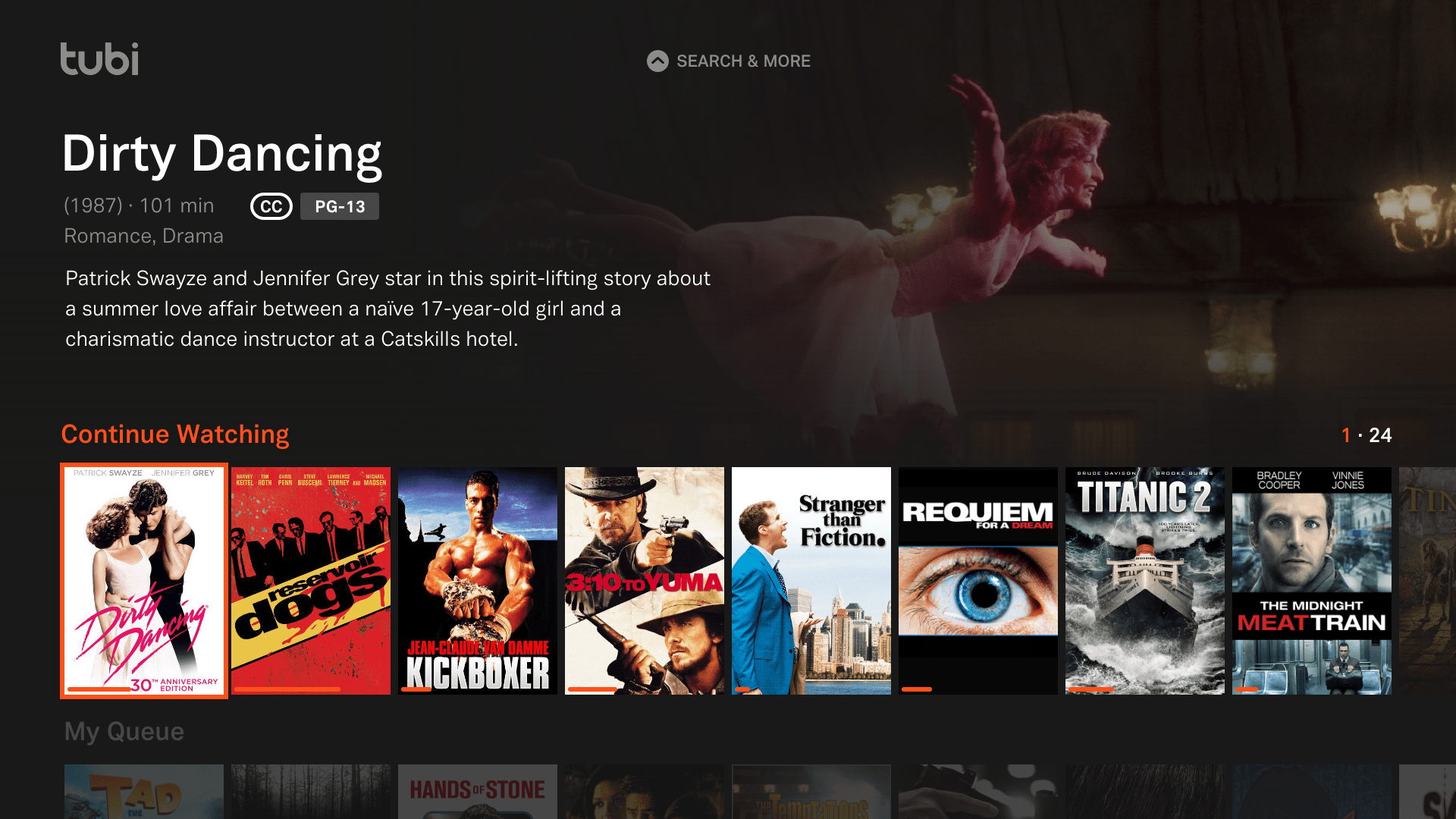
Luckily, Tubi is pretty much everywhere in terms of platforms and devices. You can watch it via the website on your computer or elsewhere, while native apps are available on smartphones and tablets, not to mention set-top boxes and game consoles.

You'll find iOS and Android apps, for example, as well as apps for Roku, Apple TV, and Amazon Fire TV boxes. The PlayStation 4, Xbox One, and Xbox 360 have native Tubi apps, too, and they're all pretty easy to use and navigate through.

Tubi doesn't require a login to watch some videos on the service, but anything that's rated R or otherwise has a Mature designation will require a free account. There's other value to using an account, however, such as queuing up interesting movies and shows, getting smart recommendations based on your viewing habits, and resuming something you started on any device.

What are Tubi's key features?

As mentioned before, Tubi is totally free and accessible from nearly any modern device you're likely to wield – so it has both of those things going for it.

More importantly, Tubi has a lot of free content available – quite a bit more than Crackle, based on browsing the extensive listings. According to the company, Tubi has more than 50,000 titles in its library, with key partnerships with Lionsgate, Paramount, MGM, and Starz helping to keep its content coffers full.

Granted, you might not be compelled to watch everything on Tubi, and that's about more than just preference. Tubi has a fair amount of random junk filling up its listings, with straight-to-DVD movies and a lot of other generic-looking fare that you've never heard of before. It's not anywhere near as curated for quality as premium services tend to be, and you'll have to dig around to find the good stuff.

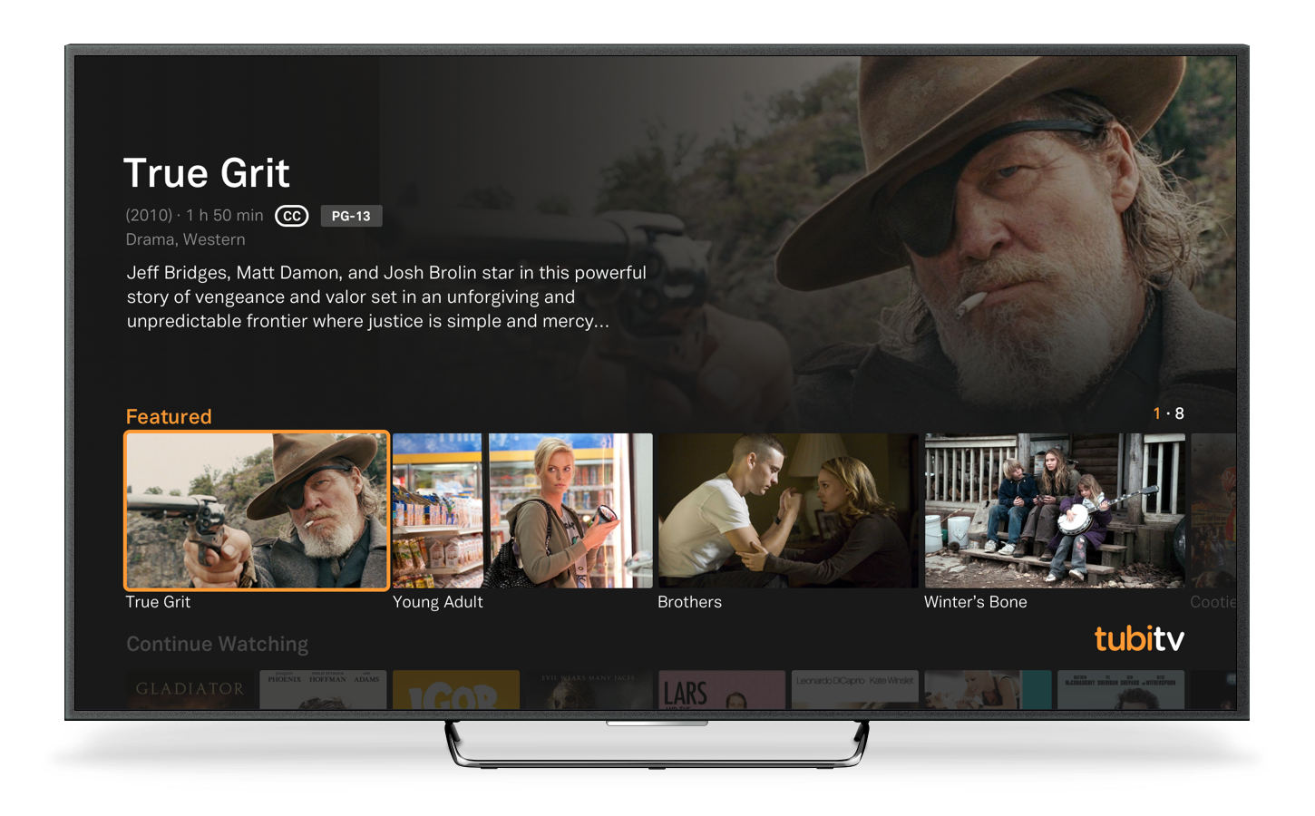
But it does have a lot of stuff, and there are some solid gems in the mix. In terms of feature films, the selection as of this writing includes picks like Young Adult, Oldboy, True Grit (2010), School of Rock, Mulholland Drive, and Glengarry Glen Ross.

Tubi doesn't have a lot of high-profile TV shows, unfortunately, unless you're into Alf ... and why wouldn't you be? It has some cult favorites, too, like The IT Crowd and Spaced, plus Tubi's anime selection is pretty stellar, with series like Cowboy Bebop, Naruto, and Revolutionary Girl Utena available as of this posting. 

Tubi seems to add new movies and shows gradually throughout the month, as well, so it's worth checking back and having a browse from time to time.

Why choose Tubi over Netflix?

It's all about the money, really, or the lack thereof. Netflix's monthly subscription fee has gradually risen over the years, particularly as the company pours billions into original shows and movies, and you're paying for exclusive content and a strong selection of newish movies and TV shows from elsewhere.

Tubi TV offers no high-profile exclusives, and the vast majority of the noteworthy content is at least several years old at this point. But Tubi TV has a surprisingly large library on offer, and it's all completely free – with a totally reasonable amount of video ads along the way.

Not finding what you're looking for on Netflix? Have a look on Tubi: it won't cost you anything, and maybe you'll stumble upon an old favorite flick or something appealing that you haven't seen before. Tubi probably won't replace Netflix for the average paying customer, but if you're not keen on spending for streaming video, then it's a strong ad-supported alternative.

Watch these shows 

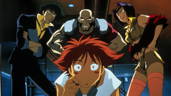
Cowboy Bebop: One of the most beloved anime series around, Cowboy Bebop follows a ragtag bunch of space bounty hunters. It has wonderful characters, brilliant animation and music, and a potent blend of action, drama, wry humor, and emotional punch. 

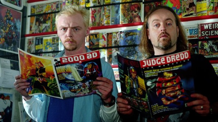
Spaced: Do you like Shaun of the Dead and Hot Fuzz? If so, then don't miss Spaced, another UK cult favorite from director Edgar Wright and star Simon Pegg. Like their flicks, this sitcom is endlessly quotable and packed with pop culture adoration. 

Watch these movies 

Battle Royale: Haven't seen the original Japanese film that inspired everything from The Hunger Games to PlayerUnknown's Battlegrounds? Well, this tale of a class of students all trying to kill each other is delightfully ultra-violent, and it's free on Tubi. 

Posted in Uncategorised

Best Nintendo Wii games: from Super Mario to Metroid, Zelda and beyond

Nintendo's all-time top-selling home console was a massive success, to say the least, but also enormously divisive. By focusing on accessibility and affordability, the Wii reached millions of players who might not have otherwise bought a pricier, more powerful console. That's great!

However, the focus on motion controls and weaker graphics put off some longtime Nintendo fans who felt like they were being ignored or edged out. That's not so great. Needless to say, the Wii couldn't be everything to everyone at all times—but when all was said and done, the console still delivered incredible games for all types of players, including many that are still worth looping back on today.

Looking to fill holes in your classic collection? Here's a look at our favorite Nintendo Wii games of all time, including an array of familiar Nintendo icons—and a couple of surprises along the way.

Super Mario Galaxy

One of the Super Mario series' greatest strengths over the years has been its consistent ability to reinvent itself, and Super Mario Galaxy is undoubtedly one of its best permutations. This planet-hopping 3D quest is bursting at the seams with creative concepts and inventive twists, delivering a pitch-perfect platformer that can stand the test of time. And sequel Super Mario Galaxy 2 goes above and beyond being just a simple follow-up, thanks to its own plethora of brilliant ideas.

The Legend of Zelda: Twilight Princess

Just as the Switch did with Breath of the Wild a decade later, the Wii came out swinging with a brilliant Legend of Zelda game on day one. Twilight Princess was notably darker than previous games, delivering an epic quest that embraced the Wii's motion controls while making other strides for the series. It also launched on GameCube soon after the Wii debut, but it's primarily known for being a seriously captivating quest on a console known for its casual favorites. 

Super Smash Bros. Brawl

Although not as beloved by the Smash community as the GameCube's Melee before it, Super Smash Bros. Brawl brought massive enhancements to Nintendo's cross-franchise battler. Most important, of course, was the addition of online play, but Brawl is also known for being the first in the series to implement third-party characters such as Sonic the Hedgehog and Solid Snake, setting the stage for many, many more guest brawlers in future entries. 

Wii Sports

There were a lot of Wii games like Wii Sports, but none of them felt as effortlessly enjoyable as Nintendo's original pack-in. While simplistic, the motion-controlled versions of sports like tennis and bowling showed the brilliance of the Wii's focus on accessibility, and it's a game that you can keep coming back to—with any mix of friends and family in tow. Special shout-out to sequel Wii Sports Resort, which had a few super-fun Wii MotionPlus-enhanced games within but wasn't nearly as impactful overall.

Metroid Prime 3: Corruption

Metroid Prime was originally built for a dual-analog gamepad, but Metroid Prime 3: Corruption showed how surprisingly adept the Wii Remote and Nunchuk combo could be for a first-person shooter. Metroid Prime 3 marks a high point for the sci-fi adventure sub-series, delivering larger and more immersive environments and some of the best visuals you'll find on the Wii. And the later Metroid Prime Trilogy is even better, packing in updated versions of the GameCube originals with the same kind of added motion controls.

Kirby's Epic Yarn

Looking for a serious challenge? You won't find it in Kirby's Epic Yarn, but don't dismiss this gorgeous platformer because of that. What Epic Yarn lacks in difficulty it more than makes up for with immense charm, as the pink puff is reimagined in an absorbing world made of yarn and fabric. It's a whimsical affair that's sure to put a smile on your face, which is likely to stay put thanks to the creative levels and incredible heart packed within.

The Legend of Zelda: Skyward Sword

The Wii houses not just one, but two brilliant Zelda adventures. The second is The Legend of Zelda: Skyward Sword, a game that is built around Wii MotionPlus gesture controls and features a much brighter aesthetic than Twilight Princess before it. With a look inspired by impressionist painters, this dreamy-looking quest sticks to Zelda conventions in some ways while completely sidestepping them in others. The end result is thoroughly captivating.

New Super Mario Bros. Wii

New Super Mario Bros. Wii enters unexplored and unexpected terrain for the long-running series with the addition of four-player multiplayer support. The end result is raucous and hilarious, as the side-scrolling levels serve up both cooperation and competition as your heroes leap and bop en route to the finish. It's not as mind-blowingly inventive as Super Mario Galaxy, but this retro-redefined romp is still a blast whether playing solo or with pals.

Tatsunoko vs. Capcom: Ultimate All-Stars

Decidedly lesser-known than Marvel vs. Capcom and that lineage of cross-franchise fighters, Tatsunoko vs. Capcom: Ultimate All-Stars is an overlooked gem of a Wii exclusive. Pairing an odd mixture of Capcom characters—from Chun-Li and Mega Man Volnutt to Frank West and Viewtiful Joe—with various anime heroes from Tatsunoko Production series like Gatchaman and Yatterman, this explosive fighter is by far the best available on the Wii.

World of Goo

World of Goo is the only WiiWare game to make the cut and also the only indie game on this mostly Nintendo-dominated list—but it's just that good. This wonderfully offbeat puzzler makes perfect use of the Wii Remote's pointer, letting you drop in gooey, sticky ball-like creatures that can connect to devise makeshift structures. You'll have to build a bunch of them to get your way out of each level, and while the increasingly brainy challenges are a treat unto themselves, the charming look and music add so much to the overall experience.

Donkey Kong Country Returns

It's right there in the title: this is the proper, rightfully-celebrated comeback of Rare's Donkey Kong Country series from the SNES, only now in the careful hands of Metroid Prime maker Retro Studios. The end result tickles the nostalgia bone, no doubt, but doesn't feel like an old game lazily returned for the sake of it. Retro's take keeps what worked about the classics while adding new elements and giving it a seriously challenging edge. Long live Kong.

Mario Kart Wii

Mario Kart Wii isn't the most inventive entry in the beloved racing series, but with accessible motion controls opening up the fun to an even wider array of players, it's yet another winner. The Wii Wheel shell for the Wii Remote was a fun touch, especially for kids, while online play was a blast and the addition of motorbikes added a neat twist to the familiar formula. If you have a Wii and plan to play with pals, then you have to have Mario Kart Wii alongside.

Xenoblade Chronicles

Wii owners lucked out with a pair of Zelda originals, but those aren't the only role-playing epics worth remembering on the console. Nintendo's own Xenoblade Chronicles continued on the spiritual legacy of games like Xenogears and Xenosaga, this time delivering a vast open world to explore along with compelling characters and satisfying combat. It kicked off a series that has since continued on Wii U and Switch.

Posted in Uncategorised

Are smart speakers really safe for children?

Smart speakers with A.I. assistants are constantly listening to the world around them, waiting for commands while soaking in whatever dialogue is within earshot—some of which is actually screened by employees at Google and Amazon

Unfortunately, that means Alexa, Google Assistant and Siri are constantly recording the conversations of users of all ages, including your kids.

As you might expect, that doesn't sit right with a lot of people. Parents and advocacy groups have voiced their issues with the ability of Alexa and her ilk to record kids without explicit consent, not to mention the lack of an easy ability to purge that data at will. In June, a lawsuit was filed in Seattle federal court that alleges that Amazon specifically is violating child privacy laws in at least eight U.S. states by capturing audio from millions of children.

Amazon, for its part, denies any wrongdoing. And the company has gone a bold step further by recently releasing a new Echo Dot Kids Edition, a candy-coated, rainbow-plastered version with extra parent-pleasing perks such as a free subscription to its FreeTime content service and replacements for damaged units.

As appealing as that might sound for parents, are devices like the Amazon Echo and Google Home really as kid-friendly as their makers want you to believe? We asked a couple of kids' tech experts for their take.

Convenience at the expense of privacy

By their very nature, smart speakers have to constantly be listening with their far-field microphones to be useful. If you had to go up to your Echo and press a button every time you had a question, needed to set a reminder, or wanted to ask about the weather, would you even use it half as much? Would you even need it at all, given the myriad smartphones, tablets, and computers that might be in your home?

"These devices collect information that can be helpful in carrying out the simple demands for which the devices were intended, but it is important to understand that this information can be stored and possibly shared or hacked."

Dr. Pamela Roggeman

It's part and parcel of owning a smart speaker, but according to Dr. Pamela Roggeman, academic dean of the University of Phoenix College of Education, many parents aren't adequately aware of the unseen downsides of that kind of unfettered data collection.

"Parents have been inundated with advice on how they should nurture a healthy relationship between their kids and technology for years now, but not much of that discussion has included technology that kids are accessing without their parents' consent, or even awareness such as smart assistants/speakers that quietly 'listen' to the room," says Roggeman. "These devices collect information that can be helpful in carrying out the simple demands for which the devices were intended, but it is important to understand that this information can be stored and possibly shared or hacked."

Amazon and Google need to do better

The tide may be turning on that front, as efforts such as the aforementioned lawsuit draw more attention to privacy concerns with smart speakers: The Amazon Echo and other similar devices quickly became commonplace in millions of homes, but there's growing pushback to the idea that such constant "surveillance" is worth the provided benefits and convenience.

Deral Heiland, internet of things (IoT) research lead at technology security firm Rapid7, believes that such devices provide a learning experience for children and that included parental tools should be harnessed to make them as kid-friendly as possible. However, he also says that Amazon must be able to rapidly tackle concerns and put parents' minds at ease.

"The issues pointed out by privacy and safety advocates are concerning. Amazon should immediately address these issues," says Heiland. "Consumers should have full control of their personal data and voice recordings and have the ability to remove/purge this data at will. If some data is needed for improving the product, this data should then be immediately anonymized to prevent associating. 

"Also, while this data is in Amazon hands, they must take all actions necessary to protect that data from unauthorized access. This should apply to all IoT technology, whether it's an Amazon product or not. Privacy issues are important and must be addressed to consumer's satisfaction."

"With children-based technology, extra precautions should be taken by both Amazon and parents ... Amazon must work harder and faster to make their products capable of keeping children safe, protect their privacy, and not expose them to anything that is inappropriate."

Deral Heiland

No product will ever be perfect, and there are lessons to be learned along the way—but Heiland's takeaway is that Amazon must be extra-careful when it comes to kids' technology.

"With children-based technology, extra precautions should be taken by both Amazon and parents," he says. "Like any product, our good intentions will often fail, but when it does there is no need to throw the baby out with the bath water, figuratively speaking. Amazon must work harder and faster to make their products capable of keeping children safe, protect their privacy, and not expose them to anything that is inappropriate."

Can smart speakers be 'kid-proof'?

Continued advocacy for privacy enhancements and changes may ultimately result in action, but whether or not that happens, Roggeman suggests that parents consider the full picture of what they're bringing into their homes. 

"The easiest way to kid-proof the smart speaker is one of the hardest things to do: get up out of your recliner and push the 'mute' button on the device."

Dr. Pamela Roggeman

If you're comfortable with the potential privacy tradeoff and feel pretty confident that there's no real danger, that's entirely your decision to make. On the other hand, if you're left feeling uneasy about the situation, are the perks really worth it?

"The easiest way to kid-proof the smart speaker is one of the hardest things to do: get up out of your recliner and push the 'mute' button on the device," she says. "But this is counterintuitive for why the device was purchased in the first place."

And for all that Amazon and other companies might do to make their smart speakers safer for kids, Heiland suggests that there's no foolproof solution to every dilemma—and that children are uniquely poised to find their way around such restrictions anyway.

"'Kid-proof' is an oxymoron. Place any technology in front of a child and say, 'You are not allowed to do this or that,' and watch what happens," he says. "I find children to be some of the most amazing hackers, capable of always finding ways around controls and restrictions. So good luck with this one. Maybe Amazon needs to hire a few to test their tech security controls."

Posted in Uncategorised

iTunes shutting down: when and why it’s happening

First launched in 2001, Apple's iTunes is one of the most widely-used pieces of software ever made – and one of the most divisive, too.

As useful as the music and media management tool has been over the years, especially to those of us with iPods, iPhones, and iPads, it has also morphed, expanded, and evolved to be a bloated and confusing bit of legacy software.

Now all of that is changing. At WWDC 2019, Apple announced that it will soon shut down iTunes on Mac with its Fall 2019 update, replacing it instead with separate new Apple Music, Apple TV, and Apple Podcasts apps that will allow the company to better focus on each type of media.

But what about all of the music you've accumulated, and playlists you've artfully devised? What about people who still want to buy digital songs, rather than pay a monthly subscription fee? And perhaps most importantly, what about Windows PC users? Apple has put out a short FAQ to help, giving us answers to all of those questions now. Here's everything you need to know.

From one, many: iTunes to Apple Music, Podcasts, TV

Apple used WWDC this year to unveil the next big macOS update, macOS Catalina, and the event was preceded by stark headlines portending the inevitable death of iTunes. And they were right, to some extent.

It's true: on Macs, iTunes is indeed going away as a piece of software. The long-awaited iTunes shutdown is finally happening. As mentioned above, Apple will roll out separate Music, TV, and Podcasts apps that are specifically built to highlight and manage each type of media.

Apple Music, the company's all-you-can-listen subscription service, has become a significant driver of revenue in recent years as people turn away from buying individual albums and tracks. The iTunes Store surely still has some ardent users who want to "own" their music, but those numbers are significantly dwindling. The melding of classic iTunes and Apple Music has never been the most harmonious pairing, so this refocusing makes sense.

Likewise, as digital video has become a much larger part of the entertainment ecosystem, it's helped make iTunes a bloated, awkward-to-navigate affair. With Apple launching its own Apple TV Plus streaming service this year with original TV shows and movies, trying to cram that into the existing iTunes experience could've been a mess. Instead, Apple is releasing a dedicated TV app with macOS Catalina.

And as podcasts continue to grow in popularity, it didn't make sense to keep trying to include that as a listening pillar alongside Apple Music and the iTunes Store within a single app. The Podcasts app will get its own dedicated experience for fans to use on their Macs.

Image Credit: Apple

How will it happen?

Essentially, iTunes is splitting up its responsibilities amongst three children apps, and they'll continue on its legacy in a hopefully easier-to-use fashion. And Apple, the "it just works" company, seems intent on making sure that this transition causes no undue burden on Mac users as they get used to shifting to new kinds of media apps.

Apple has published a support document that answers many of the lingering questions from the WWDC reveal, including what each app will do and how your existing iTunes content will be handled by those new apps. Unsurprisingly, just about everything should happen automatically.

Music that you have imported into iTunes or purchased from the store will automatically be available via the Apple Music app. That also applies to playlists and smart playlists, so you don't have to worry about your "Workout Jamz" or "Best Summer EVER" playlists going anyway. They'll still be as amazing as ever within Apple Music.

Surprisingly, the iTunes Store itself isn't going away: it will simply be a tab within the Apple Music app on Mac. If you subscribe to the Apple Music service, you can even hide the iTunes Store listing, just for simplicity's sake. Meanwhile, the iOS and Apple TV versions of the iTunes Store will remain exactly as they are today.

Podcasts from iTunes, expectedly, will be automatically transferred into the new Podcasts app, along with your subscriptions. Audiobooks will be sent to the updated Apple Books app on Mac, however, and you'll use that app to purchase any further audiobooks in the future.

Movies and TV shows that you bought or rented from iTunes will automatically show up in the Apple TV app, then, which you'll use for future purchases and rentals. And when the new Apple TV subscription service is live, it'll coexist in there with your purchases, just like Apple Music will with iTunes Store purchases.

Got account credit in iTunes? Don't worry, it'll transfer over. Same for any iTunes Gift Cards you have laying around right now—you don't need to hurry to redeem those right away. You can still use them with the new apps and the App Store.

Lastly, iPhone, iPad, and iPad backups, syncing, and restoration will be done via Finder on Mac. That's just about everything then, right?

Image Credit: Apple

What about iTunes on Windows PCs? 

Good question! While Apple is obviously most concerned with pushing the latest and greatest software to its own hardware, iTunes has a huge contingent of users on Windows PC. Many of those probably got hooked in via an iPod, iPhone, or iPad, while others may subscribe to Apple Music. But really, regardless of whether they're still spending money in Apple's ecosystem, they need to be kept happy.

Here's the good and bad news: nothing is changing for PC users. That's good news because the existing iTunes will stay exactly how it is, which means there's no need to get used to new software, and no reason to worry that the transition will go less smoothly than Apple intends.

The bad news, of course, comes from all of those little complaints that we referenced above. While iTunes is functional enough these days, it has become big and messy over the years. Cramming the new Apple TV subscription service into there is surely doable, much as Apple did with Apple Music, but it's not going to make iTunes seem any cleaner or easier to navigate.

But that's the reality of the situation for now, at least. Perhaps Apple will roll out the separate apps in the future or otherwise streamline or rework iTunes for the PC audience. We have to think that it's probably not a huge priority in the grand scheme of things, though. Besides, if Macs have the better Apple entertainment software onboard, it's just another potential reason to compel PC owners to switch.

All Mac users with compatible devices will see the big changes sometime around September or October when macOS Catalina rolls out, but those who don't mind playing with pre-release software can get a crack at it sooner: Apple released a developers' build of macOS Catalina following the WWDC keynote, and everyone else can register and download the public beta when it rolls out sometime in July.

Posted in Uncategorised

Best indoor TV antennas 2020: 7 great digital TV antennas for inside your home

The best indoor antennas pay for themselves. By offering you dozens of free over-the-air channels in HD for no monthly fee, TV antennas are a basic portal into the world of sports, news, sitcoms and more from America's most popular networks that have largely begun to disappear.  

Unfortunately the fact that TVs can receive these channels is a fact that has largely been obscured by cable companies that are all-too-eager to sign you up for an expensive cable plan. 

Now sure, over-the-air broadcasts are much more limited than any cable package out there, but they're totally free and still usually carry the biggest sports match-ups (the NFL on Sunday, the NBA Finals and the Stanley Cup), plus sitcoms, dramas and comedy shows from NBC, ABC, CBS and more. 

So what's the best indoor antenna for your money? Well, that's exactly what we wanted to find out, so we called in a whole bunch from various manufacturers and put them to the test. What you'll find below is, in our opinion, the definitive round-up of the best indoor TV antennas on the market in 2020.

Best indoor TV antennas at a glance

  1. AmazonBasics Indoor Flat TV Antenna (35-Mile Range) 
  2. Antennas Direct ClearStream Eclipse 2 
  3. Antop HD Smart Bar AT-500SBS 
  4. Antop HD Smart Antenna SBS-301 
  5. Winegard FlatWave Amped FL5500A
  6. Mohu Blade Indoor/Outdoor Bar Antenna
  7. Clear TV HDTV Antenna

Best indoor TV antennas 2020

Best indoor TV antenna: AmazonBasics Ultra-Thin Antenna

It's right there in the name: Amazon's own antenna option is basic indeed, with a very thin, paper-like slab of plastic that mounts to your wall with the included double-sided adhesive pads. This one isn't amplified, so there's no power plug needed—it simply plugs into the coaxial input on your television.

In our testing location, we consistently saw stellar results with the AmazonBasics Indoor Flat TV Antenna, which is rated to reach sources up to 35 miles away. There were occasional discrepancies, though, such as struggling to get the local PBS channels. You may need to play around with positioning in your space to maximize the reach, but that's true with most indoor antennas.

If you live close to a major city, for example, this could be all you need. And at an asking price of just $20, it's a great deal if it fits your situation. Amazon used to sell a longer-range, amplified antenna rated for up to 50 miles, but it is now discontinued. If you live further out from a major city or broadcast source, or you anticipate having reception issues, then you may want to opt for an amplified alternative instead.

Best indoor TV antennas: Antennas Direct ClearStream Eclipse 2 

The ClearStream Eclipse 2 is similar to Amazon's thin, plastic antenna at its core, but this very distinctive figure-eight design is one of a kind. Whatever engineering Antennas Direct did to pin down this kind of design clearly worked, however, as this amplified long-range antenna does an excellent job of picking up channels.

It's rated for 60+ miles and consistently delivered strong reception while pulling in all of the channels we expected to see. It also comes with curved double-sided tape pads that sit on the upper and lower backs of the design, ensuring a snug fit to your wall. It's a pricey option at $70, but that's an investment in a quality product.

Best indoor TV antenna: Antop HD Smart Bar AT-500SBS 

If you live far from a broadcast source and/or you've had trouble with other antennas, the Antop HD Smart Bar (AT-500SBS) could solve your issues—if you're willing to pay a steep price and tolerate the very large size.

The Antop HD Smart Bar is a hard-plastic antenna that measures 2.5 feet wide and can be mounted on your wall like a soundbar, or you can use the included base stand to prop it up vertically. In any case, it's much more visible than nearly any other indoor antenna on the market, but the trade-off is a much longer promised range of 80 miles. It also has a 4G signal filter, an FM tuner, and the ability to connect to a second TV, plus the reception was excellent in our testing. However, with a $119 price tag, we recommend trying cheaper alternatives first to see if they'll meet your needs.

Antop's HD Smart Antenna (SBS-301) keeps most of the perks as the Antop model above, but does so with a slimmer design and slightly lower price. It's a flat plastic design like Amazon's antenna, but actually looks like two of them merged together. You can stick it to a wall with the included Velcro pads or prop it up using the simple plastic stand. In our testing, it pulled fewer channels on the stand next to the TV than when it was mounted higher up on the wall.

This amplified antenna's range is slightly less than the Smart Bar at 70 miles, but it still has the 4G signal filter, FM tuner, and ability to connect to two TVs at once. The $89 price point is easier to stomach too, even if it's higher than all the other non-Antop antennas on this list. The signal looked great to us, but as with the Smart Bar above, this might be an option for those who are having reception issues using other antennas.

Best indoor TV antenna: Winegard FlatWave Amped FL5500A

Best indoor TV antenna: Winegard FlatWave Amped FL5500A

Winegard's amplified FlatWave FL5500A antenna checks all of the same boxes as the AmazonBasics model listed above. It offers a 50-mile range, is flat and nearly paper-thin with black and white sides, and delivers a strong 1080p signal. In our testing, it found just over 50 channels in both locations. We have no complaints about the device itself.

Really, our only issue that the FlatWave FL5500A costs more than double the price of the AmazonBasics 50-mile option, and truth be told, we couldn't tell a difference between them in use. They are nearly identical across the board, but based on current pricing, you'll save more than $25 with Amazon's model. It's great, but there's no clear reason to pay extra that we could see.

Best indoor TV antenna: Mohu Blade Indoor/Outdoor Bar Antenna

Best indoor TV antenna: Mohu Blade Indoor/Outdoor Bar Antenna

Mohu's new Blade antenna is a one-of-a-kind – instead of a floppy sheet, it's a thicker, rectangular plastic panel that you might not be compelled to hide. You could mount it on the wall below the TV like a soundbar, or there's a little attachable kickstand if you'd rather put it on a TV stand. In any case, it's stylish in a way that most antennas simply don't strive to be. And if you want, you can mount it in an attic or even outside.

But that style comes with frustrations. We struggled mightily to attach a coaxial cable or 90-degree coaxial adapter to the back of the antenna, because its coaxial connector is wedged so tight to the backing. Ultimately, we used a screwdriver to remove the spongey support ring on the back to give our hands a bit more room, and then had to use pliers to tighten the adapter because it wouldn't budge using our fingers. It was a real pain.

Once it was finally up and running, we searched multiple times and found fewer channels with the ground-floor TV – just 44 max, compared to 50+ with the others. None of the omissions were crucial, but it was still a difference. Upstairs, we had to play around with the location before hitting the same 50+ mark as the other antennas. The Blade is sleek and stylish, but the smaller size brings a couple of frustrations along with it.

The Clear TV HDTV Antenna reimagines the classic design as a USB stick-sized antenna with extendable rabbit ears. It's small, it's simple, and it's incredibly cheap (we picked ours up from Walmart for a mere $10). But if you're thinking that a design like this is too good to be true, then you're on to something: While we experienced good reception in one location that we've used to test many antennas, we struggled to pull as many channels or as consistent of reception in another area that has been fine with larger, more powerful rivals.

We saw very different results on two floors of a house about 15 miles north of downtown Chicago. On the top floor, the antenna performed similarly to many others that we have tested in the location, picking up 55 channels and providing strong reception on most of them. We tested the antenna both directly behind the TV and a couple feet away from it on the same surface, and the results were similar in both instances.

Downstairs in the living room, the Clear TV was much less successful. We ran multiple channel scans with the antenna behind the TV, both resting on the stand and on the back of the set itself, and only pulled in about 20 channels. Those channels looked clear and were stable, but it was a fraction of what we had pulled one floor higher.

If you have experienced troubles with interference or live farther away from a source, then you'll probably want to invest in something more powerful.  

Read the full Clear TV HDTV Antenna review

Antenna scams you should know about

Recently there have been a number of misleading product pages on Amazon that have promised customers outrageous features like a 120-mile range and 4K resolution. Do not take them at their word. These claims are misleading and, with our current technology, impossible. 

 You can read a great breakdown of lies antenna manufacturers tell you over on TechHive, but suffice it to say that the curvature of the Earth prevents more than an 80-mile range for broadcasts and no broadcast station in America currently puts out a 4K OTA signal. That is going to be part of the next set of ATSC standards that's currently in development and is called NextGen TV. That should start rolling out by the end of 2020. 

Best indoor TV antenna: how we tested

For this piece, we tested indoor antennas that remain near your TV, both standard antennas that connect solely via coaxial cable, and amplified ones that add a USB connection or must be plugged into a wall outlet for a powered-up range boost. 

We tested several current indoor TV antennas from the top makers in the business, watching to see how many channels each antenna could find, how easy it was to set up, how crisp the signal looked, the style and size of the device, and the price and overall value.

Our testing environment was a two-story house just outside of Chicago, less than 15 miles from downtown. Each antenna was tested on two televisions: one on the first floor, and another upstairs on the second floor.

Even if modern antennas are more reliable than the old versions, they can still be fickle: your distance from broadcast towers is important, but so too is where you place the antenna, where you are in your home, and what's around it. Your experience may vary to ours, as a result, and you may need to experiment with location to yield the most channels to watch.

These are the best indoor TV antennas that we've tested so far, and we'll be adding more to the list once we try more models.

Posted in Uncategorised

Nvidia Volta release date, news, and features

When it comes to the best graphics cards, Nvidia’s varied selection of awesome graphics cards is unrivaled. From the wickedly powerful GeForce RTX 2080 Ti to the entry-level GTX 1050 – and everything in between. Nvidia remains the crowned ruler of the graphics world.

But, because there’s always a demand for new graphics technology and faster hardware, particularly among creators and data scientists, the best graphics card is never enough. This is why Nvidia Volta was created – the next generation architecture for creatives and professionals.

There have already been some Nvidia Volta cards out there, but you should consider that these aren’t for gamers – these high-end GPUs are aimed at professionals, and they have price tags to match.

That’s not to say that Nvidia Volta isn’t exciting – it definitely is – especially when its developments in AI-powered Tensor cores has trickled down to Nvidia TuringGeForce graphics cards like the GeForce RTX 2080 Ti and RTX 2080.  

Cut to the chase

  • What is it? Nvidia's next-gen, 12nm GPU line
  • When is it out? The Tesla V100 and Titan V are out now
  • What will it cost? $2,999 (£2,800, AU$4,699) to start 

Image Credit: Nvidia

Nvidia Volta release date

We already mentioned that Nvidia Volta is available now, but not in any from that you’ll slip into your gaming PC. The Nvidia Tesla V100 hit the streets in May 2017, as a pro-level GPU built to empower AI workloads and run data centers. It’s not a consumer-level device by any stretch of the imagination.

On the other hand, the Nvidia Titan V – released in December 2017 – is considered a consumer device, but you might scoff at the $2,999 (about £2149, AU$3800) price point. The Titan V is targeted towards researchers and other high-performance computing needs rather than making PlayerUnknown's Battlegrounds look pretty.  

Image Credit: Nvidia

Nvidia Volta price

Because Nvidia Volta cards are aimed entirely at professionals and creatives, you shouldn’t expect them to be affordable for a gaming build. Both the Volta-powered Titan V and Tesla V100 are ludicrously expensive. The Titan V comes in at a cool $2,999 (£2,800, AU$4,699), where the Tesla V100  will cost you about $8,799 (£8,819, about AU$12,378) – definitely not cards you want to use to run Battlefield V.

As for consumer-grade cards, we don’t think Volta will ever actually create one. Instead, Nvidia Turing was created with real-time ray-tracing tech that’s priced at a level that gamers should find palatable. 

Nvidia Volta specs

Volta introduces a new 12-nanometer manufacturing process, which marks a significant step up from the 16nm process seen with the Pascal GPUs. 

What exactly does that mean? 

Well, it means that Nvidia's manufacturing partner TSMC can jam a whole lot more transistors into a comparable amount of space, thus yielding a massive surge in computing ability. You'll get better performance, not to mention significant power savings.

The Titan V packs in 21.1 billion transistors, which collectively provide a stunning 110 teraflops of computing power. New tensor cores are designed to speed up deep learning ability, with nine times more peak computing teraflops over the previous Titan Xp card. And it's twice as energy-efficient too.

Additionally, the Titan V has six graphics processing clusters with 5,120 CUDA cores (up from 3,840 in the Titan Xp) and 320 texture units, and a base clock of 1200MHz that can boost up to 1455MHz. With 12GB HBM2 memory onboard, the Titan V boasts a memory bandwidth of 652.8GB/sec. 

The last bit on the specs side is surprising from Nvidia, whom just the last year championed the enhanced speed of GDDR5X memory on its high-end GPUs. 

The Nvidia Titan V is the first mainline card to feature high-bandwidth memory outside of the company’s Quadro and Tesla parts. Whether this means HBM2 will be a mainstay of Volta remains to be seen.

All told, it's a potentially enormous upgrade over the last generation of Nvidia cards.

Image Credit: Nvidia

But let's step back for a moment, because comparing a $2,999 gpu to its $1,200 predecessor doesn’t make much sense – and there isn’t going to be any Volta-powered gaming graphics cards, anyway. 

Based on these initial pro-level renditions, Volta seems capable of so much more than the previous Pascal-powered GPUs – and even if those are powerful enough right now, Volta appears poised to take AI and professional workloads to previously unseen levels.

Either way, keep this page bookmarked, as we’ll update it as new details, leaks or cards pop up on our radar.

Posted in Uncategorised

AMD Ryzen 2nd Generation release date, news and features: everything you need to know

Intel used to be the de facto king of the CPU world, designing the best processors out there – hands down. However, with AMD Ryzen, everything changed. These days, AMD is dominating the market with not just AMD Ryzen 2nd Generation and Threadripper 2nd Generation, but also its recently released Ryzen 3rd Generation. In fact, AMD has more than doubled Intel’s sales, according to a German retailer.

As far as this generation goes, however, we’ve been able to put a wide range of Ryzen 2nd Generation processors to the test, from the Ryzen 5 2600X to the powerhouse Ryzen 7 2700X, we know AMD isn’t pulling any punches when it comes to power and value.

There were rumors of a Ryzen 7 2800X, which might have given the recent Coffee Lake Refresh processors a run for their money – but, with the advent of AMD Ryzen 3rd Generation, announced at Computex 2019 and released July 7th, 2019, we doubt that particular processor will ever surface.

Additionally, AMD has brought Zen 2 to the mainstream, the architecture behind the 3rd generation of Ryzen. And, according to the latest rumors, we could see up to 16-cores on the flagship, and clock speeds up to 5.0GHz. If there’s any weight to this, the processor world will shake when these next-gen chunks of silicon drop sometime in 2019.

Microsoft has also announced that its next-generation Xbox console, known as Project Scarlett, will utilize a custom-designed SoC based on Zen 2.

Cut to the chase

  • What is it? AMD's upgraded, budget-friendly processor chips
  • When is it out? Out now
  • What will it cost?  $199 (about £140, AU$260) starting price for the Ryzen 5 2600

amd ryzen 2nd generation

Image Credit: AMD

AMD Ryzen 2nd Generation release date

The first-generation Ryzen processors launched in March 2017 and continued to roll out throughout 2017. Ryzen 2nd Generation chips launched at around the same time the following year, on April 19, 2018, after being made available for pre-order a few days before.

Beyond the first few AMD Ryzen 2nd Generation chips, AMD continued to roll out some Ryzen Pro and Ryzen Threadripper chips through the rest of 2018. Ryzen Pro chips are designed for business and IT use cases, with up to 8-cores and 16-threads. Ryzen Threadripper 2nd Generation, the ‘big daddy’ of AMD’s 2nd gen offerings with up to 32 cores, is for die hard creative types.

AMD also announced a Ryzen 5 2500X and Ryzen 3 2300X, but at this point we don’t expect to see these mid-range chips make it to market. Intel’s Coffee Lake Refresh has been out for a while now, and Ryzen 3rd Generation chips have also hit the streets, having been announced at Computex 2019.

Even though AMD Ryzen 3rd Generation have been released, AMD may be releasing 50th anniversary editions of some of its parts, including the beloved Ryzen 7 2700X.

amd ryzen 2nd generation

Image Credit: AMD

AMD Ryzen 2nd Generation price

AMD made its second generation of Ryzen chips to be just as affordable as the first batch. Granted, offering more reasonably priced CPUs has always been AMD's edge. However, for the first time in years, the cheaper Ryzen chips could truly compete with, if not surpass, Intel's offerings.

AMD has decided to continue its course with the 2nd Generation models. It was important that it delivered affordable, high-performing CPUs. And, the price tags we’ve seen for the mid-range chips keep in line with the pricing for the first generation.

  • AMD Ryzen 7 2700X: $329 (£329, AU$509) 
  • AMD Ryzen 7 2700:  $299 (£279, AU$419) 
  • AMD Ryzen 5 2600X: $229 (£209, AU$338) 
  • AMD Ryzen 5 2600: $199 (£179, AU$259) 

In 2017, the quad-core Ryzen 3 1300X debuted at $129 (£112, AU$169), while Intel's Core i3 7350K went for $149 (£169, AU$299). Bump up to the hexa-core Ryzen 5 1600X, and we saw it offered for $249 (£249, AU$359) – compare that to the quad-core Intel Core i5-7600K at $239 (£219, AU$339), although you drop a couple of cores in the process.

We saw the biggest difference in price with the Ryzen 7 1800X, which at $499 (£500, around AU$650) was almost half the price of Intel's Core i7-5960X/6900K. Of course, this lead Intel to introduce a more affordable Intel Core i7-8700K and Intel Core i7-7820X. Meanwhile, the AMD Threadripper 1950X came in at $999 (£999, AU$1,439) and delivered even stronger performance than Intel's like-priced Core i9-7900X.

Of course, AMD had slashed its Ryzen prices across the board when they announced the 2nd Generation, keeping things competitive with Intel as the two companies fight for your CPU-buying dollars.

AMD Ryzen 2nd Generation specs

Ryzen 2nd generation processors offer an impressive generational leap over their predecessors. They're built using an updated 12-nanometer process, which will pack in even more transistors and thus provide more raw speed along the way.

According to AMD 12nm process results in an approximately 16% performance increase and 11% better lower power draw over the original Ryzen's 14nm process.

We finally came across rumors swirling around about the Ryzen 2nd Generation APUs, which will succeed the Ryzen 5 2400G and Ryzen 3 2200G. According to PCGamesN, the next generation APUs should be coming out in the next year, and will feature the same Zen+ 12nm architecture as the Ryzen 2nd Generation CPUs. This could mean APUs will see a similar performance boost as we saw when the first generation Ryzen chips were superseded.

AMD states that the Ryzen 2nd Generation chips will be the smallest and fastest desktop processors to date – lofty promises. However, they’ll definitely excite PC enthusiasts and users of all stripes. Ryzen 2nd Generation chips should deliver higher clock speeds and introduce the enhanced Precision Boost 2 technology to boost performance during high-drain scenarios.

And, now that we’ve been able to play with the Ryzen 7 2700X and the Ryzen 5 2600X, we know that AMD has succeeded in pushing its specs. The 2700X with its 8-cores, 16-threads and speedy boost clock of 4.3GHz outperforms the Intel Core i7-8700K, AMD has fully embraced the enthusiast market. Even the lower-end Ryzen 5 2600X pushes performance into the next generation with 6-cores, 12-threads and a 4.2 GHz boost clock.

We also saw leaked benchmarks for the Ryzen 3 2300X and Ryzen 5 2500X. The former is a four-core, four-thread processor clocked at 3.5GHz and a 4.0GHz boost clock. Meanwhile the Ryzen 5 2500X is a four-core, eight-thread chip, featuring a 3.6GHz core clock, boosting up to 4.0GHz.

Since these chips came out, they’ve been excellent entry-level and mid-range options, respectively, but seem to only be available in prebuilt systems.

We also saw a leak from ASRock pointing to the existence of some low-power E-series Ryzen 2nd Generation chips, the Ryzen 5 2600E and Ryzen 7 2700E. These chips will have a much lower 45W TDP and feature an 8-core design for the Ryzen 7, and 6-cores for the Ryzen 5 – according to the rumor reported by Wccftech. These rumors have since been proven true when they both launched in September of 2018.

However, it doesn’t stop with the desktop chips. AMD has also rolled out Ryzen 2nd Generation mobile chips in the Ryzen 7 2700U, Ryzen 5 2500U, Ryzen 3 2300U and Ryzen 3 2200U. These all have Vega graphics packed in, which means you can do some light gaming on them. The two higher-end chips are four-core, eight-thread processors with boost clocks of 3.8GHz and 3.6GHz for the Ryzen 7 and Ryzen 5, respectively.

The Ryzen 3 2300U and 2200U are four-core, four-thread chips with 3.4GHz boost clocks. The main difference between these two chips is that the former features stronger Vega graphics, while the 2200U has a higher base clock of 2.5GHz.

AMD Ryzen 2nd Generation is the culmination of everything AMD wanted to do with Ryzen. And, if the specs of the Ryzen 2nd Generation CPUs are anything to go off of, we’re very excited about what this lineup can do.

AMD has a very technical primer on Precision Boost 2 from its Ryzen Mobile Processor with Radeon Vega Graphics, in case you want to dig into the specs.

We've seen some SenseMi improvements in AMD's recent Ryzen-based desktop APUs, so it stands to reason that there are similar performance and efficiency increases in the Ryzen 2nd Generation line. That could include optimized power usage through Pure Power smart sensors and improved overclocking potential from Extended Frequency Range 2.

amd ryzen 2nd generation

Image Credit: AMD

Anyone wanting to upgrade from Ryzen Gen 1 should be happy to know that AMD has kept the same AM4 socket intact, so you don’t have to buy a new motherboard to slot one of these CPUs into your machine. There is also an enhanced X470 chipset that’s optimized for Ryzen 2nd Generation with lower power consumption.

Keep in mind that AMD calls the heart of Ryzen 2nd Generation the Zen+ architecture, rather than Zen 2. What’s the difference? Well, Zen 2 is a completely new architecture built on a 7nm process, which – as you can imagine – offers a world of difference when it comes to power and performance.

amd ryzen 2nd generation

Image Credit: TechRadar

AMD's roadmap shows the Zen 2 and Zen 3 (listed at "7nm+") cores coming somewhere between the release of the Zen+ and the year 2020, which we expected to appear in 2019. And it looks like Zen 2 has arrived along with Ryzen’s 3rd generation.

Zen 2 design is, naturally, complete at this point, and it "improves on Zen in multiple dimensions" according to AMD. And the Zen 3 is "on track," as well. AMD could be primed to shake up the CPU industry all over again with the Zen 2. However, Zen+ is what's powering the Ryzen 2nd Gen chips.

Even so, there are many reasons to be excited for the Ryzen 2nd Generation chips, especially if you’re in the market for a PC upgrade this year. And, even with Intel on the defensive, it’s safe to say that AMD has knocked it out of the park.

Posted in Uncategorised

How Roccat built the Titan switch inside the brilliant Vulcan keyboard

Gaze upon our list of the world's best keyboards right now, and you'll find the Roccat Vulcan 120 Aimo near the top (as of this writing). Roccat's latest mechanical keyboard is largely thanks to its new Titan mechanical key switch that makes a powerful impact upon first glance.

Unlike just about any other keyboard in existence, the keys are only capped at the top, thus revealing the intricate inner housing beneath. Not only does that give the Vulcan 120 and its brethren a unique visual edge, but it also allows the vibrant RGB LED lights to shine through the transparent switch in a way that adds a unique, singular glow. 

Roccat's overall aesthetic here is more industrial than in-your-face (although maybe a bit sci-fi, as well), and the end result is one of the best-looking keyboards we've ever laid eyes on.

But looks aren't everything; in fact, if the keys don't feel and act right, then looks mean nothing at all for a keyboard. Luckily, Roccat's Vulcan is the complete package featuring the company's new proprietary mechanical Titan switches. Built to find the middle ground between the two most popular types of Cherry MX switches, albeit, with speedier responsiveness, the end result is a keyboard that's great for gaming, typing and essentially anything else.

And it all started with those Titan switches. To find out how Roccat designed the tech inside our new favorite keyboard, we spoke with product head and Roccat Studios Taipei general manager Thaddäus Tetzner about building a mechanical switch that looks good, feels right, and delivers a new sweet spot that's ideal for all types of computing.

Roccat fuel

When Roccat first began the project about three years ago, they had a multipronged plan of attack. First, they wanted to highlight the Titan switch itself within the keyboard design, and not have that integral part be buried behind a bulky keycap. After all, it's the defining feature of a mechanical keyboard. Why hide it?

"We didn't really like that the mechanical keyboard switch is always treated like an internal, mechanical part—not something that you show or that's visible, so it's not part of the cosmetics of the products," said Tetzner. Many internal parts aren't made to be beautiful simply because they'll never be seen by consumers. Roccat's team thought that they could find a better way and highlight the Titan switch without hiding it. "It was not apparent for us why it has to be ugly," he added.

Visually, there's nothing quite like the Roccat Vulcan. Mechanically, however, the company didn't start entirely from scratch with the Titan switch; it's more refinement than revolution, unlike Razer's recent Optomechanical hybrid switch.

Instead, Roccat and partner TTC tried to find a middle ground in type feel between two of the most common Cherry switches, Brown and Red. The speedy, linear Red switches are considered best for pure gaming purposes, while the tactile Brown switches allow for more diverse usage, such as typing articles and papers. Roccat saw an opportunity to bridge that gap and create an even better all-around typing experience.

"We felt that between the Red and the Brown types, between linear and tactile, there was still an opportunity to have," Tetzner explained. "We felt that the gap was too big and the compromises of making a Brown tactile type faster or just making a Red type faster, and not the sweet spot we perceived in the middle of that – between those two. Nobody really went there."

Feeling it out

That's a fine goal, but making that happen was no easy feat. The sensation felt when pressing a key is such a subjective thing, especially when you consider the different applications of a keyboard. That's even true just within gaming, as different games reward different kinds of inputs and reaction speeds. "A hardcore Quake Champions player will have a very different opinion on the best switch than maybe a PUBG player," said Tetzner.

Extensive user testing was needed to try and quantify the ambiguous concept of type feeling, and ensure that they were getting the kind of result that they wanted. Lengthy reliability testing was also necessary to determine that the new switches could hold up to potentially years of usage and not give up the ghost too soon – something that could derail the entire product line if left unchecked.

When it came to making the keys feel so speedy and responsive, Roccat opted against significantly shortening the distance to actuation – that is, how far the key can be pressed before registering the input. That's a straightforward way to do so, of course, but Tetzner and his team felt like the end result would be compromised. You'd feel the difference right away, so Roccat stuck with a 1.8mm actuation point. That is shorter than the Cherry standard of 2.0mm, but not dramatically so.

More importantly, Roccat focused on minimizing contact bouncing and tweaking the debounce rate. When the metal plates inside of a switch make contact, they bounce and vibrate – so manufacturers use a brief debounce delay and then check again for contact, ensuring that one key press doesn't count as two or more. However, that metal can wear down a bit over time, and many manufacturers use a longer debounce rate to ensure that their keyboards remain effective over the longer haul. It's a trade-off.

But for the Titan switch, Roccat refined its components to trim down the bounce as much as possible and used a faster debounce rate to ensure that keystrokes feel speedy and precise without needing to trim the physical travel distance.

"We wanted to give you the same benefit of speed without touching that part that makes, in our opinion, the switch not feel as good," said Tetzner. "Basically, the idea is: instead of making it too short, we save the time somewhere else and still keep typing feeling good."

A true titan

According to Tetzner, development of the Titan Switch proved to be a relatively smooth process, with their core aims holding true all the way through manufacturing. Only the internal makeup of the switches saw any significant overhaul during the testing process, as they had to solve new ways to assemble the key components to ensure both reliability and attractiveness. "The traditional way is something that basically destroys the aesthetics but is easy to manufacture," he said.

It was clearly worth the effort. As our review and best gaming keyboards list placement both suggest, the Vulcan 120 Aimo – Roccat's current top-tier keyboard wielding the Titan switch – is one of the best keyboards you can buy today. And that certainly won't be the last we see of the Titan switch.

The current version is dubbed the Titan switch tactile, and Tetzner suggests that other variants could be coming based on demand, including versions that are more akin to Linear or Clicky switches from other makers. He's also thinking ahead to second- and third-generation editions of the Titan Switch. There's still room for improvement and innovation in this market, Tetzner said, both from Roccat and competitors, but he can't help but hope that the Titan Switch itself ends up influencing followers.

"We do believe that the Titan switch will create a new kind of trend," he surmised, noting its balance between mechanical and industrial design. "The love and the detail, for even something like the debounce rate, is also something that will hopefully leave its mark on the industry."

  • If you liked this, you're going to love our look behind Razer's Optomechanical switches
Posted in Uncategorised

BlackBerry Classic Review: Old Meets Newish

When fully touch-centric smartphones suddenly exploded in popularity, BlackBerry wound up caught flat-footed. When the Waterloo company finally made the move to modernize years later, it couldn’t compete with the new heavyweights and disappointed old fans in the process. For a while there, it looked like BlackBerry couldn’t win.

BlackBerry Classic

BlackBerry Classic

But the company’s once improbable comeback is inching along, and after last year’s Passport—a large and awkward, yet certainly interesting device—BlackBerry is back with the Classic. Quite obviously, in both name and design, it’s a return to its business-centric strengths. It echoes the familiar pocket-sized BlackBerry design of old, with the square screen above a physical keyboard, but with a sleek, refined finish.

It’s undoubtedly the finest traditional BlackBerry that the company has ever produced, but how does a top-level BlackBerry phone compare in this day and age? Can it really compete with the iPhone 6 and leading Android handsets? No, not in the slightest. But as a productivity machine, it has perks.

Build and Design

The BlackBerry Classic is one impressively built device. Upon picking it up, we immediately felt at least 20% more professional—it just has a premium air to it that feels wholly distinct from other modern smartphones. Actually using the device might not always fill you with such confidence, but the hardware itself is ace.

BlackBerry Classic back

BlackBerry Classic back

What’s really striking is the heft of it: at 6.28oz, the Classic feels weighty and substantial, but that goes a long way toward selling the quality of the device. Like most phones on the market today, the latest BlackBerry has grown a bit since the Bold line, coming in at 5.16 inches tall, 2.85 inches wide, and a thickness of 0.4 inches. It’s still a little short and stout compared to the iPhone 6 or an Android flagship, but it looks a little heartier and more significant than previous models.

Naturally, the core point of focus on the BlackBerry Classic is its 35-button QWERTY keyboard, which retains the look and feel of past versions. The keys slope outwards from the center of the phone to guide your respective thumbs, with a big space bar below and a small resting space at the bottom. The BlackBerry Passport tried to shake things up by putting symbols and more on the touch screen, but the Classic keyboard lives up to its namesake, letting you tap “alt,” “sym,” or the shift arrow to modify text without leaving the keys.

No surprise: The keyboard feels great, and it’s the best you can get for a phone of this size—in part because there really aren’t competitors, but mainly because BlackBerry has spent ages refining this design. However, anyone who has spent years typing on touchscreens probably won’t see a speed increase here, at least not for some time. In our case, we’d get tripped up on a typo or try hunting for a symbol and find the process much slower than on Android or iOS. There’s a learning curve to using such a condensed, all-in-one keyboard; the short-term benefits aren’t very obvious.

BlackBerry Classic keyboard

BlackBerry Classic keyboard

Above the keyboard are the familiar physical navigation buttons: one for initiating the calling app and another for settings on the left, along with the back button and exit app/end call button on the right. Dead center sits the trackpad, which serves as a tiny touch button for scrolling through menus and in some cases bringing up a small mouse pointer. With a touch display, this primarily seems like a way to appease fans of the older phones; it’s rarely faster to use that little nub than to just touch the icon or button you need.

On the right side of the phone are volume buttons, plus a smaller one between them that triggers BlackBerry Assistant. The power button and headphone jack are up top, you’ll find SIM and microSD card slots on the upper left, and the USB jack and solid-sounding speaker grates are on the bottom. A metal border helps define the premium aesthetic, but opinions may be mixed on the textured, rubberized backing, which is black with a metallic BlackBerry logo at center plus the camera panel near the top (along with the word “Classic”). We appreciate the grip and feel of it, although a metal or glass design might’ve been more appealing.

Display

BlackBerry Classic

BlackBerry Classic

In a world of widescreen smartphone displays, the BlackBerry Classic sticks to its guns and presents another square screen. That’s a necessity with this form factor, due to the keyboard taking up most of the rest of the phone’s face, but it proves to be limiting in many respects.

At least it’s a solidly sharp screen: the 3.5-inch display runs at 720×720, or 294ppi, which isn’t as crisp (or as large, certainly) as the Passport, but it’s clear and colorful here. Strong contrast makes apps and media look bold and attractive, although the display could stand to be brighter. We had it at maximum brightness during most of our testing, and the way it automatically dims in darker scenarios made for some less-than-ideal evening moments.

As discussed in our Passport review last fall, the square screen is inconvenient for a lot of purposes. Most video media isn’t formatted in a 1:1 ratio, so 16:9 widescreen clips in particular leave a lot of blank space on a display like this. And while the OS is obviously designed for the dimensions, the poor third-party app support means some of the apps you’ll download from the Amazon Appstore either run with borders or appear scrunched on the screen. Again, when it comes to general, everyday use, the BlackBerry Classic has notable deficiencies.

The post BlackBerry Classic Review: Old Meets Newish appeared first on Brighthand.com.

Samsung Galaxy Note Edge Review: On the Edge of Greatness?

Samsung Galaxy Note Edge

Samsung Galaxy Note Edge

Samsung’s grip on the mobile world is waning, partially because it’s continued to play things safe with its Galaxy S line while its competitors up their game. So kudos to the Korean giant for taking a shot at something truly new and different with the Galaxy Note Edge, a delightfully odd concept phone that somehow made it into stores.

Sure, it’s essentially a Galaxy Note 4 variant at heart, with the same powerful internals and core functionality, but the difference is right there in the name: This 5.6-inch phablet screen doesn’t stop when it hits the usual right border, instead pouring over to form a curved edge on the side of the phone. That’s definitely weird, especially for a very large and expensive flagship device, but is it wonderful?

Yes and no. Actually, most of the time, we just felt ambivalence towards the extra space and its minor added functionality. There’s promise here, and some of it is realized, but the addition of another 160 pixels over the side doesn’t seriously change the smartphone experience. Not yet, at least.

Build and Design

Samsung Galaxy Note Edge

Samsung Galaxy Note Edge

As mentioned, the Galaxy Note Edge begins with the same design as the Galaxy Note 4, Samsung’s more traditional phablet wonder, but there are notable differences beyond the lack of a traditional border on one side. Namely, while the Note 4 impresses with its metal frame, the Note Edge is stuck with matte plastic along the sides. That’s likely a trade-off due to the odd screen dimensions, although you still get a slim metal border around the display panel. Also, the display loses a tenth of an inch in size, dipping from 5.7 inches on the Note 4 to 5.6 inches here, but as you’ll see at a glance, that’s obviously not the whole story with the screen.

Despite those shifts, the Note Edge still feels like a premium device, and looks the part as well—beyond the gorgeous display. The hardware itself is quite sharp, with an attractive and subtle horizontal line pattern along the bezel, and a faux leather backing that may not convince you upon touch, but it looks higher-end than the rubbery texture seen on many Samsung devices.

The Note Edge is a very large phone, so unless you’ve got gargantuan paws, it’s a tricky device to use one handed. And that’s especially true with the Edge, which does change the way you’ll want to hold it. It’s naturally tricky to hold in your right hand, because there’s a good chance your palm will activate an edge command while reaching across the screen with your thumb. Furthermore, not having a typical side right there just feels odd. It’s not a flaw, but it is a foreign consideration.

Display

Samsung Galaxy Note Edge

Samsung Galaxy Note Edge

No surprise here if you’re familiar with the Note 4: This screen is a stunner. It’s a Quad HD+ Super AMOLED panel coming in at 2560×1440 across the bulk of the screen, although the curve adds the aforementioned 160 pixels of extra width (so it’s 2560×1600, technically). While it’s a seamless display over the edge, that extra space is often treated differently by apps and the UI, so it’s no surprise to see that distinction notated in the specs, as well.

Wherever you’re looking on the display, the image is remarkably crisp and colorful. And because it’s just a bit smaller than the Note 4’s display, it’s actually sharper at 525ppi, although at that pixel density, you shouldn’t notice a difference anyway. What is quite apparent is just how vibrant everything looks on this beauty, and how detailed higher-resolution photos or videos can appear on the screen.

Because it’s not a fully flat surface, the Note Edge is more susceptible to glare, and you may notice that the content along the curve looks distorted at certain angles. In other moments, the curve seemed to give that part of the image the odd illusion of depth. Maybe that’s just part of the process of getting used to a new kind of display design and technology, although we’re curious if a successor might be able to deliver more consistent views along the edge from any angle.

Keep in mind that the Note Edge defaults to Samsung’s Adaptive display mode, which pumps up the contrast and saturation. The resulting effect is almost intoxicating, really showing off the richness of the display — but it also makes for unnatural looking coloring and overblown effects. You can always switch down to the basic setting, which looks flat by comparison but is much more accurate.

The post Samsung Galaxy Note Edge Review: On the Edge of Greatness? appeared first on Brighthand.com.

Sharp Aquos Crystal Review: Eye-Catching, But That’s It

In the smartphone world, Sharp is known primarily as a supplier of displays for other companies’ devices, not as a handset manufacturer itself. As such, the Aquos Crystal is an unexpected foray for the storied Japanese electronics company, and it’s quite the head-turner as well.

Sharp Aquos Crystal

Sharp Aquos Crystal

It’s obvious at a glance: the Aquos Crystal features almost no visible bezel around the five-inch display—a neat trick made even more surprising by the phone’s budget pricing. Has there been a more distinctive handset on the low end of the price scale in recent memory? In a market saturated with innocuously designed, unremarkable-looking Android devices, it’s a breath of fresh air.

But there are major drawbacks, and not even the usual ones you’d expect from the price—the Sprint model we reviewed sells for $240 outright—like unremarkable performance and some lower-quality components. In fact, it’s the unique form that causes many frustrations, reminding us that a cool-looking phone probably isn’t worth the fuss if its best quality is merely looking cool.

Build and Design

Need we even say it? There’s just nothing quite like the Sharp Aquos Crystal, and that’s true from the entry-level to the flagship ends of the modern smartphone scale. Sharp clearly intended to make a big splash with its first U.S. phone in a few years, and to that aim, we say: mission accomplished.

Sharp Aquos Crystal side

Sharp Aquos Crystal side

But expectedly, putting an edge-to-edge five-inch display on a phone with extremely minimal bezel on three sides results in a very untraditional design. Namely, there’s a big block of space on the bottom of the phone’s face with a couple things you usually find up top—like the 1.2-megapixel front camera and the notification light. We’ll touch on the camera in a bit, but as you might expect, everyday use requires some adjustments if you’re moving over from something with a more familiar design.

The Aquos Crystal keeps a moderate profile for a five-inch device, coming in at 5.17 x 2.64 x 0.4 in., with a weight of 4.97 oz. It’s not ultra-thin, certainly, but the unique build doesn’t add an uncomfortable level of bulk either. And while it might look like a premium device at a glance, it doesn’t really feel like it: The grey plastic sides and stiff backing don’t seem particularly labored over or refined.

You’ll find the power button and 3.5mm audio jack on the top, the microUSB port on the bottom, and a volume rocker on the upper left that barely juts out from the surface. Beneath the removable back cover is access to the SIM card and a slot for up to a 128 GB microSD card, which you’ll likely want since there’s only 8 GB of internal storage included by default.

Display

Sharp Aquos Crystal display

Sharp Aquos Crystal display

It’s the Aquos Crystal’s most obvious perk, yet it proves to be one of its biggest downfalls: the design of the display. To be fair, the 720p LCD screen itself is, well, quite sharp. It’s super bright, with solid contrast and coloring, and at 294 ppi, it’s crisp enough to get the job done. And truly, the phone’s overall build highlights the display, making it seem almost like you’re holding a screen and nothing else.

But that initial sensation gives away to some serious annoyances, the biggest of which has to be Sharp’s decision to angle the edges of the screen with a chamfer surrounding the glass on all sides. It’s similar to what Motorola did with the Moto 360 smartwatch.

What might have been a move to make the Aquos Crystal more visually distinctive instead ends up distorting the screen quality from nearly every angle. No matter how you look at it, some small portion of the display will have an odd, distracting effect over it. Furthermore, the angled glass looks extra thick and creates a distorted sense of distance between your finger and the actual component housed beneath. And because the screen comprises so much of the phone’s face, it appears to collect dust and fingerprints more easily than most others, only amplifying that effect.

And much as we might ooh and ahh over the lack of bezel, the trade-off becomes clear once you start using the phone: You really need something to separate your fingers from the sides of the multitouch screen. We experienced multiple instances of the device reading a touch from the absolute edge of the screen simply by virtue of how we held it—a particular irritation for games with a pause icon in the upper corner. Perhaps long term, extended use will help you learn to avoid such issues via different hand positions, but the inability to hold this smartphone like a regular smartphone is one of the stranger initial quirks.

The post Sharp Aquos Crystal Review: Eye-Catching, But That’s It appeared first on Brighthand.com.