Motorola Moto G4 Play Review: Cheap and Capable

Motorola has the budget phone market figured out, evident by devices like the Moto E and the Moto G iterations. These phones, while obviously nowhere near the top-of-the-line in terms of performance and features, still managed to impress thanks to their quality and reliability.

Now, Motorola is looking to continue that trend with its latest lower-tier offering, the Moto G4 Play. Thanks to Motorola’s existing reputation and an attractive price tag of only $150 unlocked, the G4 Play could be good choice for those looking for a cheap phone that isn’t a hopeless piece of trash.

Read this Motorola Moto G4 Play review to see if it’s actually worth your consideration and a small chunk of cash.

Build & Design

Motorola Moto G4 Play review unit

The Motorola Moto G4 Play is plain, but that’s OK.

The Motorola Moto G4 Play’s build is about as vanilla as it gets; this thing won’t win any prizes for innovation. That isn’t entirely a bad thing, though, because the Moto G4 Play is a manageable size and comfortable to hold. And besides, when it comes to budget devices, playing it safe and keeping it basic makes sense, since the target market is most likely looking for a smartphone that just works.

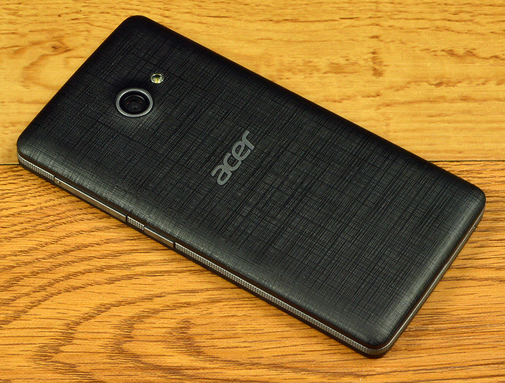
The Moto G4 Play is modestly-sized at 5.69 x 2.83 x 0.39 inches, weighing 4.83 ounces. This offers just enough heft to make it feel good in the hand without going overboard. The device sports a slightly textured, black back panel, which can be removed, offering access to the micro-SIM and microSD card slots. The one pleasant surprise: the design is splashproof, which adds a touch of ruggedness to the Android smartphone.

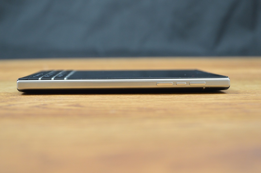
The only physical buttons are the textured power/standby switch and the volume rocker, which are both located on the right side of the device. The front-facing and rear facing cameras are appropriately located, with the former above and to the right of the display and the latter centered toward the top of the phone’s rear. The top edge plays host to a 3.5mm headphone jack, the microUSB charging port is located on the bottom, and the left edge is devoid of any buttons or ports.

The Moto G4 Play charges via microUSB.

The Moto G4 Play charges via microUSB.

Moto G4 Play power button and volume rocker

Moto G4 Play power button and volume rocker

Display & Speakers

The Moto G4 Play has a slightly-textured back panel.

The Motorola Moto G4 Play has a slightly-textured back panel.

The Motorola Moto G4 Play has a 5-inch IPS LCD display with a 1280 x 720 resolution, resulting in 294 pixels per inch. The flagship Android devices top 500 ppi, and the display is a Moto G4 Play weak spot. It’s not terribly bright, even on max settings, and visibility in bright light is poor. Its middling resolution doesn’t do it any favors either, as it’s readily apparent even without looking at detailed images or websites. Contrast and colors look fine though, even if the whites lean a little toward the blue side of the spectrum.

As for the speakers, there aren’t any beyond the single speaker grill located directly above the display. The sound quality of the lone speaker is exactly what you would expect: tinny and not particularly powerful. HTC BoomSound this is not. The microphone doesn’t even get its own grill, and is instead just a pinhole placed near the lower right-hand corner of the phone’s front face.

Moto G4 Line

Motorola offers three smartphones in the 2016 Moto G lineup: the $250 Moto G4 Plus, $200 Moto G4, and $150 Moto G4 Play. The G4 Plus and G4 both have larger 5.5-inch displays with full HD resolutions, more powerful eight-core processors, Turbo charging, and more design options. The G4 Plus has a 16-megapixel camera and comes with either 16GB or 64GB capacity. The G4 has a 13-megapixel camera and comes with either 16GB or 32GB capacity.

All of them offer great price-to-performance ratio, considering flagships like the iPhone 7 and Samsung Galaxy S7 edge costs more than $700, and the high-end Moto Z handsets start at $400.

Performance

Underneath the hood, the Moto G4 Play is powered by a quad-core, Qualcomm Snapdragon 410 that clocks in at 1.2 GHz. It also comes equipped with 2GB RAM.

The specs are modest (there’s a substantial gap between the Moto G4 Play’s power and those in the upper echelon), but not unreasonable for a budget device. The Moto G4 Play scored 510 and 1336 on the Geekbench 4 single-core and multi-core tests, respectively, and a 773 on the compute GPU test. To put this in perspective, Samsung’s Galaxy S7 flagships scored 1687, 3945, and 6185 on those tests, respectively.

Those are just numbers, though. In reality, the Moto G4 Play performs perfectly fine in that it offers precisely the type of OK performance you would expect of a $150 phone. We never encountered any navigation hiccups with our Motorola Moto G4 play review unit, and simple applications ran smoothly. Meanwhile, more intensive affairs occasionally ran into some hitches; games would stutter and load times were definitely on the longer side.

Battery

Considering its manageable size and price, the Moto G4 Play comes with a surprisingly beefy 2800mAh Li-Po battery that will easily last you two days with casual use, and it’s replaceable.

Moto G4 Play replaceable battery

Motorola Moto G4 Play replaceable battery

In terms of more concrete metrics, we also performed our usual test of seeing how long a full charge lasted while streaming Netflix over Wi-Fi with the display brightness set to max. Our Motorola Moto G4 Play review unit was able to stream for 8 hours and 8 minutes on a single charge. That’s an impressive length of time (anything over 8 hours is good) that’s likely owed to the not-very-bright and small display, also its lower pixel density.

Connectivity

The Moto G4 Play works on all the major carriers, and most minor carriers as well. It takes micro-SIM, and nano-SIM with an adapter (sold separately). It supports single-channel 802.11 b/g/n Wi-Fi (higher-end devices support dual-channel 802.11 b/g/n/ac Wi-Fi), and Bluetooth 4.1 LE. There is no wireless charging or NFC support, like you’d find on more expensive handsets.

Software

We’ve praised Motorola for its smartphones with a nearly pure Android experience, only adding features that serve to enhance the user experience rather than bogging it down. Luckily, that still holds true here.

The Moto G4 Play comes preloaded with Android 6.0.1 Marshmallow out of the box, with Moto’s take virtually identical to stock Android. The only noticeable difference is the Moto G4 Play standby screen, which can be modified to show notifications “at a glance” that fade in and out while the screen is off.

One other Moto feature is the ability to shrink the screen by swiping up from the bottom of the display, allowing for more comfortable one-handed use. A tap in the black border that forms around the shrunken display returns it to its full size. Like the “glance” notifications, this is actually pretty useful and makes life much easier, especially for folk with smaller mitts.

Other Moto smartphones, like the 2015 Moto X, have more Moto enhancements, but the “glance” notifications and shrinking screen are the only two offered on the G4 Play. And you know what? That’s just fine. Better to err on the side of leanness with budget smartphones. And the best part about these Moto features is that if you’re not into them, you can always just turn them off.

Thankfully, Motorola also remained true to form with its dearth of bloatware on the Moto G4 Play. Aside from an FM radio app and its Moto app that allows users to adjust the aforementioned settings, the only software that comes preloaded on the phone is the standard suite of Google apps.

This is probably for the best given that, at most, the Moto G4 Play only comes with 16GB of onboard storage. So it’s nice that between the low-key nature of Moto and the minimal additional software, users are still left with a decent amount of free space; out of the box, our Motorola Moto G4 Play review unit had 10.4GB capacity available.

Camera

The Moto G4 Play’s 8-megapixel camera, while not a total disaster, is definitely not one of its strong suits. First and foremost, its ability to shoot in low-light is abysmal. Noise and grain abound, and that’s if your picture doesn’t just come out completely black. As evidenced in the sample photo of Tracer and some shoes in an unlit closet (but with plenty of light surrounding it), there’s a rapid decline in the ability to make out subjects the moment darkness creeps.

Moto G4 Play low-light sample photo

Motorola Moto G4 Play low-light sample photo

Meanwhile, there are other smaller issues, like the camera’s struggles to focus properly on the desired subject. Color saturation is a bit of a problem as well; in the sample photo of the shoe polish, the orange on the can comes out looking much closer to red.


The Moto G4 Play photos are often oversaturated

The Moto G4 Play photos are often oversaturated

The good news, however, is that the camera shoots well in both natural and artificial light. The resolution is enough to offer a respectable amount of sharpness and clarity in the right conditions.

Moto G4 Play sample photo

Moto G4 Play sample photo

Conclusion

Moto G4Motorola has budget phones down to a near-science, so we had no doubt that the Moto G4 Play would deliver as a reliable, great bang-for-your-buck device. The Moto G4 Play’s shortcomings are nothing more than what comes with the territory of affordable phones, for the most part: an exceptionally plain design, a middling camera, and decent but not terribly fast performance.

Really, the only weakness that’s an actual disappointment is the display. It’s a lower-end device, but they could have done better.

But don’t let that deter you from considering this budget device. The Moto G4 Play is a very solid bet for a mere $150.

Pros:

  • Good battery life
  • Extremely affordable
  • Streamlined Android experience
  • Splash-proof build

Cons:

  • Design is otherwise about as boring as it gets
  • Weak display
  • Camera just OK

The post Motorola Moto G4 Play Review: Cheap and Capable appeared first on Brighthand.com.

Samsung Galaxy S7 Review: Boring, And That’s Just the Way We Like It

Whether it’s a result of market oversaturation or manufacturers releasing new iterations too frequently, it’s starting to feel like “this year’s smartphone model” isn’t all that distinct from “last year’s smartphone model.” Sure, phones are getting better every year, objectively speaking; a slightly faster processor here, a marginally improved camera there. But when new versions are launching at such a fast clip, you’re bound to occasionally end up with phones like the Samsung Galaxy S7: undoubtedly excellent, but without many new and meaningful features.

Don’t get us wrong, this is a tremendous phone that defines “top of the line.” It’s just that the line isn’t all that far from where it was a year ago.

Please note, the Samsung Galaxy S7 is very similar to the Galaxy S7 edge that launches alongside it. The S7 edge is slightly bigger, with a 5.5-inch screen, and has the Edge display, but it’s otherwise the same smartphone.

Build & Design

The Samsung Galaxy S7 doesn't deviate from the traditional Galaxy design.

The Samsung Galaxy S7 doesn’t deviate from the traditional Galaxy design.

The usual complimentary language applies to the Galaxy S7 build – sleek, gorgeous, premium, etc. – but it also leans a little towards futuristic. Part of this is due to the metallic, semi-reflective nature of the “Gold Platinum” color variant we reviewed. But it can also be chalked up to Samsung’s seamless blending of sharp and rounded aspects. Most of the Galaxy S7 edges come together at a sharp crease, but the back panel of the phone meets the rest of the body with gently sloped edges on the sides. This back “panel” is not actually removable; although it’s clearly a separate piece, you won’t find any battery access here.

Another attractive aspect of the Galaxy S7’s design, in addition to its beautiful metal and glass construction, is its manageable size. Many on the NotebookReview team have long lamented the unfortunate trend of smartphones becoming larger with each generation, but Samsung has finally taken a step back and created a phone with a more reasonable footprint than some of the competition (and even some of its predecessors). Thanks to an efficient use of real estate, the phone still has a good-sized screen at 5.1 inches while sporting comfortable dimensions, measuring in at 5.61 x 2.74 x 0.31 inches. Together, the design and the more compact size make it great to use and hold.

The phone’s weight isn’t excessive either, also adding to the comfort factor. At 5.36 ounces (152 grams), this device strikes that perfect balance: it’s not so light that it feels cheap, but it’s not so heavy that it feels like a brick. It has just enough heft to feel like the byproduct of a quality build rather than poor engineering.

The Galaxy S7 has a metal and glass build, but the back panel is not removable.

The Galaxy S7 has a metal and glass build, but the back panel is not removable.

A word of warning: this phone is slick, literally. Metal and glass are not the most grip-friendly materials. We fumbled with and dropped it a few times during testing. It may be a good-looking smartphone, but you’ll want to buy a case for it ASAP.

As for various ports and controls, nearly everything is where you would expect. Two separate buttons serve as a volume rocker and reside on the left side, while the right side plays host only to the power/standby button. The front of the phone is standard, with the physical home button/fingerprint sensor placed directly below the display, flanked by capacitive recent apps and back buttons. In addition to the sensors on the left of the phone’s earpiece, there is also a multi-colored notification light, while the 5-megapixel front-facing camera sits on the right. The back houses the 12-megapixel rear-facing camera and, directly to its right, the LED flash and returning heart rate sensor.

The 3.5mm headphone jack, microUSB port, and speaker sit on the bottom edge. And finally, the card tray rests on the top edge. The tray holds not only the phone’s SIM card, but also a microSD card as expandable memory makes its triumphant return to the Galaxy S series.

Samsung Galaxy S7 microSD card slot.

Samsung Galaxy S7 microSD card slot

Samsung Galaxy S7 microUSB input

Samsung Galaxy S7 microUSB input

Samsung Galaxy S7 volume rocker

Samsung Galaxy S7 volume rocker

Display

There isn’t much new to be said about Samsung’s Super AMOLED displays, but it’s worth noting the S7 display is a real beauty. Colors are deep and well saturated, it’s bright (even on lower settings), and the sharpness is among the best on the market. Protected by a healthy layer of Corning Gorilla Glass, the Galaxy S7’s 5.1-inch display sports a 1440 x 2560 resolution for a density of roughly 577 pixels per inch. This iteration of the Galaxy S also introduces an “always-on” display feature, should you want it, which we’ll get to soon.

The only real gripe we had about the display is that it very occasionally suffered from some accuracy issues in testing, particularly near the edge of screen. This happened a few times with one handed navigation, particularly while navigating deep into menus, as the phone seemed to register just below our thumb taps.

Specs

Our Verizon Samsung Galaxy S7 review unit came with the following specs:

  • 5.1-inch Super AMOLED Display (2560 x 1440 resolution, 577ppi), Gorilla Glass 4
  • 5.61 x 2.74 x 0.31 inches
  • 5.36 ounces
  • IP68 certified dust and water resistance
  • Qualcomm MSM8996 Snapdragon 820 processor (dual-core 2.15 GHz Kryo and dual-core 1.6 GHz Kryo, Adreno 530 GPU)
  • 4GB RAM
  • 32GB capacity (microSD expandable to 200GB as of this writing)
  • Android 6.0.1 with TouchWiz UI
  • microUSB 2.0 charging and data
  • 12-megapixel rear camera, 5-megapixel front, f/1.7 lens, dual-pixel phase detection autofocus, OIS
  • 3000mAh battery (non-removable)
  • Bluetooth v4.2, A2DP, LE, apt-X
  • LTE Cat9, VoLTE, 802.11 a/b/g/n/ac dual-band Wi-Fi
  • PMA wireless, QuickCharge 2.0
  • Samsung Pay support (NFC, MTS), Knox 2.6
  • Black Onyx, Silver Titanium, Gold Platinum
  • Price: $672 (will vary slightly by carrier)

The post Samsung Galaxy S7 Review: Boring, And That’s Just the Way We Like It appeared first on Brighthand.com.

Motorola Moto G Review (3rd Gen): Good & Cheap

This site is no stranger to testing some of the more affordable handsets out on the market. While many of them receive favorable reviews, it’s usually with the caveat that it really isn’t that great of a phone, but it’s just hard to knock something so cheap.

With the third generation Moto G from Motorola, this is no longer the case. Don’t get us wrong, there will still be a few concessions made here and there, just not nearly as many as usual.  Put simply: starting at $180 unlocked, the Moto G is the epitome of “bang for your buck.”

Build & Design

The Moto G has a removable back panel.

The Moto G has a removable back panel.

The very first thing I noticed about the Moto G upon taking it out of the box is that it’s a little chunky. The lean, svelte design of your typical flagship phone got tossed out the door along with the dollars off the price tag; affordability, somewhat paradoxically, comes at a price. It’s nearly half an inch thick, with its full dimensions measuring 5.59 x 2.85 x 0.46 inches, and the device’s heft is equally noticeable at 5.47 ounces. That said, its weight doesn’t leave it feeling unwieldy. If anything, it gives the handset a quality feel that reminds the user that it’s solidly built.

True to Motorola’s Burger King-esque approach of allowing you to “have it your way” when it comes to your devices, the Moto G has a plastic back cover that can be easily swapped out, giving you the option to switch up the color scheme of your device should you feel so compelled.  Many of Motorola’s customization options are available here too, like picking the color of the “accent piece” (the strip along the back), engraving, and a choice between white or black for the face color.

But the fancier options of the Moto X line like leather or wood won’t be found here, so the swappable shells only offer color customization — though there are flip shells that also give your phone a screen cover that go for $40 a pop. The plastic shell is textured though, giving it its own appeal and offering the user a little more grip than you might find elsewhere (as an owner of a Moto X with an especially slippery wooden back panel, I can speak to the benefits of this).

The Moto G has a 5-inch display and relatively thick bezel.

The Moto G has a 5-inch display and relatively thick bezel.

Sadly, the removable back shell doesn’t offer as much access as one would hope. Once you’re able to wrench the thing off (when I said “easily” earlier, I was using the term loosely), you’ll find that you have access to the device’s micro SD card and SIM card slots, both of which are welcome features, but not to its battery. It looks like we’ve moved on from the removable battery design in smartphones, and that’s a shame.

The rest of the design is as simple as it gets: power/standby switch and volume rocker on the right edge, microUSB charging port on the bottom, and 3.5mm headphone jack on the top. The phone’s rear-facing camera is centered toward the top of the back of the phone, and the front-facing camera is in the upper right corner of the front of the device, right next to the ambient light sensor.

The only other element of the Moto G’s design that’s worth mentioning is that the bezel is a bit thick, especially above and below the display. It doesn’t feel like the most efficient use of the phone’s real estate; its relatively small (by today’s standards, at least) 5-inch display belies its larger footprint.

Display

Speaking of which, the display of the Moto G doesn’t exactly dazzle, but it gets the job done. I’ve often lamented the trend of ever-growing display sizes on smartphones, so I’m comfortable with the fact that it’s “only” 5 inches. Of course smaller screens sadly go hand in hand with lower specs, but at least the device is a manageable size that doesn’t look absurd in my pocket.

No, the disappointing part here is how washed-out it looks. Pictures and webpages looked flat, even if its modest 1280 x 720 resolution did manage to offer a reasonable amount of sharpness (make no mistake: with a pixel density of 294, it’s still a little fuzzy and isn’t about to rival the beautiful displays of top-tier handsets). On a better note, the display had excellent brightness, especially when it was cranked up to the max. I never had any issues when attempting to view it outdoors.

The post Motorola Moto G Review (3rd Gen): Good & Cheap appeared first on Brighthand.com.

Samsung Galaxy S6 edge+ Review: Absurdly Large Android at Its Finest

As Samsung is wont to do, it has introduced yet another variant to its current lineup of smartphones, this time bringing us a supersized version of its most recent (and unique) model: the Galaxy S6 edge+. Obviously, it sports a massive display, but what else does it bring to the table? Is it worth choosing over the regular Galaxy S6 flagship, or the smaller version of the Galaxy S6 edge? It all depends on what you’re looking for but – spoiler alert – if you do choose it, you won’t be disappointed by its quality.

Build & Design

Samsung Galaxy S6 edge+ has a great display.

Samsung Galaxy S6 edge+ has a great display.

Everything about the S6 edge+ screams premium. Whether it’s the metal trim that runs around the edge of the phone, the champagne color (it is also available in black, for those who are looking for something a little less gaudy), or the flat back, every aspect of the aesthetic reminds you that this is a top-tier device. The glass backing, which gives the unit a nice sheen, also adds to the phone’s fancy looks, but it comes at a small price: it’s not particularly grippy and it makes the handset a magnet for fingerprints and smudges. It also hurts that the unibody design means that there is no removable back for battery access.

But the upside is that the S6 edge+ sports a sleek, futuristic look, and a big part of that is how thin it is. It may be a monster in terms of its 2.98-inch width and 6.08-inch height, but at 0.27 inches thick, it’s exceptionally lean. Speaking of which, it’s also surprisingly light at only 5.4 ounces, but not so light that it’s left feeling cheap.

That all said, yes, it is absurdly large, hence the “plus” moniker. For people with weird little baby hands like myself, one-handed use of the phone is more or less impossible if I want to maintain any sort of hold on the phone. But I imagine that it’s big enough that even people with normal-sized hands might find the experience to be somewhat uncomfortable.

The Samsung Galaxy S6 edge+ glass back is a smudge magnet.

The Samsung Galaxy S6 edge+ glass back is a smudge magnet.

While this is where I would normally rail against the obnoxious trend of smartphones becoming increasingly large, that wouldn’t be entirely fair given that in this case being massive is kind of the point. And besides, there is a choice available here, what with the regular S6 and S6 edge. Sure, they’re also on the larger side, but the S6 edge+ is targeting a specific audience: those people who want something gigantic and just can’t get enough real estate for their displays, no matter how comically large it makes their phones. And while the Galaxy Note5 fits that bill, it’s other selling point is the S Pen, which some users may not want.

So it’s hard to knock the S6 edge+ for being huge because people who buy it know what they’re signing up for, and that means that they don’t mind if it looks like they have an HD antenna stuffed in their pocket when they’re carrying it.

There’s a fair amount going on here in terms of the buttons and ports. The left edge of the phone houses two buttons for volume adjustment, while the right side is where the power/standby button is found. The device’s physical home button is located directly below the display and also serves as a fingerprint sensor. To the left and right of the home button are capacitive window and back keys, which is somewhat unconventional given that most Android handsets these days use on-screen buttons for navigation. Above the display you’ll find the phone’s front-facing camera, light sensor, and notification light.

The only feature on the top edge of the phone is the nano SIM card tray (which requires a pin to eject), and the bottom of the phone plays host to the 3.5mm headphone jack, a speaker, and a micro USB charging port. Finally, the back of the phone is where you’ll find a slightly raised area – on an otherwise completely flat back — for the camera’s lens, alongside of which there is a small area that houses the camera’s flash as well as a heart rate sensor.

Display

The Samsung Galaxy S6 edge+ has sloped edges, which look great, but don't offer much utility.

The Samsung Galaxy S6 edge+ has sloped edges, which look great, but don’t offer much utility.

Regardless of any reservations you might have about the 5.7-inch OLED display of the S6 edge+, it’s difficult to deny its beauty. Sporting a blistering resolution of 2560 x 1440 pixels, the display keeps both text and images looking sharp. The brightness and contrast are excellent as well; leaving the brightness on auto was more than sufficient at all times (though the max setting was certainly impressive), and I never had any trouble seeing it outdoors, even in direct sunlight. Colors are crisp, if a little overly saturated at times, and all in all this is a wonderful-looking screen.

The one thing that isn’t all that special, however, is the very feature that gives the phone its namesake: the sloped edges. While they do give the display a nice edge-to-edge look (see what I did there?), by and large they amount to little more than a gimmick as far as their usefulness is concerned. We’ll get into this more when discussing the phone’s software and how exactly you can make use of the phone’s edges, but suffice to say that they won’t change your life.

Performance

The Samsung Galaxy S6 edge+ has a speaker, microUSB 2.0, and audio jack on the bottom

The Samsung Galaxy S6 edge+ has a speaker, microUSB 2.0, and audio jack on the bottom

Packing a 2.1GHz octa-core Exynos processor under the hood, the S6 edge+ is a powerful piece of hardware. We never encountered any performance issues in terms of speed or crashing during our testing, which is precisely what we want to see from a top-tier, flagship device. Other specs include 4GB of RAM and a solid 32GB (or 64GB) of onboard storage, which is welcome considering that there is no microSD card slot for expandable memory. The phone is also equipped with fast-charging technology, but unfortunately this was not something we could test since our unit came with an international charger.

But it isn’t all about speed and a crash-free experiences. Other aspects of the performance were a little spottier. The “information stream” feature, for example, which displays a single line of information along one of the device’s edges after a quick back-and-forth swiping gesture, was not terribly responsive. It usually took two or three gestures before the information popped up, and then it often failed to detect up- or down-swipes to scroll through the different types of information (time/weather/battery life, notifications, and news updates).

It’s also worth noting that the slanted edges of the screen resulted in a great deal of accidental screen taps and button presses for me. In some cases, it was just a matter of me trying to rest my thumb on the edge of the device, only to find that I was still interacting with the screen. In other cases, I was trying to reach across the massive display, only to have the palm of my hand touch the slanted edge and accidentally perform an action.

On the whole, though, the S6 edge+ offered a pretty polished experience. The fingerprint and heart rate sensors worked nearly flawlessly. I rarely had to re-enter my thumbprint to unlock my phone, and the heart rate sensor never had a problem tracking my information. It was especially fun to use the latter to reject calls when the phone was face down; holding one’s finger over the sensor for two seconds automatically declines the call and sends a follow up text saying that you’re busy, and the feature works without a hitch.

Software

Samsung Galaxy S6 edge+ apps edge

Samsung Galaxy S6 edge+ apps edge

The Galaxy S6 edge+’s sloped sides may make it look cool and unique, but they’re only as useful as the software that utilizes them. As it turns out, that software isn’t particularly useful.

The most prominent uses of the edge feature are edge contacts and edge apps, which are precisely what they sound like. After swiping along a small tab that points inwards from the slanted edge, the rest of the display is thrown into soft focus and the user is presented with five circles aligned vertically along the edge of the screen, which are reserved for five contacts of the user’s choice. Swiping left or right across those circles brings up another five circles for apps of your choosing.

The problem is, at a certain point it could be just as quick – if not quicker – to navigate traditionally. If you just unlocked your phone and you’re looking at your home screen that has a shortcut to one of your preferred apps, you simply tap it and you’re there. Using the edge, meanwhile, would require to swipe in (a gesture, for the record, that isn’t always properly detected), swipe again to get to the apps list (if that wasn’t the last page you left up on the edge), and then tap to launch the app. One could argue that it’s maybe useful if you’re already in another app, but again: it’s the same number of actions. Swipe in and select your app, or hit the home button and select your app. The edges may seem cool on the surface, but if you stop and think about it, they’re really not all that helpful or time-saving.

Samsung Galaxy S6 edge+ contacts edge

Samsung Galaxy S6 edge+ contacts edge

In terms of the contacts, the edge will glow a certain color if one of the contacts is calling and the device is face down. The color depends on which “slot” is calling. Once again, it’s cool, but not that helpful.

It’s not unlike some of the other features that Samsung has thrown in as part of their kitchen sink approach where the coolness tends to outweigh usefulness. Remember how I said it was fun to reject calls using the heart rate sensor? Notice how I said “fun,” and not “useful.” After all if you have your phone out on the table, it’s causing a disturbance if it rings at all, and you’re still being rude by interacting with your phone when you shouldn’t be.

Another frustrating aspect of how the edges are used is with regards to the aforementioned info stream. See, the way the edges work is that you can only “assign” the edge to one side at a time. So, things like edge contacts and edge apps will only ever be accessible on the left or the right, but never both. The reason this is important is because the info stream only works on the side to which the edge is currently assigned.

This means that if the wrong side happens to be facing you while your phone is on the table, you’ll have to turn it around first before sliding your finger across the edge to access the info stream. Let’s face it: at a certain point, you’re putting in too much effort to avoid just picking up your phone and turning it on. It’s also an odd choice because it almost entirely defeats the purpose of the phone having two sloped edges, and it makes me wonder if maybe Samsung had the right idea with the first edge model that only had one sloped side. After all, without being able to have both sides active at the same time in any capacity, the only remaining reason for this design is so right- and left-handed people can choose the side that’s more comfortable for them.

Samsung Galaxy S6 edge+ TouchWiz

Samsung Galaxy S6 edge+ TouchWiz

Much of the other software choices that you’ll see here prove to be a little more useful, however. Though we were unable to test it given that it has yet to launch, the Galaxy S6 edge+ will feature Samsung Pay, which will be the company’s NFC payment offering that also works with traditional card-swipe terminals. The phone also has the ability to do video broadcasts through YouTube Live and supports SideSync 4.0, Samsung’s software that allows you to control your phone through your PC (anything that allows me to type on a real keyboard instead of my phone’s on-screen keyboard is OK by me).

While I should mention that the phone sports “Ultra High Quality Audio,” which is Samsung’s way of saying audio upscaling for apps like YouTube or Pandora, it can be difficult to hear the difference in quality. It’s not like the audio quality sounds bad, but I tried listening to the same videos on the Galaxy S6 edge+ and my current phone (a second gen Moto X) and I had trouble identifying any discernible difference in quality. Then again, I’m not an audiophile, so maybe I’m just ignorant.

Again, given Samsung’s typical kitchen sink approach, the company has piled its many new software offerings on top of some of its existing gesture/UI software. Features like flip (or cover) to mute, palm swipe to capture, and Smart Stay (display stays on as long as you’re looking at it) return here, with some being useful and some not. There is now also a Flipboard-powered newsfeed located to the left of the first home screen — not unlike HTC’s BlinkFeed – and hopefully you like it, because it can’t be disabled (though users can download and opt for the Google Now home-screen experience, which is similar).

As for the rest of the preloaded software, the good news is that Samsung really took it easy with the bloatware. Beyond a few redundant additions (like a link to its proprietary app store, native non-Google music and video apps, S Voice when all Android phones these days are equipped with voice commands in Google Now, etc.), the preloaded apps are limited to only those that are either basic and/or useful. In fact, out of the box there are only two pages of apps – with only two apps on the second page – loaded onto the phone. And many of them are actually useful, like the full suite of Microsoft Office apps, Samsung’s S Health fitness app, and, of course, Google apps like Chrome, Maps, YouTube, etc.

Camera & Battery Life

The Galaxy S6 edge+ is equipped with a 16-megapixel camera that performs well, even if it’s not the highlight of the phone. Pictures come out sharp and shooting in poorly lit environments results in only a mild amount of noise, but the biggest drawback seems to be that colors are dull and not at all saturated. In one of our test photos, for example, the deep red leaves on a plant came out looking flat – almost pinkish or pastel in nature.

Samsung Galaxy S6 edge+ sample picture

Samsung Galaxy S6 edge+ sample picture

Overall, the battery life of the Galaxy S6 edge+ is solid, with a single charge carrying me for two and a half days. My testing on the whole was intensive, but I was especially surprised by how aggressively the last 10 percent hung on and how much effort it took just to get it to shut off. At any rate, the unit was definitely put through its paces, as those two and half days included a full hour’s worth of streaming video from YouTube, two commutes’ (to and from work) worth of web browsing, multiple photos taken/edited, and other general testing and experiments with the phone’s software.

The thing is, the unit is equipped with a rather large 3,000 mAh battery, so one might be tempted to think it should last for even longer. But the whole reason it has such a high capacity battery in the first place is to support its equally massive screen and high-powered hardware, so it all tends to even out.

Conclusion

The Galaxy S6 edge+ is the embodiment of Samsung at the top of its game. With its beautiful build and powerful hardware, it’s more than worthy of the flagship title. To top it off, the hardware is supported by secondary features (thumbprint and heart sensors) that perform smoothly, as well as a strong software showing.

As is bound to happen with Samsung’s kitchen-sink approach, however, there are a few misses here, the most significant being the lack of utility behind the device’s trademarked edges. Nevertheless, it’s hard to hold these shortcomings against the phone, given that that they mostly don’t detract from the phone’s premium experience in any way. At worst, they’re harmless additions that are fun to mess around with but ultimately will not change your life. The only downside is that it costs a little more, but hey, that’s what the Galaxy S6 is for (and if the size is your qualm, that’s what the regular Galaxy S6 edge is for).

The size may be too large for my tastes, but if you want a supersized phone and you’re intrigued by the edges, this is definitely the phone that you want.

Pros:

  • Incredible performance
  • Beautiful build and display
  • Added features like fingerprint and heart rate sensors function well

Cons:

  • Edges don’t prove to be all that useful
  • Humongous (even if that’s the point, it can be impractical)

The post Samsung Galaxy S6 edge+ Review: Absurdly Large Android at Its Finest appeared first on Brighthand.com.

Microsoft Lumia 735 Review

There are roughly 7 million entry- to mid-level Microsoft (nee Nokia) Lumia phones out there, varying ever so slightly from one another in performance and appearance. So it shouldn’t come as much of a surprise that the Lumia 735 is in many ways a very familiar device, but that doesn’t mean it should be written off completely.

While the phone does little to distinguish itself from its (many) brothers and sisters, it’s a respectable offering that has enough strengths to put it in contention for anybody who’s looking for a lower-end handset. But are those strengths enough to warrant its off-contract MSRP of $300? Let’s take a look at the big picture and find out.

Build and Design

Microsoft Lumia 735

Microsoft Lumia 735

If you’ve handled a Lumia handset, then you probably have a pretty good idea of what the build of the Lumia 735 is like. It has a very solid-feeling plastic body with a finish that, while soft to the touch, isn’t quite matte. As such, it doesn’t provide much grip and the phone can feel a bit slippery at times.

It terms of the structure, the Lumia 735 sports the same shape with rounded sides (but pointed corners) as many of the other Lumia models. While I can appreciate the uniqueness of this particular design choice, it’s not really my cup of tea. Also returning is the back that bulges out slightly, making the overall package feel a bit thick. In fact, the overall footprint of the Lumia 735 is a little bigger than you might expect; at 134.7 x 68.5 x 8.9 mm (5.30 x 2.70 x 0.35 inches), it isn’t as low profile as one might guess for a phone that is intended to be “smaller” by today’s standards (i.e. equipped with a 4.7-inch display).

Microsoft Lumia 735 buttons

Microsoft Lumia 735 buttons

As far as buttons and ports go, there’s nothing out of the ordinary here. The left edge is devoid of any features, while the right side plays host to the volume rocker and power/standby button. The microUSB charging port, meanwhile, is on the bottom edge of the device, and the 3.5mm headphone jack is on the top edge.

The back cover of the Lumia 735 is removable, but Microsoft deserves some credit here for making it look so seamless that I honestly thought the phone had a unibody build when I first inspected it. Granted, this means that it takes a little bit of work to get the cover off, but it’s worth it to have such a low-profile connection between it and the rest of the phone. Beneath the removable back panel, there’s access to the unit’s battery, as well as nano SIM and microSD card (good for expanding the memory by up to 128 GB) slots at the user’s disposal.

The only other external features are the Carl Zeiss camera, which is located toward the top of the phone’s back, and a small speaker in the lower right corner of the rear of the device.

Display

Microsoft Lumia 735 back panel

Microsoft Lumia 735 back panel

The Lumia 735’s display is solid showing, especially for a low-end device such as this. The 4.7-inch, 1280 x 720 OLED display isn’t about to destroy anybody’s eyeballs with its sharpness, but it certainly isn’t anything to sneeze at, either.

Its 312 pixel-per-inch density is more than serviceable and leaves the pronounced edges of the Windows Phone aesthetic (thank you, tiles) looking crisp and sharp despite a resolution that, at least on paper, is mediocre. As for everything else, colors are vibrant and the brightness, when put on its highest possible setting, looks fantastic. The screen, which is protected by Corning Gorilla Glass 3, fights glare quite well too, so outdoor viewing isn’t much of a problem.

It’s also worth mentioning that the bezel around the display is very low profile, which is always nice to see; besides looking pleasant, it’s an efficient use of space (even if the rest of the build is a bit bulkier than it should be). This is especially true to the left and right of the display, where the bezel is exceptionally thin, giving the screen an almost edge-to-edge appearance.

The post Microsoft Lumia 735 Review appeared first on Brighthand.com.

Huawei P8 Lite Review

It’s a shame that Huawei is a bit of an unknown entity in the United States, because the Chinese device maker consistently releases great-looking hardware that performs just as well as that of its American competitors. The good news is that one of Huawei’s more recent US releases, the P8 Lite, stays true to the company’s track record.

A beautiful mid-range device that serves as a smaller version of the true Huawei P8, the P8 Lite sells for only $250 unlocked while offering an experience that feels closer to flagship than mid-tier. Unfortunately, what is an otherwise high-quality handset is marred by questionable UI choices. Bearing that in mind, is it still worth your hard-earned cash?

Build & Design

Huawei P8 Lite back

Huawei P8 Lite back

There is no denying it: the P8 Lite is one seriously slick unit. Sharp edges, rounded corners, and a flat back lend the phone a sleek, low-profile look that is somewhat reminiscent of the Apple iPhone 5 and 5s. A metallic silver band also runs around the entire edge of the phone, and though the colors can vary, our particular unit was white. Both design choices added to the phone’s clean aesthetic.

Weighing in at 4.62 ounces, the P8 Lite has a little more heft than you would expect just from looking at it, but it’s only 0.3 inches thick, which keeps it from feeling too bulky or unwieldy. In fact, the “Lite” in the P8 Lite’s name refers to the smaller screen (in an annoying industry trend, this also means downgraded specs), the upside of which is that it results in a smaller footprint that makes the phone quite comfortable to hold. The slightly textured backing feels nice in the hand, even if it doesn’t do much in the way of offering something to grip.

The layout of the P8 Lite’s buttons and ports is a little unorthodox, mostly due to the existence of its dual SIM ports. Located on the right edge of the phone, the two ports require pin ejection to access and, oddly enough, are for two different types of SIM cards: one is for a nanoSIM, while the other is for a microSIM. In a neat twist, the nanoSIM slot can also be used for a microSD card to expand the phone’s storage space (though it would be nice if it could be inserted in the microSIM card slot instead, given that the nanoSIM is becoming increasingly prevalent).

Huawei P8 Lite dual SIM slots

Huawei P8 Lite dual SIM slots

Huawei P8 Lite side

Huawei P8 Lite side

Also located on the right side are the phone’s power/standby button and the volume rocker. The left edge is devoid of any features, but the top edge houses the unit’s 3.5mm headphone jack, while the bottom edge features dual speakers, one on each side of the microUSB charging port.

Huawei P8 Lite top

Huawei P8 Lite top

Huawei P8 Lite bottom

Huawei P8 Lite bottom

Display

Huawei P8 Lite edge-to-edge display

Huawei P8 Lite edge-to-edge display

In the face of heavy marketing campaigns championing increasingly high resolution displays, it’s easy to forget that when screens are this size, pixel count becomes unimportant once the density reaches a certain point. The differences can’t be discerned by the naked eye. Case in point: the P8 Lite’s 720 x 1280 resolution may seem pedestrian on paper in comparison to some of the eye-popping numbers of other phones’ resolutions, but in reality it still looks quite good on its 5-inch display.

While the crispness and the vibrancy of its colors are undoubtedly impressive, the real eye-catching element of the P8 Lite’s display is its near-edge-to-edge design. The bezel on the left and right sides of the screen is virtually nonexistent, allowing the display to maximize its real estate while keeping the phone’s footprint more compact. And aside from the fact that it looks stunning, it also helps with functionality; when there’s no bezel to speak of to get in the way, basically everything is in reach of your thumb during one-handed use.

The post Huawei P8 Lite Review appeared first on Brighthand.com.

Acer Liquid M220 Review: The $80 Smartphone

At a certain point, a deal is so good that certain sacrifices become acceptable, right?

Acer Liquid M220, an $80 smartphone

Acer Liquid M220, an $80 smartphone

That would at least appear to be Acer’s philosophy with its first US smartphone offering, the Windows Phone-powered Liquid M220. For a mere $80 off contract, users can get their hands on a full-fledged smartphone, albeit an entry level one. Emerging markets are undoubtedly at least part of the target audience here, but that’s still a solid deal no matter how you slice it.

It’s important to remember that you get what you pay for — at $80, this simply isn’t a top-notch, high-end device, nor was there any way Acer could have made it one.  But that doesn’t mean that there isn’t some decent bang for your buck to be found here.

Build & Design

The build of the Liquid M220 is simple, but it also has a certain understated appeal to it. Sharp-angled edges and rounded corners make for a straightforward slab of a phone that, while unadventurous, is comfortable in its familiarity. It’s also very low-profile, weighing in at 4.2 ounces (119 grams) and sporting a nice, small footprint that measures only 4.92 x 2.52 x 0.38 inches.

Acer Liquid M220 back panel

Acer Liquid M220 back panel

That said, it feels like Acer made the bezel unnecessarily large, especially below the display, given that Windows Phones no longer place capacitive navigation buttons on the hardware itself, instead opting to display them on screen. It’s not a huge deal; it just seems like wasted space.

Though the removable backing is cheap, flimsy plastic that has only the slightest of textures to it, a ridged band snakes its way around the edges of the phone, thankfully lending the user something to grip. Underneath the back plate lies access to the unit’s removable battery, microSD card slot, and two SIM card slots. The two SIM card slots are different sizes, with one for a regular-sized SIM and one for a microSIM.

The arrangement and selection of the phone’s buttons and ports is standard, with the 3.5mm headphone jack and microUSB charging port located on the top edge, and the volume rocker and power button located on the right. The left and bottom edges are devoid of any features, while the Liquid M220’s 5-megapixel rear-facing camera is centered towards the top of the phone’s back, and the 2-megapixel front-facing shooter is located in the upper right corner above the display.

Acer Liquid M220 microUSB input

Acer Liquid M220 microUSB input

Acer Liquid M220 mic

Acer Liquid M220 mic

Acer Liquid M220 side

Acer Liquid M220 side

Acer Liquid M220 volume rocker

Acer Liquid M220 volume rocker

Display

As mentioned, with such a low off-contract price point, it’s to be expected that many aspects of the Liquid M220 will be lacking in quality, and in few places is it more apparent than the device’s display.

Before I really lay into it, though, I would like to point out that I find the smaller screen size refreshing; this reviewer is particularly averse to the unstoppable trend of smartphones becoming increasingly large in the name of massive displays. So the Liquid M220’s 4-inch display is perfectly comfortable for me, but the compliments end there.

Graininess abounds on the display, which is to be expected when the resolution is a mere 800 x 480 pixels. Colors aren’t particularly crisp, and the brightness is very poor. Even on its highest setting, the brightness of the Liquid M220 is underwhelming at best, and it makes viewing the display outdoors in high-light situations nearly impossible.

The post Acer Liquid M220 Review: The $80 Smartphone appeared first on Brighthand.com.

BlackBerry Passport Review: Be Square

Most smartphones these days are more or less identical at first glance: a rectangular slab, the entire front of which is taken up by a screen, and maybe one physical key. The major differences don’t become apparent until you actually turn a phone on.

BlackBerry Passport

BlackBerry Passport

But with the Passport, BlackBerry is looking to make a bold impression the moment you set your eyes on its new flagship. Featuring an unorthodox square display and a trimmed down physical QWERTY keyboard, there’s no denying that the Passport is unlike anything else out there.

The question is, does different necessarily mean better? Let’s find out how well BlackBerry’s unique creation holds up.

Build and Design

Put simply, the Passport’s design is inconvenient. The phone is built around its awkwardly shaped display, giving it a footprint that is entirely too wide. While one can maybe appreciate BlackBerry’s efforts to think outside the box, it’s all for naught if it doesn’t present any benefits to the user, which is the case here.

BlackBerry Passport back

BlackBerry Passport back

BlackBerry tries to make the case that the display provides a better viewing and reading experience, but the fact is that most media these days is either presented in a vertical layout or a true, 16:9 widescreen format – for which users can simply turn their phones sideways and reorient the content. Therefore, you rarely ever find yourself in a situation where you need a screen like this (i.e. one that’s wider than average, but presented as a perfect square “full screen” instead of an actual 16:9 widescreen).

Instead, all you’re left with is a fat-faced phone that, more often than not, needs to be handled with two hands instead of one. Its 5.04” x 3.56” x 0.36” body is also entirely too awkward to comfortably fit in your pocket, so the best bet is to carry it in a bag.

That said, the actual quality of the Passport’s build is great. It’s fairly thin, and though it’s a little heavy at 6.91 ounces (196 grams), it does lend the phone a nice, solid feel. The back features a rubberized coating that offers a little bit of grip — though it is a fingerprint magnet — and the metallic accents along the edges and in between the rows of keys bring a high quality aesthetic to the device.

BlackBerry Passport side

BlackBerry Passport side

Save for the physical QWERTY keyboard below the display, the layout of the phone is ordinary. The power/standby button can be found on the top edge along with the headphone jack, while BlackBerry’s three-button volume rocker plus mute/pause button can be found on the right. The left edge is devoid of any buttons or ports, while the bottom features two speakers (which can really scream) as well as a microUSB charging port. The cameras are also where you’d expect them to be, with the front-facing shooter in the top right corner of the device, and the rear one in the top center of the back.

Unfortunately, the phone doesn’t feature a removable battery, but there is a small segment of the back panel that can be pried off to provide access to the nano SIM slot and a micro SD expansion port.

Display

Despite its bizarre proportions, the quality of the Passport’s 4.5-inch display is excellent. With a resolution of 1440 x 1440 and a pixel density of 452 ppi, images and, perhaps more importantly for such a work-oriented device, text look extremely sharp. Colors aren’t the most vivid we’ve ever seen, but they pop enough to satisfy considering that the primary function of this device isn’t media consumption. The display doesn’t fight glare especially well, but its maximum brightness is impressive enough to help mitigate the issue somewhat.

BlackBerry Passport bottom

BlackBerry Passport bottom

As we established when discussing the build, the shape of the screen is mostly pointless. You could maybe understand BlackBerry’s argument that a wide square display offers a decent setup for reading documents, but it’s far from a necessity given our earlier point about being able to turn a traditionally-shaped smartphone sideways for a widescreen format. It’s worth pointing out, though, that unless you’re viewing a graph or maybe a slideshow, most documents are typically vertically oriented anyway, so the traditional smartphone display is still a better fit.

Beyond that, there really isn’t much of a case you can make for such an oddly shaped display, as all it does is make it more difficult to tap things on the far side of the screen. It’s especially unpleasant for viewing videos because the vast majority of them are presented in a widescreen format nowadays. Have you ever tried watching a widescreen 16:9 ratio movie on a standard 4:3 ratio television? It’s basically like that.

The post BlackBerry Passport Review: Be Square appeared first on Brighthand.com.